

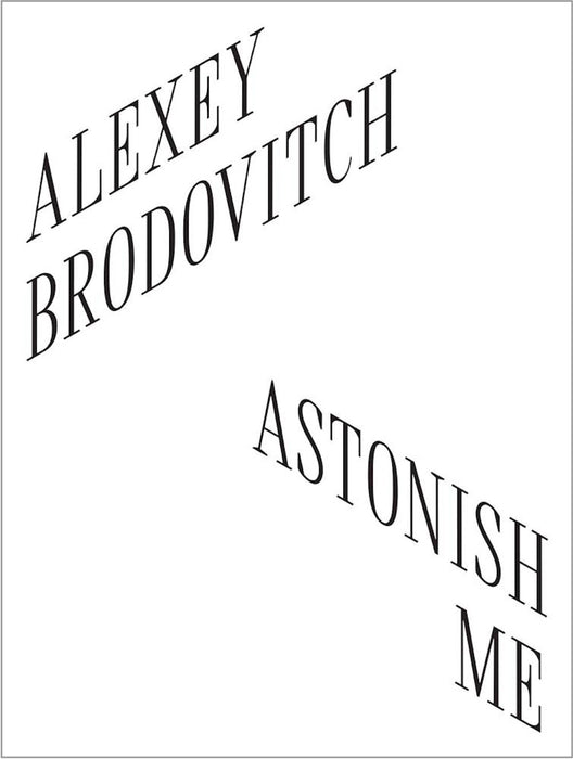
Alexey Brodovitch: Astonish Me
£40.00
Given his long influence on editorial design and visual storytelling, it seems incredible that a current exhibition in Philadelphia is the first major US exhibition devoted to the work of Alexey Brodovitch. For those that can’t get to visit the show, the accompanying exhibition catalogue is a must-read.
Brodovitch’s 25 years as art director at Harper’s Bazaar in New York brought European modernism to bear on magazines just in time for their mid 20th century media dominance. He left Russia for the US via Paris, where he absorbed the work of the surrealists, dadaists, contructivists and the Bauhaus, arriving in Philadelphia in 1930.

It was Brodovitch who established the role of the modern magazine art director, his time in Paris fuelling his passion not only for typography and photography but also for the way the two disclipines could be combined. He saw experimentation as they key, emphasising the crossover of fine art and commercial design, another essential tenet of magazine art direction that continues today.
He was not alone in this—his brilliant rival Alexander Liberman travelled a similar route from Russia via Paris to New York and took on the art direction role at Vogue. The two emigrés competitively pushed each other forward.
There have been books about Brodovitch before, of course; several sit here on the magCulture shelves. What makes ‘Alexey Brodovitch—Astonish Me’ stand out is the way its sets out to address people that don’t know its subject. Previous books come from the traditional design canon genre: lots of images, history and timelines. This new book, like the exhibition it’s tied to, concerns his place in contemporary design, and asks, why does he matter?
The essayists contributing to the book are aided in this by its design. Earlier books have felt obliged to use Brodovitch’s favourite font Bodoni as a nod to his work, otherwise letting copious images of his designs demonstrate his ethos.

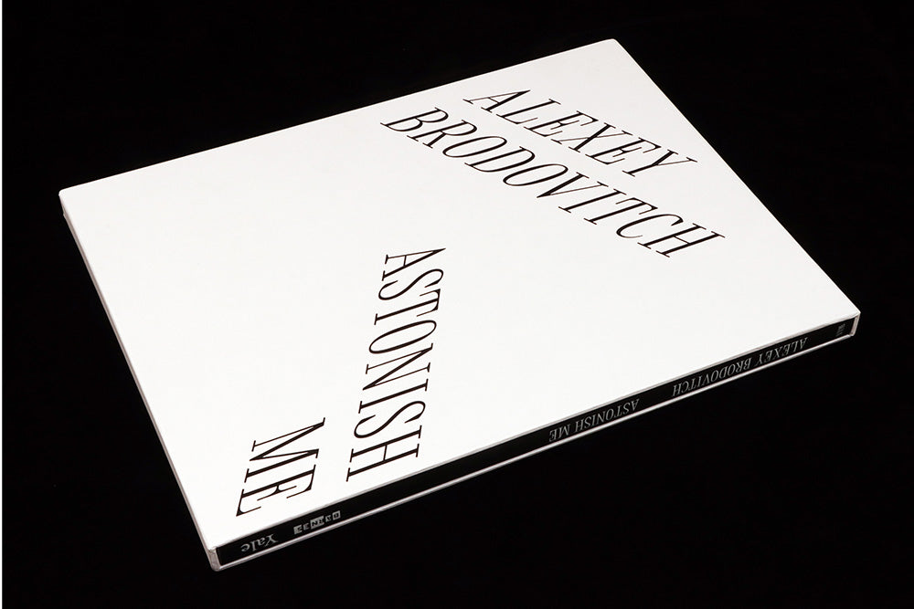
The new book, designed by London studio A Practice for Everyday Life, takes a more distinct, focused approach. APFEL have produced many exhibition catalogues, and they’re known for breaking out of the templated approach to book production. For this publication they zero in on the point at which a book becomes a magazine, replicating the exact, large page size of Brodovitch-era Harper’s Bazaar. ‘We wanted the book to feel floppy like a magazine,’ founding director Kirsty Carter told me, ‘to communicate a sense of Brodovitch’s work without parodying it’.
The paper used is heavier than that used by the magazine, avoiding show-through, but the softback binding delivers the desired floppiness. If this was creatively sound—and the studio were supported here by exhibition curator Kate Wan—catalogue economics came into play. There is always pressure for a catalogue to be hardback; the publisher can reach a certain price point which is more financially viable. ‘Unlike the UK, the American market is really hung up on hardback books. A museum book of this calibre needed to be hardback,’ Kirsty adds. The solution was a slipcase, delivering the desired solidity along with a powerful design switch from black-on-white to white-on-black.

The large pages also allowed the designers to channel Brodovitch’s use of white space and diagonal text columns. ‘There are a lot of asymmetric elements in the book,’ Kirsty explains, ‘celebrating Brodovitch while again avoiding parody.’

Another nice reference point are the section breaks, with titles screenprinted in white on uncoated black paper (above). ‘Normally you’d just reverse these out of printed black, but that would have felt too much like a magazine,’ adds Kirsty, ‘It’s these moments that move it to homage.’ Brodovitch’s stunning designs for Portfolio magazine featured similar inserted papers. An additional sense of the materiality of the publication is the way that double-page landscape images stretch either side of these dividers (above and below).

APFEL often create a bespoke typeface for their projects (they have their own type foundry), and for this one they devised a condensed serif font that references Brodovitch favourites Bodoni and Didot. ‘We felt we couldn’t use those typefaces in the book, again to avoid parody, so we married them both to create a new title face featuring the angled serifs of those classics,’ says Kirsty, ‘and we used Grilli Type’s GT America for the text, a contemporary take on the grotesque typefaces of his time.’

Another difference from earlier books is the use of Brodovitch’s own photographs on the slipcase and cover (above). His reputation in part rests on the discovery and patronage of an era-defining series of photographers—Avedon, Kertesz, Bassman et al—and their images are often pushed to the fore to represent the art director. ‘He didn’t do much photography himself,’ says Kirsty, ‘except for the one series titled Ballet. So we made a conscious decision to use only those images on the cover’.

The result is a concise volume that includes the major works of Brodovitch’s career, treats those designs with respect (the magazine spreads are very well photographed) and makes a strong visual case for his reputation. The large pages let the images breath, and APFEL’s gentle homage to his design aesthetic is a delightful extra that makes the featured work feel more contemporary.
And if there are any remaining doubts about his relevance, Vince Aletti’s essay in the catalogue, ‘Why Brodovitch Matters,’ settles the matter. Referring to Brodovitch and Liberman, he writes ‘It’s hard to imagine contemorary magazine design without their examples,’ before asserting, ‘Brodovitch, that cranky genius, has the edge when it comes to throwaway elegance and wit. Where would we be without him?’
The exhibition ‘Alexey Brodovitch, Astonish Me’ contines at the Barnes Foundation, Philadelphia, US, until 19 May.
Buy your copy from the magCulture Shop