

032c #30
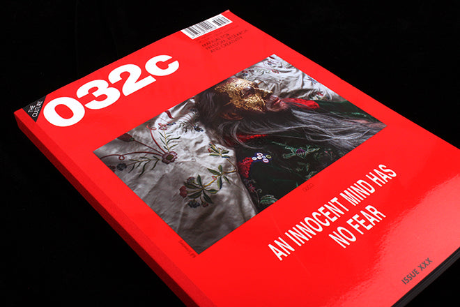
In 2007, a bright flash of Pantone 032c red began to regularly puncture newsstands everywhere – the colour was an emphatic statement that powerfully framed the covers of Berlin’s 032c magazine. It soon became the publication’s hallmark.

The red was part of Mike Meiré’s redesign, issue one had been to designed to look like a Pantone colour sample, and Meiré brought it back – the first punch of his aggressive new layout that was subsequently hotly debated and celebrated. At the time it was described as an “aesthetic of brutal violence”, and some now attribute Meiré’s vision as the inspiration behind the term “the new ugly”.
As Meiré told Creative Review, “I used my chance with 032c to come up with something different”.
The design was a deliberate rule-breaking and it was a gleeful provocation. Now, in the way that the radical often quickly becomes the status quo, others have caught up: stretched type and the purposefully brutal is the new normal and something we often see in contemporary magazine design. Looking closely at the new issue of 032c today – its 30th issue, which celebrates its 15th birthday – it’s remarkable to see how Meiré’s now nine year old touch has altered the approach of so many other independents. A close look at issue 30 also confirms that 032c are still the masters, the ones doing it best.
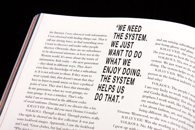
It’s gentle manipulations of type, for example, contorts perception while simultaneously feeling strangely balanced and elegantly harmonious. There’s no one doing it better:


Aside from a single “hip hip hurray” from Jörg Koch in his editor’s letter, there is nothing obviously celebratory about the 15th anniversary “special”. 032c have decided to drive full-force ahead with its vision rather than basking in the glory of a retrospective (Koch notes that he would rather “keep the magazine free from nostalgia”, though he does mention a box set about 032c that will be released later this year). This approach reminds me of Berlin-based mono.kultur’s 10th birthday celebration last year, which chose not to dwell on the history of the magazine but to look at contemporary independents from the city instead. 032c chose to loosely (very loosely) focus its anniversary issue on the city of Berlin – saying that without it, the magazine could never have thrived and grown.
A John Donne quote printed above the masthead – one that today has special, profound relevance – reminds readers that “no man is an island”, as does the list of stockists for Wolfgang Tillman’s 25 posters created in protest of today’s EU referendum.


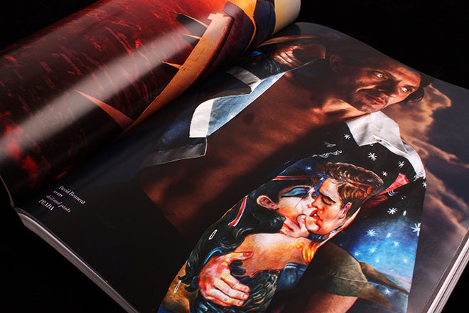
To celebrate Berlin, there’s a shoot languorously stretching for nearly 100 pages and which imagines the “ultimate Berlin film” by Ralph Schmerberg (below). The reader then turns to thinking about Germany more generally for an article by sociologist Heinz Bude that strives to understand the way that Angela Merkel’s mind works (also below).

Elsewhere, there’s an in-depth interview with industrialist and contemporary art collector Dakis Joannaou at his home in Athens (below), which tells his story through a list of the art he owns. There’s also a visit to John Berger’s home in the suburbs of Paris, told from the perspective of Tilda Swinton’s new set of films about the art critic, The Seasons of Quincy.

Yesterday Jeremy reviewed 212, a magazine that’s forcefully tackling the massive changes taking place today, and noted that it’s great to see ‘these big, heavyweight publications making such a strong, almost defiant, use of print’. 032c has a similar vision when it comes to what print can do and say, it believes in its power to change things and subvert and alter perspectives.
In Koch’s editorial, he emphasizes the importance of thinking forward and not backwards – hence the decisive lack of nostalgia in this issue. He ends on a positive note: ‘I would love to think that the small world of 032c can be an active fighter against the dark times’. Perhaps that’s why this issue feels so borderless – slipping from place to place, from one kind of story to another, so seamlessly, as if trying to compress its vision of an open and unified community into the shape of a magazine.