

At Work With: Colin Caradec and Morgane Rébulard, The Shelf Journal

Colin Caradec and Morgane Rébulard run The Shelf Company, a Paris-based graphic and typographic design studio and publishing house. They publish The Shelf Journal, a beautifully produced magazine dedicated to publishing design, books and what they call ‘the cult of the shelf’. With the third issue of the The Shelf Journal now available, we look ahead at their week and get an insight into French magazine culture.

Where are you today?
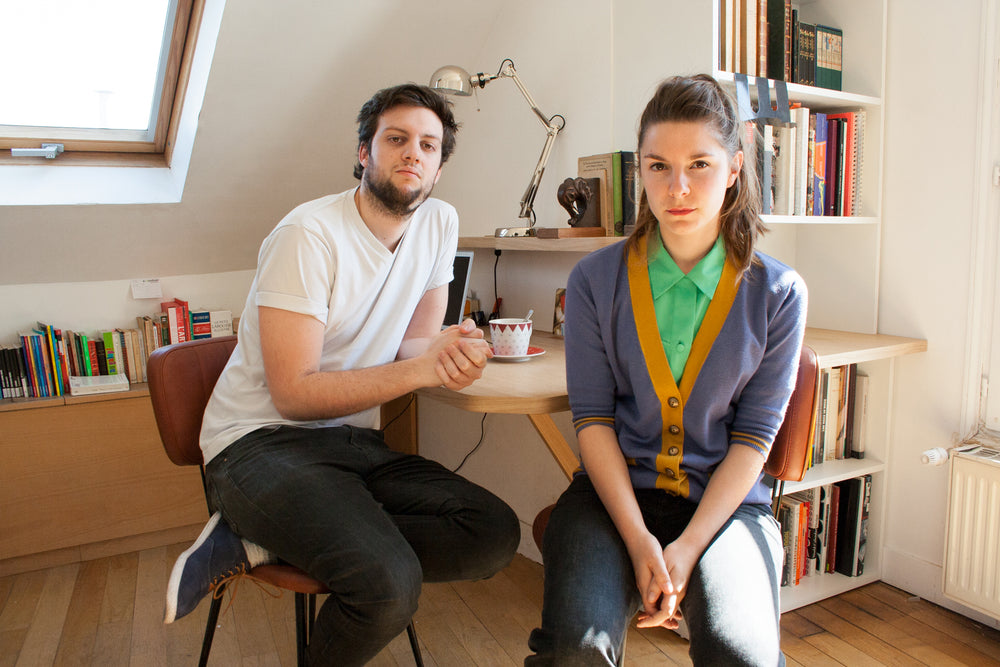
We’re at our studio in Paris’ 3rd district where we moved a few month ago. It’s a flat used as a studio, we are upstairs in a former bedroom with a small bathroom so we have a bath tub in the back. We share the place with two sisters, respectively a graphic designer and a theatre director.

What can you see from the window?
Depends on the window, we have three here. We can see:
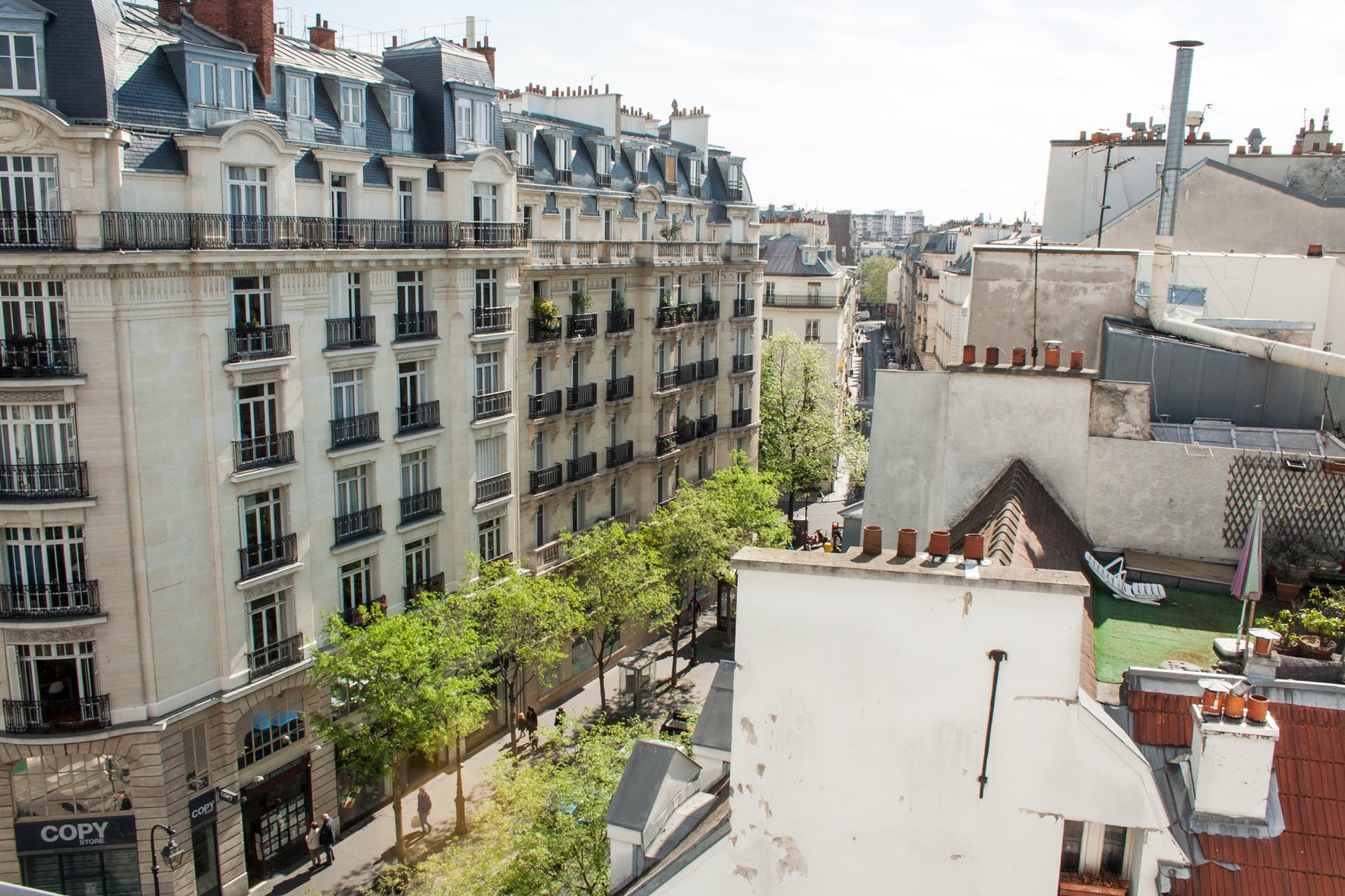
— Rue de Bretagne/Rue Debelleyme, a very vivid neighbourhood in the very heart of Paris, invaded by bohemian-bourgeois, hipsters, fashion addicts, pale vegans, and graphic designers…
— Roof tops (one is furnished with a deckchair, an umbrella and fake grass) because we work in kind of an attic on the 5th floor of a typical Parisian building.
— What’s very useful is that we can see the copy printer across the street and if it’s too crowded or not when we need some proof copies.
Are you morning or evening people?
Colin: I have often problems waking up in the morning because I’m out almost every night, but I prefer to work in the morning… so I’d like to see myself as a morning person.
Morgane: When I was a student I worked during the night very often. Now I’m with a morning boyfriend so I had to adapt myself.

What’s your favourite magazine this morning?
Colin: I’m not really into magazines. If so I’d read Fait & Documents, which is more a bimonthly letter about french politics. In terms of design I recently discovered Garment which is quite good looking for a fashion magazine.
Morgane: I’m a big fan of the Rane section of IL Magazine (above), and more widely all the work of Francesco Franchi. We discovered Rane after creating The Shelf Journal, but when I saw it I found it quite close of what I like and what we do in terms of design : It’s blackish, playful and it use figurative elements to structure the editorial contents and data. I felt a bit jealous, I’d like to have done it myself.
We both like the crazyness and freedom of Herself. We were very interested by its art direction and their way to mix fashion photos with drawings or collages is quite unusual. Alla Carta is a very cool magazine too.
Otherwise The Shelf is kind of a platform were you can pick some of the magazine we liked and gratefully display, mono.kultur, The Weekender or The National Grid are good examples too.

The Shelf Journal has a unique design aesthetic. Describe it for us.
This aesthetic come from two main influences. First we both come from typeface design. Typography, its aesthetic, the strength of black ink on paper is a constant in our taste and in our philosophy. Also, as graphic designers, books were a great influence in our thinking about design, as finished object, with a start and an end, books are the first industrial product of western civilisation and they are the example of objects which are always the same but all different.

There are two pragmatic reasons that drove the layout of The Shelf where it is. The fact that French and English texts are always next to each other and the question about showing a book in a book. These two design problems are the core of the layout. They have been solved in a way some would say clever, others would say quirky… we often describe this work as functional-ornamentalism. We like to think ornaments as structural parts of the layout, not only as decoration.

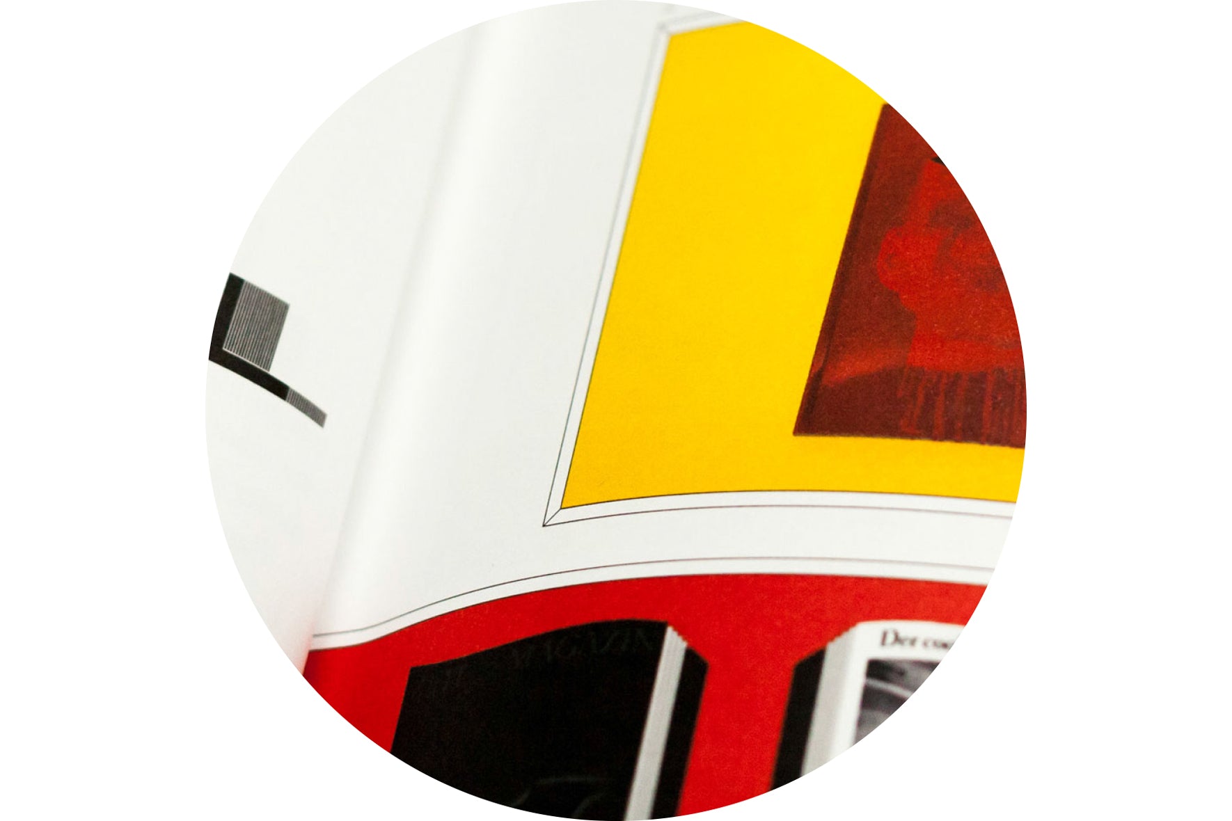
For instance, showing a books in the Journal involved three type of photographs: frontal spread or cover shot, frontal single page shot, and close-up. In the first case, the photograph is put on a shelf (above), in the second case (below) it’s hold by a “newspaper holding-clip”…

…and finally in the third case we put the photograph in a frame (below).
What drove us to make it this way is that help giving books their materiality back, and confer some space to pages. We like to design spreads as a room where it would be pleasant to live and books like houses it would be fun to walk into.

Each section of the Journal was also the occasion to draw so esoteric vignettes which evoke their different state of mind. What can be felt in our aesthetic is a will for mixing what’s good in tradition with what’s interesting in post-modernism.
Many parts of Europe are experiencing a boom in independent magazines, but France seems to be an exception. Why do you think that is?
France is not really into magazine culture. This is more of an Anglo Saxon culture. But we have a real tradition of literary and poetry reviews here even though it’s not really appealing, not the way magazines can be. Gruppen is a counter-example and is quite cool though.
Maybe it have to do with the economic context of France. Also, French magazines are mainly made for French people, this seems not to be always the case for Swedish, German or Italian independent magazines we believe. On another hand things are moving in France though. We recently took part in a conference where we met three interesting exemples of what is independent periodical publishing in the country now. There was Roven, The Drawer, and Collection which is French-English and is quite worth a look.

In the field of graphic design, Back Cover is now a well known review, clever, well made and internationally spread. Perhaps one of the best graphic design “think tank review” in the world, and totally independent too.
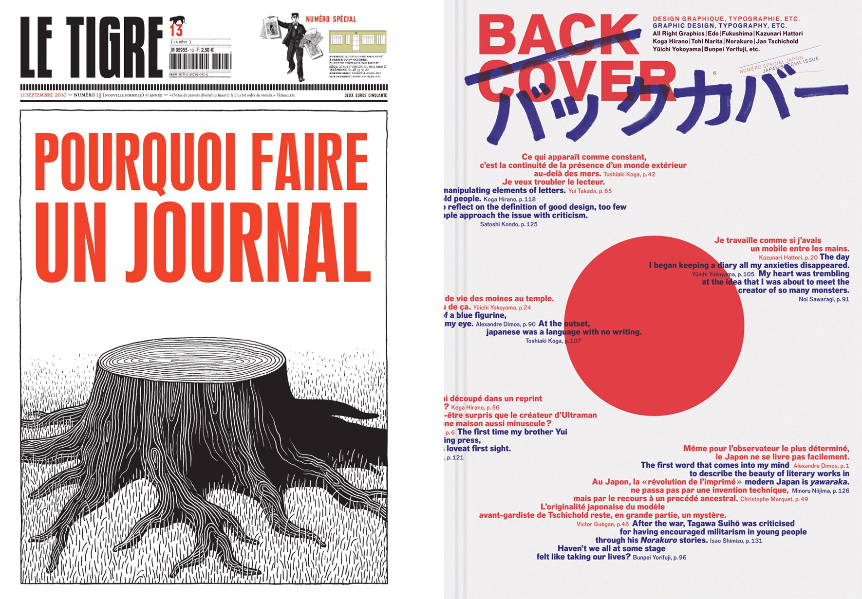
Dealing with proper magazines, there are some good stuff like Le Tigre, Monster, Desports (really interesting and well designed), Figure, or So Foot (which may not be independent but a bit off the grid, lot of fun, and very popular here).
Each of your front covers shows a set of shelves progressively filling up with books, issue by issue. Tell us about these books.
Each book on the cover represent a book mentioned in the issue, plus the ones from past issues. Working on the art direction of the Journal, we wanted to build it as a book collection, in the two meanings it has. Also, having an evolving design on covers allow us to play with papers and edges colors, this is also what gives The Shelf’s identity and we think we succeeded because each issue is intriguing to people, and it’s fun to see our reader discovering the idea behind the design step by step. The only element of design free from our art direction constraints is the fake binding which is changing for each issue.
What are you doing when you’re not making The Shelf Journal?
We run a graphic and type design studio. Clients mainly come to us for art direction, editorial design and book design consulting. The Shelf is very ‘paper-centred’, but it is just a side of our taste in design. What we really like to do is managing content no matter what is the application. We also make data visualisation, identities, webdesign, etc. Right now we are involved in the conception of a big online library for contemporary art in the Parisian region, a pilot for a scientific magazine promoting a French university consortium and an the catalogue of an exposition who takes place in an old shut down train station.
We are also designing an alphabet poster mixing fashion items with wild animals for the promotion of our company. We like to take time making some personal stuff because it’s a lot of enjoyment and this freedom of tone attract clients that like our work and share the same enthusiasm.
What are you most looking forward to this week?
Morgane: A ‘go’ from a client who want a whole typeface family and a book collection design. And purchases from magCulture’s readers.
Colin: PSG beating Chelsea at Stamford Bridge.
What are you least looking forward to this week?
Morgane: A ‘no’ from this client who want a whole typeface family and a book collection design.
Colin: PSG defeated by Chelsea at Stamford Bridge.
What will you be doing after this chat?
Morgane: Yesterday I went to Normandy get some copies of issue 3 from our stockage unit (my parents beautiful house) there. We are now preparing deliveries for Parisian bookshops which didn’t get their copies of The Shelf #3 yet. This afternoon we’ll be around dispatching our magazine.