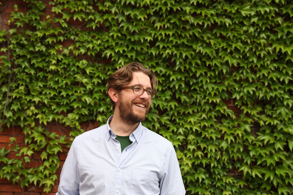
At Work With: Thomas Alberty, New York

New York is a rare example of a magazine that has successfully spanned several decades to remain as vital, if not more vital, then ever. From its early days with Milton Glaser as design director, it has boasted a who’s who of US editorial design at its helm. We look ahead at the new week with current design director Thomas Alberty just after his team’s Magazine of the Year win at this years SPD Awards.

Where are you today?
In my office at New York magazine, on the edge of SoHo, in New York City, island of Manhattan.
What can you see from the window?
There's an empty lot across the street from our office. It will be a building or something but for now it's like a temporary park. Last summer there were food trucks there, so i hope they come back again. The empty space allows for a clear view of all the traffic on Canal Street. Our building is next to the Holland Tunnel (which connects New York to New Jersey), so there’s always a comforting din of traffic.
Are you a morning or evening person?
I'm more of an evening person. I'll work late on covers once things quiet down. I wish I was a morning person, it's probably more efficient. I’m barely functional without an iced coffee (black, no sugar).


What’s your favourite magazine this morning?
So many magazines to choose from. Today I saw the latest issue of Bloomberg Pursuits, it’s fantastic. With summer coming, I’m digging surf magazines right now. Saturdays is a beautiful, book-sized annual made by the guys behind the Saturdays surf shop. And what designer can't love IL?
And what’s your favourite other city?
Austin, Texas. Austin, Texas. It’s got a fun design community, and you can score some great vintage swag. Plus there's great music, bars, barbecue, and breakfast tacos.


New York magazine is an institution, a key visual reference point for a great city. How has it retained this role over the years?
It’s not really a secret: Adam Moss, the editor in chief. More than any editor I've worked with, he understands the idea of graphic design as the editorial visual language that packages and organizes the product. The fact that the visuals are as appreciated as the words inspires me and my team and photo director Jody Quon and her team to push ourselves to do good work.
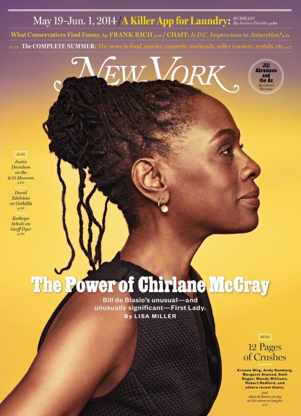
Plus, I think our readers, who are mostly New Yorkers, have a certain affection for the magazine; it's a magazine they read and use. The magazine has always been a little scrappy, with a palpable love for the city and urban living (see vintage covers, above). It started as the weekly supplement to the New York Herald Tribune. When the newspaper folded in the 60s, editor Clay Felker and design director Milton Glazer bought the rights and made it a weekly newsstand magazine to compete with the New Yorker. If you look at covers from the 70s, they're just fantastic: they've got attitude. And we still have that spirit. We we have serious journalism, we have serious service coverage, but we've got a little edge, too. I think readers appreciate our range.

The magazine recently changed from being published weekly to fortnightly. How has this affected the design of the magazine?
The editorial process was affected more than the design process - we’ve been a weekly for so long the editors had to rethink the magazine’s coverage. We wanted to add more per issue but at the same time we didn’t want to change what wasn’t broken (the Approval Matrix wasn’t going anywhere).

We now have four feature articles, up from three., and we’re making a conscious effort to make the feature well feel more unified. We added a six-page fashion section called The Cut, based on our fashion website of the same name. We rejigged the Intelligencer section, which had been very newsy, to have our columnists and to feature photo projects such as a Life in Pictures. In the Strategist section, we redesigned the Best Bets page to be jam-packed with bits of information (it’s my favorite page in the magazine).

Lastly the cover: we tweaked the cover format - we made the dates of the issue more prominent, during our prototyping and discussing we thought we should just own the idea of being bi-weekly.

Even a fortnightly is a fast, repetitive pace. Where do you go/look to keep inspired?
The city itself keeps the energy going. Just walk around and look: art galleries to museums to the architecture of neighborhoods to graffiti murals to a really nice hand painted deli sign. The visual food is everywhere. In terms of magazine design, we’re very aware of our history. The magazine was born in the late sixties and took off in the seventies, so that era is a source of inspiration. There's a lot of Herb Lubalin, Pushpin, and Willy Fleckhaus on our mood boards. So much wit and punch.
What one place should a visitor visit to experience the real New York City?
Ride the subway.
What are you most looking forward to this week?
Later this afternoon we're going on a quick art field trip to AIGA to see the Century of Type exhibit. One advantage of the biweekly schedule is we can afford a long lunch break once in a while.
What are you least looking forward to this week?
Memorial Day weekend. Three days away from the magazine is too long!
What will you be doing after this chat?
Meeting with Jody Quon and Adam to look at the cover shoot for the next issue.
Portrait by Jola Bielat


