

Bad Day #19
It’s amazing how a simple Q&A interview can be so different depending on which magazine it’s in. In The Great Discontent, interviews are wide in scope and all encompassing; they’re accompanied by personable photography and the large format of the publication matches the open and up-close interview style. A Q&A in mono.kultur will often be long and thoughtful, with design tailored to the speaker. An interview in Bad Day, however, will always be laid-back and cool, sprawling and conversational so that it feels like you’re the one sitting in, say, Harmony Korine or Sofia Coppola’s living room, having a cup of coffee and a chat.
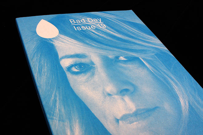
Founded in Toronto, Bad Day is often hailed in the local newspapers as Canada’s most internationally known independent magazine. It started as a zine and has grown steadily since, and it now has offices in New York and an editorial team made up of more than just the two co-founders. The ‘hanging-out’ tone deeply engrained in Bad Day’s philosophy hasn’t changed since its zine days: it’s still reflected in the publication’s easy and accessible bookish size, as well as its simple two-tone colouring (the two colours change issue to issue).

 Editor Eva Michon, designer Colin Bergh and publisher Jackie Linton first started printing in two colours to cut costs, but even as their subjects have gotten bigger and better known, they’ve kept to the format. There’s something refreshing about reading an interview with a TV star or cult-hero in a small, two-tone booklet: it’s almost like the magazine is capturing a different side of an interviewee, one that’s more at ease. Designer Colin told Canada’s The Globe and Mail: ‘I describe the design as neutral. I’m influenced by everything I look at, but it’s not nostalgic. It’s almost default.’ This approach makes the spreads all the more laid-back.
In the cream and turquoise issue 19, Bad Day chat with their cover-star Kim Gordon, with Rookie founder Tavi Gevinson, with photographer Mark Borthwick, and with filmmaking brothers Josh and Ben Safdie. The clean, spacious margins are peppered with colloquial quotes (also above), and sapphire blue portraits that stand out cooly from the off-white background (also below).

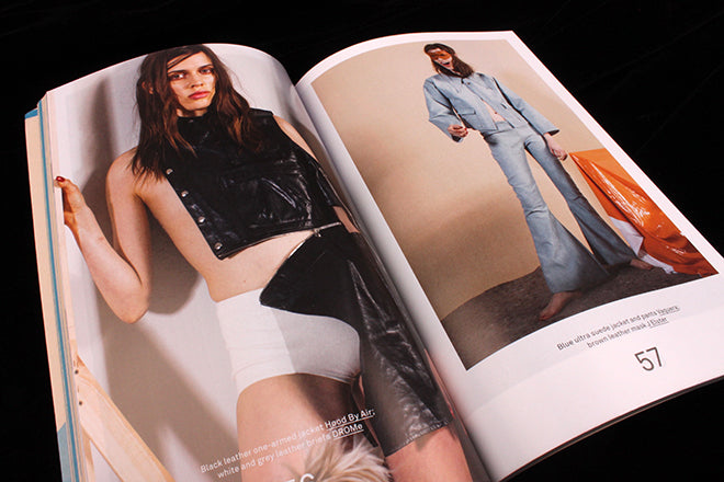 Towards the centre, a full colour, glossy fashion shoot departs from the two-tone spreads, but the Bad Day aesthetic is still visible in the slightly hazy photography and in the relaxed look of the models (above). These colourful spreads are a recent addition to the magazine, and they’re very effective: they create a break from the otherwise interview-based features.
Bad Day has a simple recipe that they follow unwaveringly from issue to issue, whether they’re speaking with an unknown local Toronto band or an actress from Orange is the New Black. Their aesthetic is also simple and actually very black and white, or rather green and yellow, or red and pink, or purple and blue…