

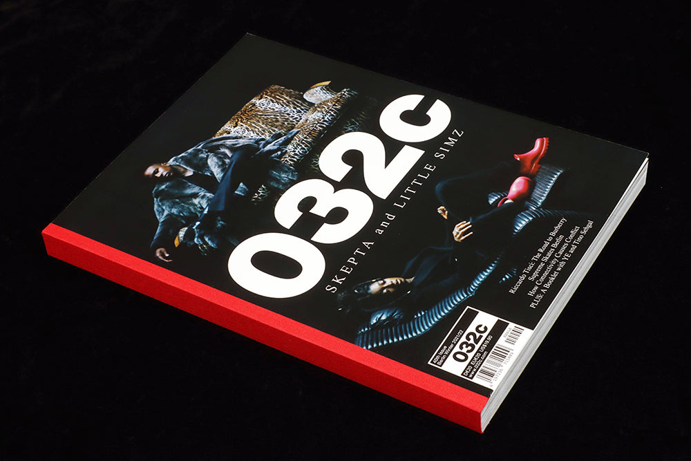
032c #40
Plenty of magazines map the intersections of the art-fashion-culture-music-design landscape, but 032c does it better than most from its Berlin base. It’s also always been of interest for its layout design.
An essay about how connectivity causes conflict (a must-read right now)? A look at how the humble puffa jacket has become a status item? A fashion shoot starring Cate Blanchett? 032c can switch comfortably between them all.
It’s been through quite a few design iterations since its 2011 launch; some, like it’s mid-noughties ‘new ugly’ stage, very powerful and forthright. How are its pages looking today?

In this 40th edition, the page design is clean and calm, almost anonymous. Recent issues have been packed with imagery at the expense of words, full bleed photography coming to the fore instead of typographic fireworks.

Such calmness also comes from the editorial structure—there is little sense of running order, just full pages of text and of image. Frankly, there is little to design, just a run of pages with a consistency of approach rather than a defined set of type styles and grid systems (‘Theory is there to be fucked with’, as Blanchett says in her biog).

The exception to this is the opening part of the issue, which exists as a self-contained editorial section with a dedicated design system—shown in the images in this post. Titled ‘Société de 032c’, theses designs caught my eye for their bold, contrasting colours and simple photographic identity.

As these pictures show, ‘Société de 032c’ is a collection of brief interviews. It opens unannounced, but quickly explains itself; each subject is photographed reading a copy of 032c, their name, five-word bio and a quote presented using Helvetica in various oppositions of colour. Simple but effective.

It’s a lovely expression of community—these are the people who read this magazine. The portraits are all very different, but the design ties them together as a section, establishes a shared identity, and sets a solid start for the rest of the pages in the issue to work against.

Editor-in-chief/Creative director: Joerg Koch
Art director: Mike Mieré