

Amalgam #3
There are many reasons why Amalgam, the intriguing typography and language publication from Chicago, deserves attention: it has a strong sense of purpose, the writing is intelligent and surprising, and it always looks great.
But for this post I want to highlight the parameters its editor/designer Pouya Ahmadi has set himself. Commissioning a broad range of articles examining the intersection of typography, language and visual art and then designing it yourself might easily lead to an over-worked and indulgent end-product. By drastically reducing his options, Pouya avoids that to produce an ideal balance of text and design.

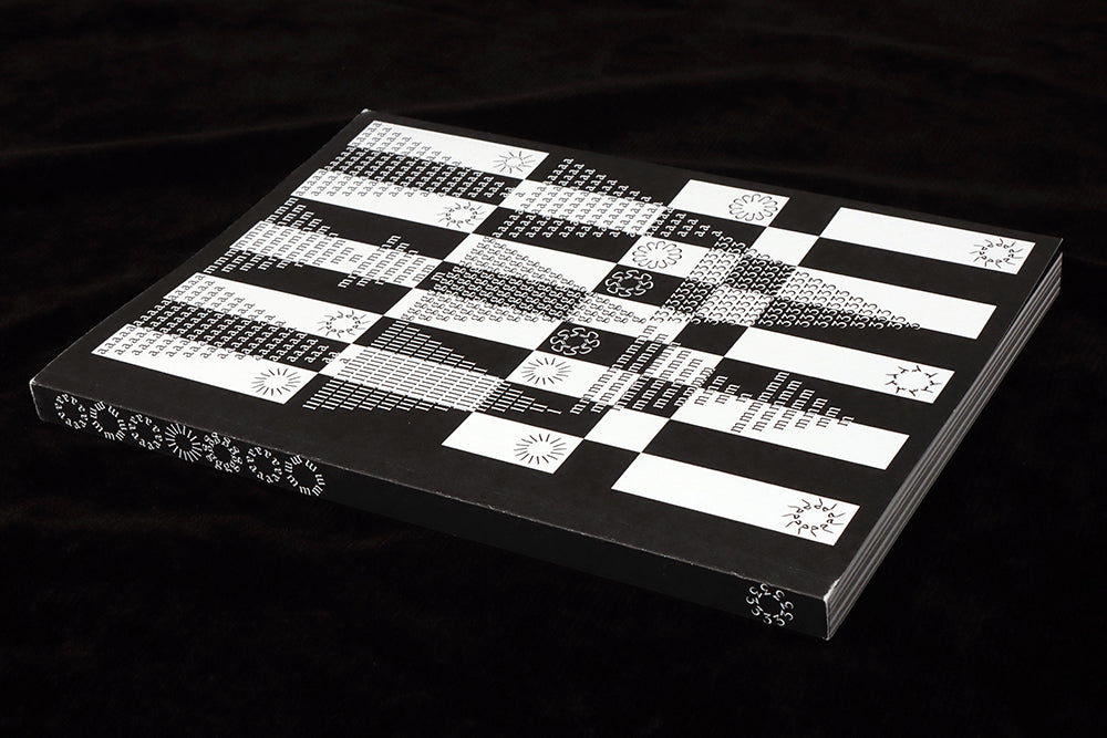
The primary reduction is the decision to print the entire issue using only black. And credit here to the printers (Kopa) for successfully delivering a solid black across large areas of the pages—a rarer achievement than you might think (above). Their rich, smooth black sits perfectly on the bright white paper stock. This is real black and white, almost iPhone screen-like in its stark clarity.

This denial of colour is emphasised by the lack of tints—everything (bar the occasional image) is printed in solid black or left blank white, there are no percentage tints. This means Pouya has to use other design elements to bring variation and pace across the pages, as hinted at on the cover (detail, above).

Inside, individual essays and reports switch between white and black backgrounds and use different text sizes. These changes provide the variation that might usually be provided by any number of options—the options for change are limited to the typography, as befits the subject matter.


Texts switch size freely from story to story, never less than about 12 point but often larger, filling the pages and with drop-in images as needed. The typefaces themselves vary but are from a selection of similar modern serifs by Italian designer Franziska Weitgruber.
Scattered through the pages are a series of page-height capitals that spell out and visually define the issue theme one letter at a time across the issue: TACIT LANGUAGE (T, A, I, above). This also adds an element of decoration—a vital bit of character built from the content rather than inserted as an additional effect.

Another decorative technique takes a similarly direct approach; words run across each other, their colour inverting as the two parts cross (above, below). This flies in the face of convention—it shouldn’t work, shouldn’t be done—but is used just enought to feel deliberate and convincing. And yes, these pages are more legible than you expect, almost sucking better attention from the reader due to the effort required to read.

The whole issue is a brilliant piece of editorial design, the self-imposed limitations proving exactly why they’re needed.
The reading is strong too, of course—what point great design if the texts aren’t great too? Within Amalgam’s 94 pages you can read an analysis of the word ‘Enter’; a history of the grid that extends back to the Mesopotamian origins of writing; Franziska Weitgruber discusses the devlopment of her career and fonts; a piece about teenage girls and tumblr reminds us that everyone is a designer in the age of social media.
Amalgam is one of those small independents that deliver on every level, living up to its name by combining challenging content with challenging design.