

Buffalo Zine #4
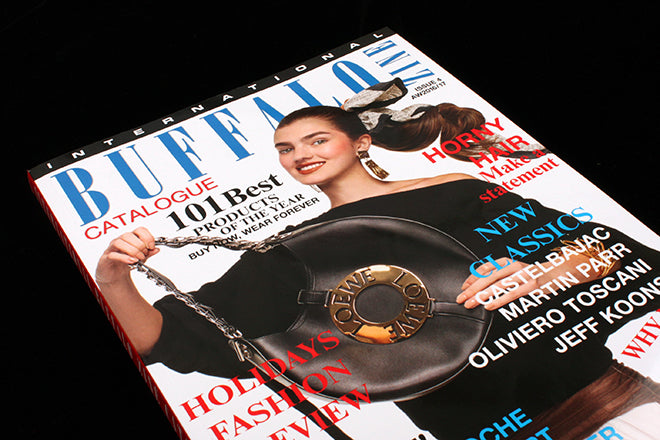
The latest issue of Buffalo Zine comes in the form of a shopping catalogue. ‘International Buffalo Zine Catalogue’ chimes with a number of publications received recently, from Mushpit (the new issue of which is imminent) to Sofa. It shares with these mags a love of a throwaway visual vernacular: clumsily mixed system fonts, random display typefaces, cheesy photoshop techniques and oversaturated colours add up to a visual cacophony quite contrary to ‘good’ design.
Buffalo Zine is a shapeshifter, every issue is different (originally a meta-newspaper about a magazine, then a grunge zine, then a Victorian children’s novel) and as ever, they haven’t just adopted a new format for the sake of it. The magazine is shifting from annual to biannual, and the editors have reflected their new concern for the business side of things with a close up look at advertising, selling and buying, and by extension, desire. The glossy catalogue is the natural visual format for these themes.
Perhaps even more intriguingly the team have again extended the playfulness beyond the look and feel of the issue. Inside you’ll find plenty of advertising, some of which is real and much of which isn’t. As co-founder David Uzquiza explained to me, ‘Part of the magic is that it’s kind of confusing which of the ads are real and which are not.’ The result is truly disconcerting, as pastiches by artists Kalen Hollomon and Victor Burgin sit alongside genuine advertising. At one level this can be read as a critique of the increasng volume of ‘content marketing’ to be found magazines. At another level it’s just fun.
The content between the ads is equally unorthodox for a ‘catalogue’. Essays about materialism and America’s leftist decade mix it with a piece about Princess Gloria shopping with Jeff Koons and an interview with Benneton/Colors controversialist Oliviera Toscani. Plus plenty of fashion, with shoots ruthlessly mimicking catalogue styling and fake products mising with real ones. A number of the spreads have QR codes which will eventually link to online sales of the products, and according to David, ‘everything will be available to buy from our website, the problem is the site isn’t finished yet… But we’re working on it…’ This includes a range of designs by Christopher Shannon, featured in a screen-grabbed porno shoot.
To knowingly create ‘bad’ design is an art to itself – just ask Mike Mieré and Tim Giesen of 032c – but Buffalo makes it seem effortless. The issue is full of paradoxes — there’s some very serious content lurking in the absurd layouts — and some great humour. I especially enjoyed Daniel Terna’s jewellry shoot based on showroom displays cleared for the night.
Creative direction and art direction: Adrian Gonzalez-Cohen and David Uzquiza