

Chutney #3
The new issue of Chutney has successfully managed the shift from low print-run production to a more efficient, longer run without jeopardising its unique character. It’s done so with such ease that we’re excited to present it as our Magazine of the Month for March.
Originally from Toronto, Chutney transferred to London with its founder Osman Bari in late 2021. We sold a few copies of the risograph-printed second issue, and could have sold many more if available. As well as its delicate riso aesthetic, Chutney was editorially sophisticated and smartly designed.
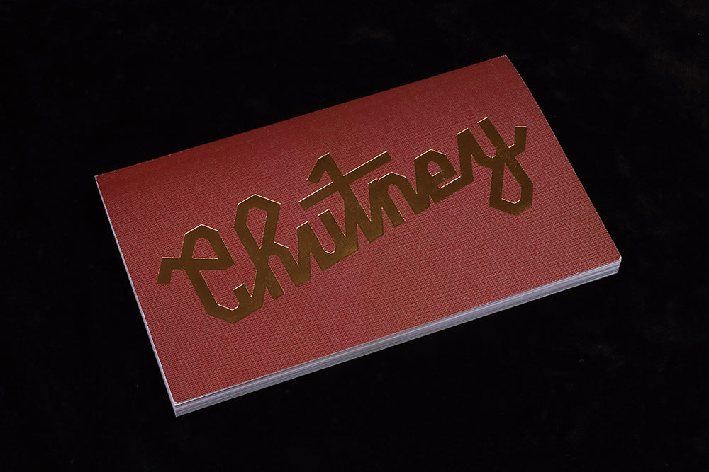
It was clear that Bari had a distinctive eye for visual storytelling—despite no formal design training—and that his magazine had a unique sense of timelessness, at once contemporary and vintage. It was also highly magazine-y, relishing its physical being, using 11 risograph colours and featuring a textured, red, thermographic logo on the cover.
The name references a traditional Urdu retort, ‘Don’t make chutney with my brain,’ and each issue is split into three sections, an editorial recipe based on the stages of chutney production—Chop, Mix and Preserve. These elements refer to Bari’s heritage, and hint at the focus for his magazine: personal stories reflecting on ‘history, cultural exchange and the legacies of others’, as he notes in his introduction to the issue.
The success of that second issue encouraged Bari to print more of issue three, and after much research and soul-searching he opted to move to offset printing. But was it possible to retain the tactile quality and specific look and feel of risograph printing?

The cover immediately soothes any doubts, the logo shiny in bright gold foil on a soft textured paper printed deep brown (above). The combination of foil and texture, and the simplicity of the design, are all strengths that are familiar from previous issues. If it doesn’t feel hand made, it does encourage touch and emphasises the tactile nature of print. In short, he’s turned what could have been a negative into a positive. It’s a step forward, an advance on previous issues.

That deep brown features throughout the issue, along with a risograph-adjacent colour palette. The colours don’t mimic riso, but they are sympathetic and several illustrations feel like riso. The use of rough stroke rules (above) hints at the coarser print process too, as do the full pages of flat colour tints and overlaid elements.
If it’s tempting to flick through the small, neat pages checking out the many design elements and pleasing layouts, but at some point the reader has to stop and dig deeper. And there’s some great content here, gathered from an international mix of contributors.

The Chop section opens with a profile by Samuel Tafreshi of musician Eric Arconte (above). It’s a personal tale of discovery, leading the writer from an obscure B-side of an Iranian funk record through years of obscure musicianship in West Africa, France and the Caribbean to Arconte’s 1980 solo album, all the time influences being shared and received. The first spread of the story sets the visual tone for the issue: vivid, overlaid, riso-like colours and subtle typography.

Mix includes a beautifully conceived visual poem, ‘Everything goes into one stomach’ written and illustrated by German-Nigerian artist Sandy Christ (above and below). International foods are introduced to each other as if guests at a party, alongside riso-looking illustrations of the foods. It’s a simple and effective way to again highlight the two-way cultural influences of our world, and also a nice change of pace from the longer written pieces in the issue.


The highlight of the third section, Preserve, is the final piece in the issue (above). Marwan Kaabour recalls his infatuation, from the age six, with iconic Egyptian TV star Sherihan. As host of ‘Fawazeer’, an annual season of shows that ran for the 30 days of Ramadan each year, she danced and sang through the nineties, and the young Kaabour joined in her every move before any notion of being queer formed.
This issue of Chutney is one of those magazines that delivers on all levels. The content is clever and compelling, the design is smart and satisfyingly (and appropriately) timeless, and the production and manufacture spot on. It makes a great argument for print, and a perfect addition to our series of Magazines of the Month.
See Chutney founder Osman Bari in conversation with Jeremy Leslie, for magCulture Meets Chutney, recorded 9 March 2023.
Watch video here