

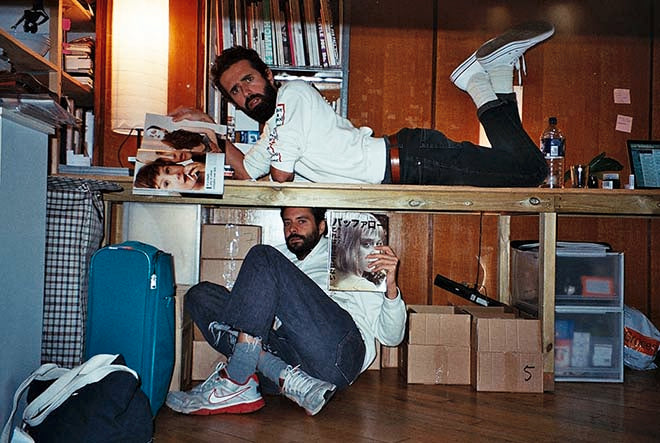
David and Adrian, Buffalo Zine
After a short break we return to our Monday morning At Work With interviews.
David Uzquiza and Adrian González-Cohen are the creative directors behind the wonderful Buffalo Zine magazines. Each of the four issues to date have taken a different form; the latest, featured in detail on the Journal recently, is an eighties-style shopping catalogue. Whatever form their magazine takes, David and Adrian always work with the best fashion creatives and call upon and impressive contacts book to add intelligent and relevant writing too. The resulting magazines are always special.
How was your weekend?
A: Nice! Our friend and collaborator Andrea Lazarov came from Madrid and we went to a fireworks party on friday, Saturday we went to Donna Huanca show and had dinner at Feng Sheng Princess boat restaurant and today we spent the day at the Spaniards Inn in Hampstead Heath, drinking mulled wine by the fire.
D: Lots of fireworks and mulled wine. Baby, it’s cold outside.
Tell us about your journey to work.
A: When I wake up I need a lot of time to start my engine at home. I walk around like a dizzy duck. I bike (dangerously) to the office through London Fields and Haggerston Park. Its a very nice route. I dont have coffee, i usually have tea and bread with oil and honey, at the office. Theres a beautiful light.
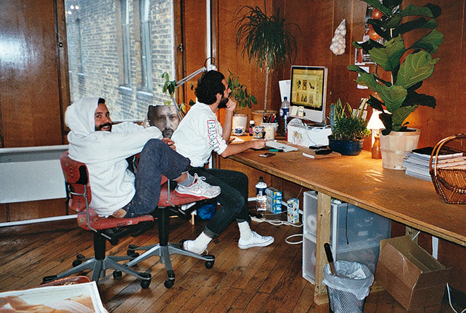
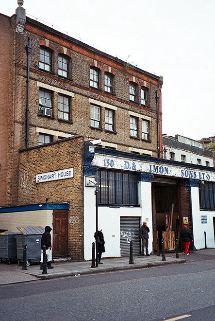
D: My journey to work is a 2 minute walk, as I live very close from our office. We are on the top floor of DJ Simons, a picture framing family business that has been going for like one hundred years, on the Shoreditch end of Hackney Road. The billboards change, new apartment towers and wine bars keep popping up, but the yard opposite our building looks like the Second World War just ended. We have a cozy office that we share with some very nice people. It has a great view of the City skyscrapers, specially at sunset. Sometimes we spend very long days and night in here, but to me it almost feels like home.


Describe the state of your desk.
A: My desk is quite minimal, surprisingly. I have a laptop, a small pile of mags and papers and some pens that i like and David hates because they make this noise he cant stand. Also vitamins and bio crap.
D: “Things-to-do” lists galore.

Which magazine do you first remember?
A: SuperPop, which was like the Spanish Smash Hits. It was amazing. Stickers, all this reader’s letters, this “my first time” section and so on.
D: I loved Super Pop too, that my sister bought, because of the amazing freebie stickers. El País Semanal (weekend supplement to El País) is the first one I remember reading. As a teenager I was obsessed with Colors.

Which magazine matters to you the most right now?
A: There are many magazines i like, but theres not a special one. World of Interiors I guess.
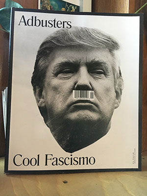
D: I’ve been reading Adbusters (probably the only magazine I always buy without looking inside – probably because every issue is pretty much the same!?) and Fantastic Man. Life is schizophrenic sometimes.


Buffalo changes format every issue – which has been your personal favourite?
A: I’m sorry, but I’m like a rock star with this: always the next one, or the last one if you insist. We only have four so far, anyway: the newspaper, the proper zine, the hardcover tales book and the catalogue issue.


D: Im very fond of the first issue (above) because there’s nothing like the first time and because it was like a trompe-l'œil of a magazine. Some spreads were photographs of a newspaper within a newspaper, with the contents floating out of the pages.


The new issue successfully adopts the look and feel of a glossy catalogue. Was it difficult to achieve that?
A: Photography wise, all was about sense of humor. All of the photographers have this, a certain humor, joy, playfulness. Or just a strong sense of irony.


D: I looked at lots of 70s and 80s advertising for design reference. Made me feel that most advertising looks so hideous now, compared to then.

Pick a spread from the new Buffalo and tell us what it says about the issue.
A: There are so many. But i always like when i see it the opening spread of the Kessels and Landy interview (above). I love that they are handling cans of Pepsi and Coke, and James Robjant's picture is perfect. Love the parking lot, Tesco in the background, they look so sharp.. And I love Kessels headline in the opposite page: “I hate advertising, really. I’ve done it for 20 years, but i really hate it every day”. Its simply smart, strong and sexy, like we wanted the issue to be.
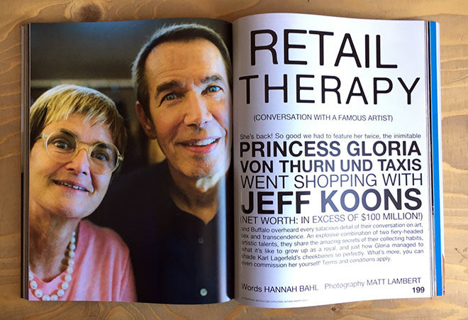
D: The opening of the conversation between Jeff Koons and Princess Gloria von Turn und Taxis (above). I think everything clicks. The title, the slightly absurd intro, their portrait with that strange celestial light, his perennial smile and her candid expression. Princess Gloria’s contribution as guest editor was crucial to this issue, in fact I would have hardly believed that this conversation was actually ever going to happen.
What are you finding most frustrating about your work this week?
A: Its actually in general: having to wait for other people to reply. Its so time consuming. Hate people that doesnt reply to emails.
D: Adrian not replying to my emails.
What's going to be the highlight of the week for you?
A: Im going to see Genesis O Porridge at Cafe Otto on Tuesday.
D: Im going with my boyfriend to his hometown, Leeds, he’s taking me to see a band that he loves of which I know almost nothing about, and I have not even heard a single song of them: Psychic TV. It could go very well or…
What will you be doing after this chat?
A: We need to sort out the theme of the upcoming issue URGENTLY.
D: I need to find a design intern to help with the new issue in the coming months. If interested please send your portfolio: hi@buffalozine.com