Dirty Furniture #5
Three years after issue four landed, Dirty Furniture has made a sudden return, redesigned to a new smaller format.
If you enjoyed the previous issues, you’re going to love this one; it retains the same level of research and intelligent but accessible writing, but now the design matches the content.
A quick recap: each issue of the magazine takes a close look at a single piece of furniture. Following Couch, Table, Toilet and Closet, we now have Phone. It’s intriguing to find this ubiquitous device presented as ‘furniture’, and it’s a measure, perhaps, of the time that has passed since the previous issue of the mag that it was first billed as the Telephone issue; that longer word is disappearing today, I guess.
I want to focus on Page 23 here, though. As magazines have adapted to the presence of the internet, the traditional opening sections of short newsy articles have become an irrelevance in terms of content—such material is better suited to the web. Yet those pages had another role beyond the stories themselves.
The opening sections of magazines set the tone for the longer features that followed, offering quick bites of content that not only helped define the scope of the publication, but allowed a little experimentation and testing of said scope. The brief snippets of content also helped the reader ease into the pages, providing a quick-flick fast read before settling into the longer reads.
Dirty Furniture has always opened with a series of shorter articles collected together in the Anecdotes section. This provides the same function as the traditional newsy openers; in issue five we have 11 pages with seven mini-essays offering different angles on the Phone.
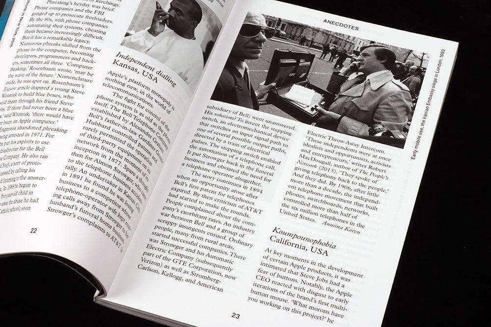
Page 23 sits towards the end of the section and contains parts of two stories. First, the late 1800’s monopoly of the Bell Telephone Company in the US is compared with that of Apple today. This is followed by an analysis of Koumpounophobis—the fear of buttons—in relation to an anecdote about Steve Jobs. Both offer vital scene-setting for the features that follow.
The Anecdotes section also contains a series of drop-in images. These are unrelated to the texts they accompany, but represent key moments in the normalisation of the mobile phone. Page 23 features a news reporter using a briefcase-sized phone in 1980, while opposite a hand-sized contemporary phone is shown being used by Kanye West. The simple contrast bewteen the two pictures provides as much context as the written essays.
Editors: Anna Bates & Elizabeth Glickfield
Design and art direction: Studio Mathias Clottu


