

Erotic Review #1
£20.00
First launched in 1995, Erotic Review had been dormant for several years before this month’s relaunch. We spoke to designer Frith Kerr about the bespoke type her studio developed for this latest iteration of the magazine.
Over the magazine’s 30 or so years the magazine has reflected very different approaches to sex and desire, mapping changes in both the publishing industry and society in general. The new magazine slips comfortably into today’s world of indie mags, promising a more cultural approach to desire; ‘a platform for exploring desire as a lens on our common humanity,’ as relaunch editor Lucy Roeber says in her opening note, alongside the new tagline, ‘Exploring desire.’
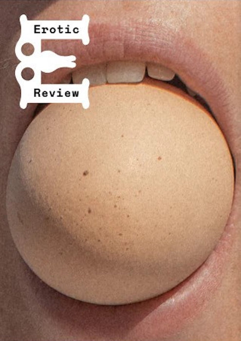
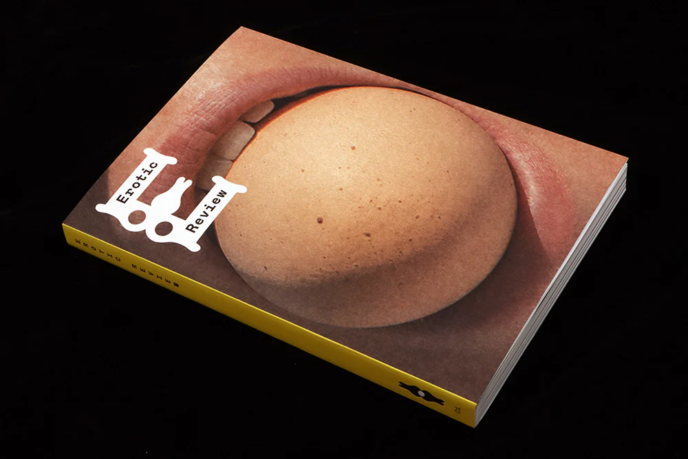
A key partner in this was London designer Frith Kerr, whose team developed an alphabet for the new magazine. Rather than a typeface for text, the new characters add an illustrative element that helps brand the publication while also expressing its subject.
‘As soon as I met Lucy and discussed what she wanted to do it was an easy decision to get involved,’ Frith told me, ‘All culture is shaped by desire. So, exploring desire as designers was of course interesting.’ Often when relaunching a magazine, a first step is to look back at previous versions of it. Did she? ‘Not in the slightest.’ Instead the magazine looks defiantly forward, as if its earlier versions never existed.


The lead character is the ‘E’ for Erotic, which appears on the front cover and on the opening page of the issue, where the central stroke of the letter first appears small but appears aroused behind the cover flap (it’s worth checking the website for a neatly animated version). Elsewhere the letterforms are used as abstract, solid shapes and as outlined headlines and drop capitals. The result imposes a shared branding on pages that are otherwise quite varied in tone—stories jump from art to poetry and fiction to comicstrip.

As well as making visual references to physical desire and arousal, they are there to create visual desire. ‘Making something desirable in Design is fundamental—not just a beautiful perfume bottle or packaging, but in wayfinding—the desire to be seen: a book jacket, the desire to be opened. Graphic design is an invitation, to say come here, look, touch, feel, read and experience.’

The characters were developed in-house. ‘The body goes through a physical change during arousal. How can the fluidity of desire be rendered? We developed a logotype and characters that can exchange: layers and edges that rub up against, soft and hard, that open and close, that envelop. We called the typeface “Give and Take,” an erotic truth—a typeface is physical, it’s when an idea (desire) becomes present (carnal).’

‘They were an integral part of our concept development for the project, sketching and exploring ideas, as they often are on other projects. Once the client has selected that approach, we evolve and refine them and create the full alphabet.’
Did she worry about the balance between gender references? ‘We didn’t worry about gender or sexuality; we are all the same and unique. We thought like plants.’
I really like the way these bespoke letterforms create a visual identity across the 184 pages of this first issue; there are just enough of them to impose order, and are a vital element of the magazine, alluding to its subject in an intelligent manner that helps position the magazine as the contemporary journal of desire it wants to be.
Buy your copy from the magCulture Shop