

Fantastic Man #37
The latest iteration of Fantastic Man has just landed, not just a new issue but a completely different magazine. What to make of this latest reinvention of one of the original indie mags?
Last time we saw the magazine it was a large, square format, and glossy. Seven issues appeared in that shape before the team excused themselves for an issue, returning this season in a more traditional upright format. Creative director Jop van Bennekom describes the change as ‘subtle and indeed drastic at the same time.’
 The three phases of Fantastic Man: issue one, the square issue 30, and the latest issue 37.
I liked the square format from a creative point of view; I’ve always loved square pages, I find them more interesting to design than the more common portrait format. But the choice was a brave one. As I quoted the editors in a post at the time, ‘It occupies the unique space that magazines hold within media TODAY…It is an EXPERIMENT’. That experiment extended beyond its shape. Themed issues were introduced, and highly varied themes at that: Greece, Hair, Rem Koolhaas…
The fresh format was initially a creative freedom, but reinventing the magazine from scratch every issue eventually became a restriction of its own. That was the message I got when I visited the the FM team at their Amsterdam offices earlier this year. It was time to change things up again.
The final square issue inspired the latest change of direction. A menswear special, I reviewed it as our Magazine of the Month this time last year. ‘The magazine has always been fashion-adjacent,’ I wrote, ‘but it’s never seemed right to add it to the fashion shelf here at our Shop. Fashion has been just one part of its agenda—until now. This is their first menswear special, its pages packed with models and clothes.’
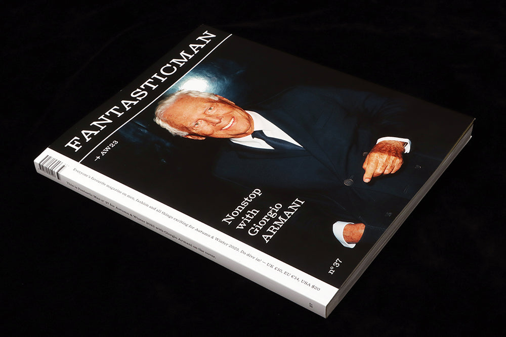
Which brings us to the reinvented 37th issue. A strong tilt towards fashion moves Fantastic Man (or Fantasticman, as the new logo has it) back to a more clearly stated position: ‘Everybody’s favourite magazine on men, fashion and all things excting…’ as the cover puts it. As well as numbering the issue, the date is rendered in fashion style too on the cover–AW23.

Many elements inside refer to the original version of the magazine. A lighter, matt paper runs throughout and designwise everything is far simpler than both previous designs, using just a single typeface—Diplomat, an as yet unreleased serif by Laurenz Brunner. ‘It’s quite amazing how that new typeface makes the whole thing feel very editorial again,’ Jop told me, ‘That wasn’t per se my intention, but no one is doing that at the moment, making an editorial magazine in the fashion and style arena.’ Overall, it’s a cleaner aesthetic that nudges it towards its sibling The Gentlewoman.

There are of course a few trademark design quirks: I love the little arrow glyph that’s used for emphasis (above), and the way the page folios are pared back to page numbers only, except on the opening spreads of new features. It’s also worth considering the ‘Fantasticman’ formulation of the name as a reference to ‘Gentlewoman’. And why not? The two are brother and sister.
Ultimately the two magazines are very different, not least in terms of the quantity of fashion in Fantastic Man. It now definitely belongs on the fashion shelf, despite a few features that look beyond the subject: an interview with musician serpentwithfeet, an opening selection of 15 fantastic works of art by various writers and curators for instance.

The centrepiece of the issue is a vast Giorgio Armani interview, and another interview introduces the man behind the system for quantifying the effect of advertising spend in the fashion press. Fascinating stuff.

Then there are the fashion shoots: there simply aren’t that many magazines specialising in men’s fashion, and these are far more witty and fun than most. Men walking the streets without trousers? Tick. Curious beard stylings? Tick. An overview of Prada’s latest menswear? Tick. Dior’s lates? Tick. And why not celebrate the humble iron with surreally creased meanswear (above)?
I hesitate to call the previous iteration of Fantastic Man a failure; it was an experiment that led the team to a new version. And who wants more safe repetitive formats? It’s to Jop van Bennekom’s and Gert Jonkers’ credit that they keep stretching and testing their publication. But any magazine is more than its latest issue—a magazine is a series and its identity is built on that episodic format. A magazine is the sum of a series of issues. If those issues are too different, what do they add up to?
I’m fascinated to see what happens with the next issue of Fantastic Man. A razor-sharp editorial vision is at play in the new issue, but has a template now been set? Which menswear designer will feature next on the cover? Or is there a more flexible plan afoot? Issue by issue it will triangulate its identity. Where will they take us? I for one am excited to continue the journey. .’
Editor-in-chief Gert Jonkers
Creative director Jop van Bennekom