

Gossamer #8
Our latest Page 23 is a reminder how a magazine can celebrate the physical nature of its production.
New York’s Gossamer is one of a wave of magazines launched around the US’s gradual relaxation of cannabis laws. ‘We tell stories that channel the mindset of someone having their best high,’ is how they describe their mission online.
Always a vividly bright, happy piece of editorial design, Gossamer has recently been adding tactile effects. ‘We always want to take advantage of the magazine as a physical object—it’s why we print a magazine in the first place,’ the magazine’s co-founder Verena von Pfetten explained to me. Their last cover had a gorgeous soft-feel finish that would have been very satisfying to anyone slightly stoned.
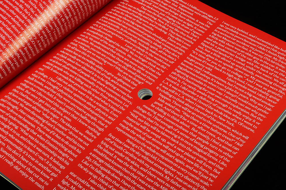
For issue eight, just released, they’ve drilled a 13mm hole straight through the centre of the issue. This affects the layout of every page, and Page 23 is no exception.
‘The idea of creating a magazine with a hole in it felt fitting for the theme—Space—and like an exciting creative prompt both internally and for our visual and written commissions. Every piece in the issue relates to the hole in some way, whether from a physical perspective—through the layout or the art—or a thematic one, via the topic.’

Page 23 is the third page of a feature about black holes by astrophysicist Janna Levin, and the presence of the drill hole is simply dealt with. The two columns of text need just a slight bit of of diversion to wrap themselves around the hole in their midst (above). With this simple design, the hole is the star of the page; elsewhere in the issue it aligns with parts of photographs, or in the case of the crossword, actually becomes a part of the page design in an extremely satisfying way.
Co-creative director Kristina Bartosova adds, ‘We wanted to embrace the idea of negative space—quite literally—and to use the hole as a sort of center of gravity for the contents of the magazine’ Page 23 illustrates this point nicely.
I suggested to Verena that the team had been influenced by late nineties mag Nest, which used similar effects, but she hadn’t seen that magazine, ‘None of us were familiar with Nest’s holes, but we’re happy to be in accidental conversation with them.’
Editorial directors Verena von Pfetten and David Weiner
Creative directors Verena Michelitsch and Kristina Bartosova