

MacGuffin #13, The Letter
£23.00
As soon as I saw the latest issue of long-time favourite MacGuffin I knew it was a possible Magazine of the Month. The only thing holding me back was that I’ve written about it so often. Was there anything new to say?
Taking a copy home for Christmas soon persuaded me there was plenty to say. I read the issue cover to cover and throughly enjoyed the entire Thing.
In case you’ve overlooked the first 12 issues of MacGuffin, a quick explanation: every issue its 200+ pages zoom in on a single thing—the magazine is subtitled ‘The Life of Things’– to explore our world. Issues have addressed The Bed, The Window, The Ball and The Log, each Thing a starting point for a broader investigation that has included sociology, politics, science, design, archeology and history to name just a few of the disciplines the magazine has utilised. It’s a brilliant concept; a seemingly tight niche quickly opens up to surprise and thrill the reader. Others have been inspired to make magazines using a tight niche to open up the broader world, but none has matched MacGuffin in overall quality.
This latest issue, number 13, looks at The Letter. Slightly ambiguous, perhaps—I could imagine MacGuffin addressing the world of postal communications—but no, this is our (generally) friendly Thing that makes up alphabets and helps we humans communicate. As a designer, The Letter is immediately appealing, but the magazine really takes its subject by the horns (serifs?) and pulls together a brilliant set of stories that will appeal beyond the design world.

The issue works to the usual MacGuffin structure, four distinct, numbered Parts plus the always enticing Appendix. Part 1, Lost Letters, looks back at the origins of The Letter from various angles, the opening piece about early scripts from across human civilisation setting the scene for a more discursive journey through letters. We learn about Joseph Churchward, one of whose typeface designs has played a key part in MacGuffin’s visual identity since issue one (above). Political campaigns, concrete poetry, the Interrobang and the negative impacts of autocorrect all follow, before a fascinating history of Scrabble closes the section.

Part 2, Bold Faces, shifts attention to what people do with letters. Here we learn about the feminist printshops of seventies Britain (above), the use of human hands, and even the body, to construct letters, the changing perceptions of graffiti, and the typography of protest.

Part 3, New Type, looks at how new forms of communication via symbols comes about. Uta Eisenreich’s visual system using photographs of objects is immediately aesthetically pleasing (above), even as it falls on the more difficult side of comprehension.

A series of weather icons for a dystopian future (above) betray our assumptions about future technology, assumptions perhaps related to Jasmine Erkan’s brilliant essay about internet memes and their relationship with language, culture and meaning. A more pragmatic new form of type and language is represented by Sinistrial Hand, a writing system for left-handed people (below).

This direction is followed further in Kitty Drake’s essay about made-up languages, new systems created for all sets of reasons, from TV’s need for narrative detail (Star Trek’s Klingon) to the desire to capture the nuances of the female experience (a feminist language called Laadan). Meanwhile another project seeks to deconstruct gendered languages by developing hybrid characters.

There is so much more filtered through the issue. Kirsten Algera and Sandra Kassenaar talk with Dutch design hero Karel Martens about his love-hate relationship with the alphabet (above); there’s a look at typographic record covers (below); and then there’s that front cover.

I already mentioned this issue of MacGuffin and its cover in our round-up of 2023, describing the bright yellow cover as my favourite MacGuffin moment to date. For this is the curious thing about MacGuffin: it has always been difficult to pull out a single story or single page design and hero it. This is a rare thing in a magazine so carefully put together, but not a bad thing. Indeed, I think this quality is part of what makes MacGuffin so special. Every page looks like MacGuffin—the design is always impeccable—yet is subservient to the whole. You experience the whole thing or nothing.

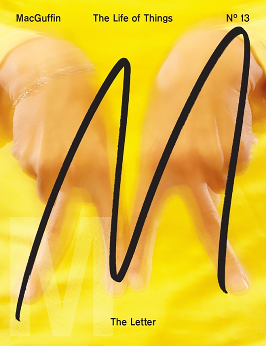
The exception is the MacGuffin cover and its design structure (what better part of a magazine to be the hero image?). Here, the hand drawn ‘M’ is the star of the thing. Stack all 13 magazines alongside one another and they make a fabulous series, the ‘M’ and full bleed photographs combining beautifully. And with issue 13 the cover has reached perfection, the ’M’ on the cover more to the fore than usual, being a letter, and backed up by an image of a pair of hands mimicking that letter, the interaction between the two reminding us that letters are only symbols.
MacGuffin remains an essential magazine, an ideal riposte to anyone doubting the power of print. As well as being editorially brilliant, it is also, itself, a beautiful Thing. Its size, format and combination of papers making it a lovely object to hold and to flick through.
Editors Kirsten Algera and Ernst van der Hoeven
Design Sandra Kassenaar
magCulture Club level two members will be receiving their copy of our Magaizne of the Month this week. Find out more.
On the Podcast:
Kirsten and Ernst discuss MacGuffin issue 12, The Log
Buy your copy from the magCulture Shop