

Magazine of the week
Magazine of the week 11: Mark

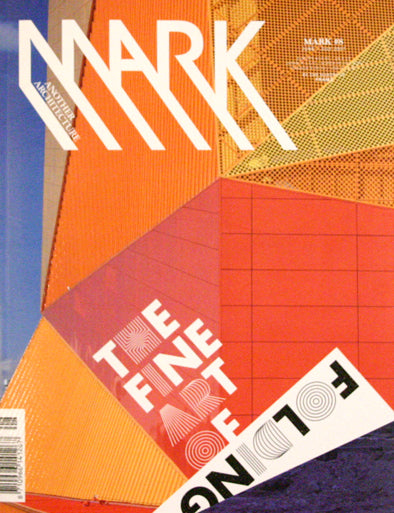
Dutch architecture magazine Mark has some great typographic touches in it's latest issue, designed by Lesley Moore. The mix of straight Futura Bold and adaptations of the font characters works well visually, and the careful choice of which letters use the adapted version of the font is intelligent. Note how the same three characters – C, A, E – are highlighted here:

…and only T, F and E here:


The issue has really strong section openers featuring bold graphic treatments using orange and combinations of ruled patterns that borrow shapes and silhouettes from the content of the section:


