

magTravels: U Symposium, Singapore

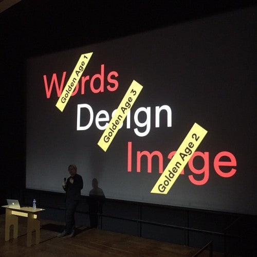
I’ve been involved in plenty of conferences about magazines and wherever I travel, whoever I meet, never fail to learn something new. But traveling to Asia was something very special; I had no idea what to expect of the first U Symposium in Singapore last week, and my few pre-conceived expectations were instantly replaced by very specific ideas and experiences. Here are some of them. (and I’m preparing notes based on my opening talk, above, for Printed Pages, will link to that when available).
The global love of and hunger for print
Any event about independent magazines is, of course, a magnet for those interested in the subject, but I can still get caught out by the passion they evoke. Such passion is naturally strong in a country with a long history of print – Germany for instance – but to find it today in Singapore was very exciting. Most of the 200+ audience were local, but others came from Malaysia, Indonesia, The Philipines and Australia and their knowledge of contemporary magazines was remarkable.

Talking to people at the Symposium and during my design workshop was a global conversation. I could have had the same exchanges about individual magazines, trends and themes with people in London or New York. Make no mistake, the love of print and an understanding of its position in the context of digital is a global phenomenon. The internet has opened up this shared knowledge, and it’s built on young people excited about this traditional medium.

Penny Martin and The Gentlewoman
I have long been a huge admirer of Penny and her magazine, but had not seen her deliver a solo presentation about The Gentlewoman until last week. It was no surprise to find her at ease sharing an overview of the magazine in the form of a series of FAQs, encompassing the initial launch, design and editorial strategies and crystal clear thinking that has produced such a shining example of contemporary editorial direction. Comfortable discussing design and content, Penny shared some of art director Veronica Ditting’s early design concepts for the magazine and references, including a much earlier magazine called The Gentlewoman (above); these covers were accompanied by incorrect renditions of the magazine’s name such The Gentle Woman, a completely different meaning. She was equally strong in the group discussion later in the day, and it is worth noting the number of young woman who queued for a word an autograph later. Penny is not only a powerful personification of her magazine but a role model for a generation many assume are digital-only. Her remark about her desire to ‘return magazines to their proper position,’ is worth noting too.
Never underestimate a magazine
Kinfolk had previously left me rather cold. Not because it isn’t beautifully art directed, designed and produced, but because all of that beauty can be a bit repetitive; perhaps I prefer a little more roughness. But meeting founder Nathan Williams and then interviewing him on stage helped me understand the project better, as did speaking to the many devotees of his magazine attending the Symposium. I got to appreciate the scale of what he and his team do – Nathan was the one speaker who attracted a longer queue of fans than Penny – and realised that for huge numbers of people, the vision of US rural life projected via his pages is a rare and special luxury. Outdoor living and open space, traditional craft and the time to practice it, are a genuine alternative to day-to-day life in the heat and humidity of Asia. And Kinfolk is more than simply a magazine – last year they organised over 250 dinners/workshop across the world, up to ten different locations a night.
Something that became clear during our live discussion was that Nathan feels he’s only recently worked out what his magazine should be; he came to publishing without any previous experience (he studied economics) and concentrated first on process and efficiency – an example being his development of bookshop sales rather than the regular newsstand sales. Such innovation is worthy of Offscreen and Works That Work. I had the sense that the success he found was a surprise; but with a recent redesign and new focus on slow living it’s definitely a magazine to watch.
The Third Man
Before live interviewing Nathan I reprised my interview with Jop van Bennekom, co-founder of Fantastic Man. This was the third time I’ve done this, it’s always enjoyable for me, and I hope it didn’t come across as a repeat. His company also publishes The Gentlewoman, The Happy Reader and COS magazine, a series of magazines that position their small team at the forefront of intelligent, commercial publishing. Which makes him sound like a senior executive figure, whereas he remains very hands on and involved in all projects. What he and creative partner Gert Jonkers have achieved is remarkable, given that their ‘own’ titles FM and GW remain so independently minded while being hugely successful. A highlight for me was hearing that Jop studied under Dutch designer Karel Martens; this further emphasised the balance of style and substance inherent in their magazines. Jop also revealed new design and editorial directions for the about-to-land new issue of FM. I was the only person in the auditorium not to see the work projected behind me as we chatted, but I look forward to the issue.
Personal v commercial
The three Singapore-based magazines in the programme were personal highlights of the weekend. I’d only ever seen Werk Work in the context of D&AD judging, a situation where little is explained about the item you’re picking up and flicking through. It was always interesting, but difficult to comprehend. Theseus Chan presented his magazine well, bringing it to life and in the process clarifying an apparent local delineation between commercial work and personal work. In London the two extremes of creative endeavour increasingly meet or even cross over, whereas in Singapore (and by extension, Asia?) personal work is more about autership, created in opposition to and as an alternative to your paid creative work. Of course the two inform each other, but a magazine like Werk Work beautifully crafted with many hand made aspects, is quite abstract. Each issue has a different theme, and every decision about the design, appearance and production method adjusts accordingly. As soon as you understand this it becomes clearer, and the name Work becomes quite ironic. Making Werk Work is hard but enjoyable work, but it has no job other than to challenge and intrigue..

True stories
The second local publication was presented by its entire creative team – father Pann, mother Claire and their two pre-teen children Renn and Aira (above), known as HolyCrap via a complex anagram-like assimilation of all their names. Rubbish Famzine was another unknown quantity that quickly came into focus as a beautifully conceived personal project about the family and their group relationship. Pann heads his own creative agency, so it’s no surprise that the small print-run zine – or famzine as they like it – looks great. Die cuts, print effects and hand finishing (often carried out by the whole family at home) mean it’s a beautifully crafted piece, but what makes its special is the way family life is brought to life in its pages. What could easily be a sickeningly sugar-coated and irritating example of over sharing comes to life in a series of cameos and insights into this intelligently self-aware family. Launched following dad’s brief heart scare to create a record of their lives together, the magazine pulls no punches. The children write poetry and draw pictures for the zine, and read and present their parts live on stage. The interplay between parents and kids is charming, and there is a good mix of light and serious.

Sadly the first two issues are sold out and the third issue – conceived as a time capsule, delivered inside an old metal lantern (above, seen at Books Actually)– was too large to carry home.

The world of U
We recently featured the latest issue of Singapore title Underscore here as magazine of the week; we’ve reviewed previous issues too, it’s a lovely publication. The guys behind the mag, Jerry Goh and Justin Long, were also the organisers of the symposium, and I was aware they’d set up smaller magazine events in Singapore previously. Justin talked us through Underscore, his calm demeanour perfectly reflecting the character of the magazine. He also explained the broader U brand (U for Underscore), including those earlier events U Factory and U Cafe. Justin and Jerry are strong advocates for independent magazines and provide a vital voice in Singapore; a magazine event the scale of U Symposium has never taken place in the city.

Live your magazine
All the speakers could be said to live their magazine; but in such a food-orientated city as Singapore it was perhaps inevitable that Lucky Peach editor Chris Ying would prove the best example. He gave his all for food, one morning enjoying four breakfasts in various parts of the city before arriving at the venue. Like LP art director Walter Green, who spoke at QVED in Munich recently, Chris is a larger-than-life character who explained well his magazine’s role as an alternative to the mainstream food press.

I can only imagine the experience of working alongside Chris and Walter – much laughter I expect. Both share a sense of humour summed up by the above slide. We all ate well during the visit but I have little doubt Chris and his wife Jamie ate best.

Magazine craft
I’ve written here before about my appreciation of The Gourmand and its rapid rise as a prime example of a new type of publication, positioned neatly between indie and mainstream (this was the core of my presentation opening the Symposium). It was great to hear co-founder David Lane show off the project and discuss the attention to detail paid to every part of the editing, design and production process.

In his self-effacing but assured presentation David did the most of all the speakers to explain the process behind magazine-making, discussing shoots, typography (including their own cuts of Monotype faces, above) and the patience required to get great results. What also shone through was the enjoyment of the process; he and partner Marina Tweed often produce events based on Gourmand stories and the live dog fashion show they produced based on their recent Hot Dog shoot typifies the length they’ll take things.

Magazines are hard
Rob Alderson also majored on process, starting his talk quoting Offscreen’s Kai Brach tweet, ‘Magazines are hard,’ and proceeding to describe the history of It’s Nice That’s magazine programme, from it’s early days as It’s Nice That magazine through to its relaunch as Printed Pages. The team learned as they went, starting with a ‘best of the website’ approach before developing a more distinct editorial approach reflecting the It’s Nice That’s championing of creativity. Particularly interesting was the way design was integral to the development of the project, with tough self criticism of the later stages of the first iteration of the magazine. Rob used the process behind the latest front cover image to explain the ups and downs of creative magazine work.
Magazine as brand
I stayed on after the Symposium primarily to catch up with my sister who lives in the city, but also visited a few magazine-related places including the recently opened Monocle shop. Discreetly located in the relatively quiet Holland Village area, the shop is a little bit of London’s Marylebone transferred east. I thought I had an appreciation of how strong the Monocle brand was, but it was fascinating to see it expressed in this context. It is immediately recognisable to anyone who’s visited their London HQ, the same branded items displayed on Vitsoe 606 shelves alongside Japanese-style wooden screens and freshly ground Allpress coffee. Above the shop is the local Monocle bureau, covering local stories for the magazine and radio service, and contributing, amongst other things, a report on the U Symposium for The Stack.
Huge thanks to Juston and Jerry at Undersocre for inviting me to help with the event and for looking after all the speakers so well during the visit. The only question hanging over the two-days of talks is will we do it again?
Other local highlights
Basheer Graphic Books, run by Nasser who started out selling secondhand books by bicycle. He now presides over a cavern of design books, in a mall full of different book stores. Nasser’s shopfront is marked by an impressive range of international independent magazines, while inside you’ll find speciality books such as Unit Editions’ latest.

Books Actually (above) is a bookshop specialising in international art and literature, and also stocks local indie magazines including the third issue of Rubbish Famzine, and a strong selection of international indies. It would grace any city but is a real asset for Singapore, plus it’s located in the beautiful art deco Tiong Bahru part of the city.