

Morgane Rebulard and Colin Caradec, art directors/editors
Each issue of The Shelf Journal features an illustration of a bookshelf on the cover. This makes a lot of sense seeing as it’s a magazine all about books and paper, and I always enjoy how with every subsequent issue, the cover’s shelf gets rearranged slightly or becomes a little bit fuller.
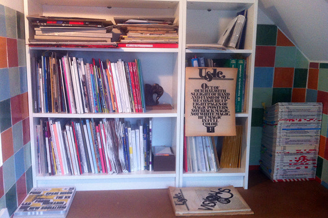
As editors Morgane Rebulard and Colin Caradec obviously care a lot about collections of printed paraphernalia, we decided to take a peek at their own magazine shelf for this week’s instalment of Issues.

We asked them to select three magazines for us: a new issue, an old issue, and a detail that has particularly caught their eye.

A New Issue: Reliefs
Since we have our own magazine all about book and editorial design, we don’t feel the need to buy books or magazines anymore. Instead, we now discover books and magazine through other people and the articles they submit. The fact we’re publishing stories about magazines almost makes us feel like we own them, in a way.

The newest thing we have at the studio is the newly released second issue of a magazine we art directed and designed. It’s called Reliefs, and it’s a French quarterly that deals with science, literature and geography, and the places where these topics intersect. It’s published by Panorama 5, and this one’s theme is ‘Tropics’.

An old issue: Plethora Magazine
We recently discovered Plethora Magazine at the OFR bookshop in Paris. It’s a biannual magazine from Copenhagen and it’s tagline – ‘culture in vivid excess’ – is the best way to describe it.
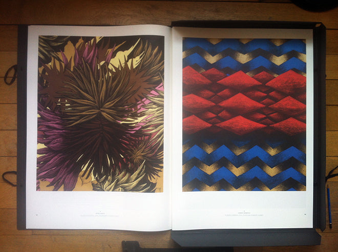
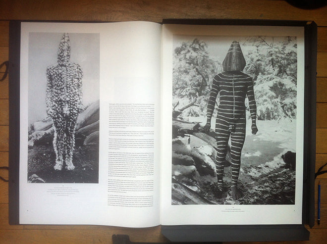
We bought issue one, which is almost sold out now, simply because we had to have it at the office. It is the most beautiful, striking magazine we’ve ever seen, which might have something to do with its gigantic format (27.6 x 19.7 inches). Everything about Plethora is beautiful: its subjects, pictures, design, print – nothing has been forgotten or left behind. It has a very contemplative feel to it and it’s a great source of inspiration.
The experimental nature of the magazine made such an impression on us, even though buying it cost a small fortune!

And another thing: Der Druckspiegel
There is a collection of magazine that we acquired by chance… the story is quite funny.

Five years ago, we were buying some old typography and print reviews on eBay (things like Signature and Fine Print). One of the sellers sent us a whole box of Der Druckspiegel with our order, a collection of issues from the 1950s… all for free.

The magazine itself wasn’t of interest to us because it’s in German, but we really like their covers. We often get them out from the shelf for colour reference or general inspiration. The colours are intense and deep despite their age, and some of the designs have a real vintage charm to them, which is to our taste.