

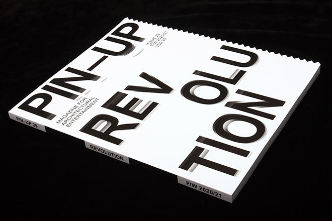
Pin-Up #29 die-cut cover
The latest issue of architecture magazine Pin-Up has arrived, sporting a new look and an impressively sharp right hand edge.
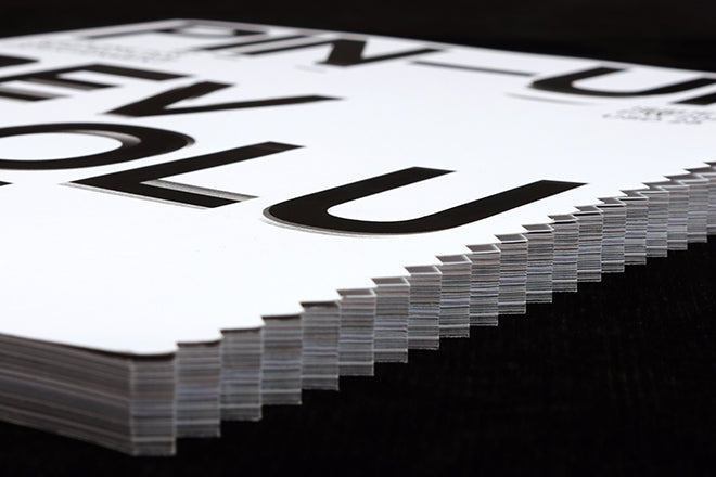
The serrated edge, which runs along all the pages, is one part homage to Nest (listen to our Podcast #21 for more) and one part reaction to today’s world.
As editor/creative director Felix Burrichter explained to me, ‘The issue coincided with three things: it was the first to planned and executed entirely during the pandemic, it was the first one by our new design director Ben Ganz, and it was put together during a year of unprecedented turmoil and upheaval, especially here in the U.S – a true sense of revolution is in the air.’

The new look is not an extreme makeover, but for a magazine rooted in a single typeface, the system font Arial, the introduction of a slightly flawed, hand-traced bespoke version marks a change of pace; meanwhile the pointed, die-cut edge is genuinely sharp. ‘It’s quite aggressive to the touch, a complete departure from how a magazine usually feels; it’s prickly,’ says Burrichter.
‘We wanted to express this pivotal moment not only in the theme – Revolution – and content, but also physically. A zig zag physically represents the ups and downs of the current time, a bit like electrocardiography – the heartbeat of the moment.’
‘The zig zag also symbolizes a rip, just like there’s been a metaphorical rip cutting through the establishment, architecture included. Architecture is usually about the status quo, set in stone. So thematically, that’s where the issue is positioned: navigating the fissures of society and trying to understand where architecture and design fits in and what role does it play and have to play – from racial and social justice, technological novelties, new (and old) materials, climate change, etc.’
‘But Nest is never far from our minds either…’