

Pleasant Place
We recently received issues one and two of new Dutch magazine Pleasant Place and I was immediately smitten. Although small, it’s a beautiful example of editorial creativity and makes a perfect Magazine of the Month as the very slightest signs of Spring emerge.
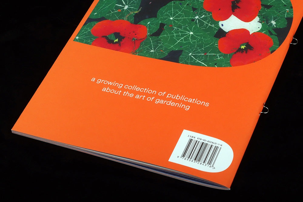
The magazine sums itself up neatly on the back cover: ‘A growing collection of publications about the art of gardening’. Each issue is dedicated to a single gardening topic, and is bound using loop staples to allow the series to be collected in a binder. Note that ‘growing’ pun—there is a satisfying synergy here between the making of the magazine and the gradual development of a garden.

The first two issues were launched at the same time to emphasise the scope of the project; issue one is themed ‘Enclosures’ and covers the creation of the dedicated garden space using walls, hedges and fences. A good place to start!
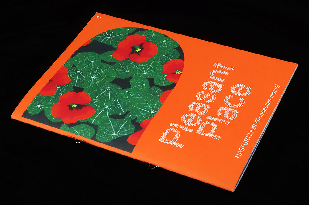
Issue two takes a single plant—the Nasturtium—and investigates its botanical, historical, artistic and nutritional roles. As publishers Floor, Guus and Lou-Lou explained to me, ‘Each issue could be different in content depending on what the topic needs, whether it’s recipes, tips ’n tricks, historical context etc’. This aligns it with other magazines that let a tight niche be the starter for a far broader series of stories (I’m thinking of fellow Dutch mag MacGuffin).

‘We’re always trying to find ways to look at gardening a little differently, or find people who do,’ say the publishers, ‘This is also why for all our imagery we work with artists, and try to depict gardens and gardening in visually exciting ways.’
This visual sense of identity is a central part of Pleasant Place. Gardening coverage can be very serious, and the subject is taken seriously here, but the team want to have fun too. ‘Together with design studio Fanfare we created a playful philosophy for the design. The way that the magazine looks can grow and change, just like a garden.’

It’s a playful, evolving design philosophy; each issue a different font made up of small elements is used for the cover masthead and headlines inside the issue. The familiar petal shape of the Nasturtium is used for issue two (above), and as well as making up letters the graphic elements are scattered through the pages, like seeds (below).

Another part of this philosophy is the use of Pantone inks to add extra colours. ‘We pick a different colour for each issue. It really makes that specific colour pop off the page, but also because we use it in different ways in text and imagery, it creates surprises, even for us. Just like in a garden.’

Colour, typography, illustration and photography are all intelligently used and combined, so that no single element overwhelms another. There’s a very singular graphic vision here that reflects the content in its careful balance of the serious and fun. I love the cover design, with its bold colour and image sat in a shape echoing the bowl of a letter ‘P’. It’s bold, but also simple and calm.

As well as the metal loops for binding, another clever tactile element is the centre spread, which is printed on a heavier stock to stiffen the whole issue. These pages are also the home of the regular ‘miniatures’, illustrated plants and gardening gear to be cut out and used to create your own tiny garden (above). A different artist is invited to create this every issue. These are by Hugo Rocci.

Pleasant Place is a delightful new publication that immediately appeals. It promises to develop like the best garden, and I can see it inspiring the garden-averse to investigate the activity. ‘We don’t claim to know everything about gardening,’ say Floor, Guus and Lou-Lou, ‘but we’re learning and doing at the same time, finding the right people to inform us, discovering things along the way.’
Editors-in-chief Guus Kaandorp, Floor Kortman and Lou-Lou van Staaveren
Design Miquel Hervas and César Rogers, Fanfare