


PPA Cover of the Century

On Monday night the PPA kicked off their 100th anniversary year with the launch of their Cover of the Century competition. In his welcome speech, CEO Barry McIlheney explained how hard it had been to whittle the selection down to a ten magazine shortlist, and headed off the inevitable criticism of the shortlist. Don’t worry if you’re magazine isn’t on the list, was the message, the overall selection shows how strong the industry was and is.
Then the gathered great and good of the UK magazine industry were ushered through to see the 10 anointed covers; the criticism began.
These are the best covers of the century?
It’s a crazy idea, of course. Ten front covers from 100 years of publishing? Such lists are always open to challenge and argument, but I can’t begin to imagine the number of covers available for selection here. Details of how the final decision was arrived at remain vague: PPA member companies were asked to submit front covers and an ‘industry panel’ sorted the final list. I couldn’t find anyone at the launch willing to own up to being on that panel; there were plenty wished they had been.
Anyhow… let’s have a look.

The earliest magazine included is this 1916 cover of Women’s Weekly, attributed to IPC Media as they now own the magazine. This is a great start – a mainstream weekly sharing not just its own history but the industry’s history. A single colour illustrated cover with delightful title typography, plus the one cover line, ‘Keep him worthy of his fathers sacrifice’. Another era in every sense (see the current edition here) and a good context for the others.
Publisher: IPC Media

We jump 25 years to the next cover – this second world war era (1941) Harper’s Bazaar. A curiosity, really, not only because I didn’t realise fashion monthlies continued to be published during the war, but because of the way it combines fashion and the war so explicitly in the artwork (which, incidentally, is by Heinrich Fritz Kohn, a German émigré using the English name Henrion). The graphic style is very much of its time, but I can’t help feeling there are similar but better covers out there.
Current publisher: Hearst Magazines.

The selection then leapfrogs the entire sixties, surely one of the most important eras of magazine publishing, to reach the third cover. This is a landmark – the 1972 launch issue of Cosmopolitan. With its trademark long-length model shot, simple, strong colour palette and blunt cover lines (‘How to turn a man on when he’s having problems in bed’, ‘Michael Parkinson talks about his vasectomy – the most beautiful thing a man can do for a woman’) this was a sea change in British publishing. A close up look at the type is entertaining – the Letraset characters are all over the place.
Current publisher: Hearst Magazines.

Thanksfully, one of Pearce Marchbank’s designs for Time Out is included, and this 1974 cover is typically strong and based on a typically contrary editorial line (anti-Churchill on his 100th anniversary). It’s better known as a listings magazine now, but for the first decade or so it was a very political read, and Marchbank’s covers reflected that. It’s almost impossible to reconcile the approach above with today’s free edition. Rumour has it the PPA wanted a less controversial TO cover, so the publishers are to be congratulated on sticking to their guns if that’s the case (though a shame they didn’t do so with their recent London Sex front cover). Marchbank was at the event, and it was a pleasure to meet him, although his view of current magazine design was a depressing one. I hope I persuaded him to look again.
Publisher: Time Out.

New Scientist has a fine history of illustrated covers, but I’m not sure this example from 1987 is its finest moment. Richard Parent’s illustration is strong but the magazine has always dealt in explanatory/concept covers – pro-science, if you like. This is unusually emotional, and that flash promising a ‘Free AIDS Poster’ is surely unique!
Publisher: Reed Business.
From here the selection falls apart as it panders to populism – not in terms of magazine sales, in terms of winning the competition vote. I could continue to describe the covers but this post would get really depressing. Here they are...
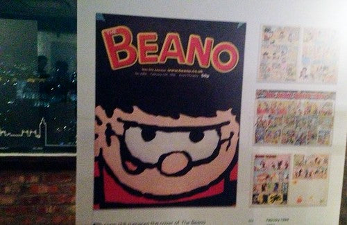
The Beano, 1999, DC Thompson

Vogue, 2001, Condé Nast

Radio Times, 2005, Immediate Media (ex-BBC)

Empire, 2005 (makes a Darth Vader breathing noise when you open it), Bauer Media
(apologies for the blurry shot).

MacUser, 2012, Dennis Publishing
There you have them – the best ten British covers according to the PPA.
It was obviously politically necessary to include all the big PPA member publishers, with only Time Out and MacUser being vaguely independent. Different entries seem to work to different criteria. Some – Women’s Weekly, Cosmo and Time Out – seem to genuinely want to reflect their part in publishing history and show a good understanding of that history and the way magazines reflect their times. Others seem to be appealing to the populist vote in a desire to win the competition, which misses the whole point of celebrating magazines. Are you voting for Dr Who or Radio Times? Star Wars or Empire? It’s the collection of ten that counts, not the single winner.
All lists exist to encourage discussion – it’s a classic editorial device. ‘What would YOU include?’ is the unspoken question. A good number of what I might have included are magazines that are no longer around: the original Man About Town, Liliput, Oz, The Face, Nova, Arena, City Limits all come to mind not only for strong covers but as important markers in magazine history. Ignoring the sixties altogether is ridiculous, while without The Face where would we be now? One of the few magazines to have crossed from publishing to a broader cultural position as part of the Design Museum collection, ignoring The Face is unforgiveable. But I guess ‘dead’ magazines send the wrong PR signal.
The Face founder/editor Nick Logan was at the launch and was deeply unimpressed, ‘It’s an uninspiring choice selected by a flawed methodology. Only publishers aligned to the PPA were asked to put forward covers, and why would they nominate defunct magazines? Hence no Arena, Smash Hits, Loaded, The Face. But also no Pop, Love, Dazed, i-D on long or short list. Nova, contrarily, was on the long list but inexplicably overlooked for the short list - that would have been my winner. But there must be hundreds of great covers that were never even in consideration because of the methodology employed.’
i-D is still around and it’s its covers that have carried it this far; Scott King-era Sleazenation would have shown a sense of humour; a Little White Lies would have livened things up. Back in the mainstream, Loaded is regarded with embarrassment now but in its heyday produced some great covers; I don’t particularly like The Week covers, but that magazine is a modern phenomenon, and Private Eye would add a uniquely British touch. Free magazines, customer magazines and newspaper supplements are all ignored, as are independents (not PPA members?).
Far from reflecting well on our industry, this inward-looking, political fudge makes a poor case for what we do. Which is sad, as I'm sure the PPA put a ton of effort into the competition. 100th anniversaries can appear as wakes, and the event branding with its plus sign and positive ‘Our first 100 years’ line makes all the right noises. At a time when our industry in on the back foot it would have been thrilling to see the anniversary campaign backed up by a braver selection of covers that really did show how exciting and relevant magazines have been and can be.
UPDATE: Andy Cowles shares his thoughts on the competition. Nova wins again!