

Redesigning in opposite directions

New Yorker creative director Wyatt Mitchell has been reworking parts of the magazine, as announced in the recently posted video. That video led with changes to the Goings On About Town listings section, but last week’s edition had a few other changes.
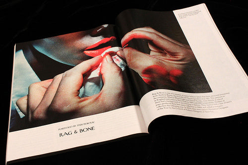
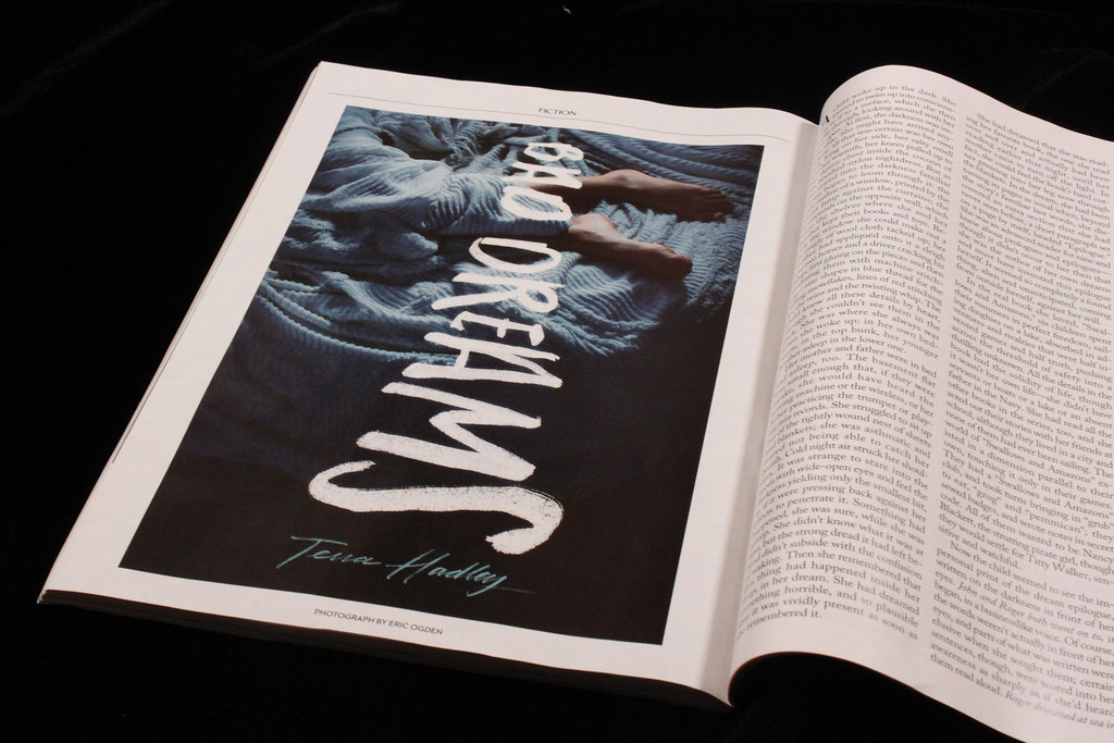
The lead story of the Talk of the Town section runs in a two-column format to differentiate it from secondary stories, an unneccesary distinction and as Andy Cowles commented elsewhere, more of a monthly than a weekly device. The features, too, saw subtle changes; they’ve run photo portfolios before but I can’t recall seeing this amount of space on the page (above); and the regular fiction piece often commissions/matches art or photography, but the use of a handwritten headline across the image is new (below). Look out for futher developments.
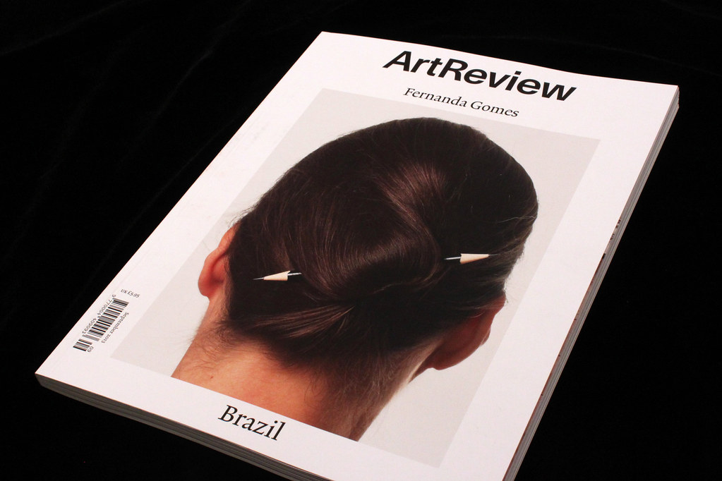
While the New Yorker appears to be getting more complex, Art Review has pared itself back. Jon Morgan’s redesign is a complete re-think of the magazine, with a new format and masthead. A stark monochrome approach and a tight grid provide structure and plenty of space – it’s rare to see so much space around columns and in the gutters. The largest text I could find is about 25pt, meaning there is a lack of pace to the pages that is clearly deliberate, and an intriguing response to the noise of the gallery ads. Some beautiful spreads, but overall too bookish for me.
