

Spectra #1
This bookish magazine from San Francisco contains work by 45 poets, and is a beautiful example of how graphic design and physical design can work together.
Spectra’s 234 pages contain only words—there are no images—but the sheer simplicity of this combined design sense brings those words to life.

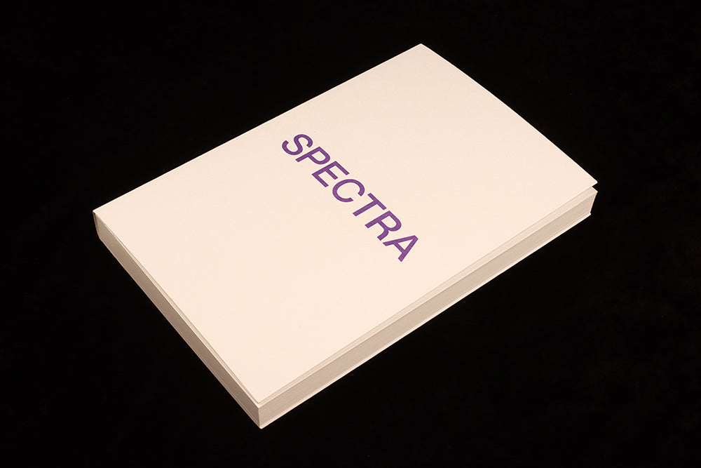
The cover sets the tone for the whole issue: the title in purple ink sits centred vertically on the warm matt white paper. The reader opens the issue and finds a second cover (above) with a longer title, centred again. The focus here is the paper: there’s a lot of blank space, but the rich, velvety stock feels anything but blank. Its warm whiteness is a perfect base for the vivid purple ink used throughout the pages, and the perfectly colour-matched tape binding and cover fold add further physical presence.

Inside, the poems are displayed in a strict and simple manner. Poet’s name and title on the left—centred to the page height again—and the poem on the right. If the poem is brief, it floats in the centre of the page rather than hanging from the top.

Although the magazine’s pages are paperback-scale—155x240mm—the text is all reproduced at a larger size than you might expect, maybe 14pt. Set in an easily read serif—I think Garamond—that size makes it really open and accessible, and is such an obvious decision when words are the very point of a magazine that I'm amazed this isn't normal practice for poetry publishers. We see so many magazines that by comparison appear to be hiding their words away at nine or 10 point.
Both title and poem are the same point size, the relative positioning of the two components defining them.

Many of the peoms fit on a single page, but when they continue onto the following page there is one little design flourish: a little arrow at the right edge (and centred to height again, above) indicates the turn.
As editor Erica Avey notes in her introduction to this launch issue, ‘The point is the poetry,’ and her magazine has been perfectly created to emphasise that.
Editor Erica Avey
Design Wiegand von Hartmann