

The Gentlewoman #13
The latest issue of The Gentlewoman has arrived just in time for the fashion weeks, and as the headline below says, the issue is stripe crazy.

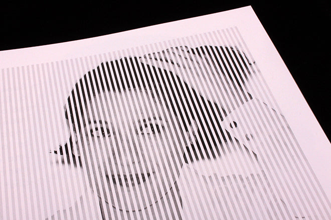
Following the last issue’s use of dots as a graphic coda, this one uses vertical stripes to add visual emphasis on text openers and images (both below).

There’s always plenty to pull out of an issue, but I’ll just highlight a couple of other things here.

First, this story comparing English and US social manners, charmingly illustrated by Lena C Emery’s photographs (above, below). I really like the images and the editorial playfullness of the split headline.

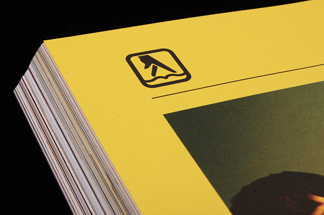
And sticking with the hand theme, who’d have expected the Yellow Pages icon to turn up here? It’s used at the head of the post-feature References pages, set on a yellow bleed tint that cross references the cover colour.
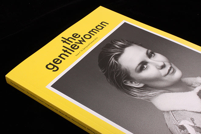
Talking of which… I enjoyed the recent colour images on the cover, but it’s reassuring to see the mag return to its classic B&W portrait/strong colour border days.