


Charlotte Strick, The Paris Review
After 14 years as an award-winning art director at Faber & Faber, Charlotte Strick is now a partner in boutique design studio Strick&Williams and art editor of The Paris Review. She also writes about art and design for the likes of The Atlantic and The Huffington Post. We speak to Charlotte at her home and workspace in Brooklyn, NY as The Paris Review’s spring/summer issue is published.

Where are you today?
Williamsburg, Brooklyn—where I live and work.
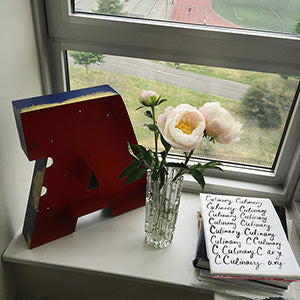
What can you see from the window?
The running track in our local park, treetops, and (lucky for me) the Manhattan skyline beyond.

Are you a morning or evening person?
I frequently do my best creative thinking as the sun begins to set (and the emails stop flying).

Which magazine do you first remember?
That would have to be a toss up between Vogue and The New Yorker — depending on whose lap I was sitting, my mom’s or my dad’s.

What’s your favourite magazine this morning?
Baseline. It’s not a magazine that’s easy to find here in The States. I discovered it years ago when I was just starting my career as a book jacket designer at Farrar, Straus and Giroux (FSG), an award-winning literary publisher here in New York. When new issues of Baseline hit the stands, they’d be quickly snatched up. I often poured over them at the bookstore without committing to the pricey imported-magazine purchase price, but I do have a small, prized collection of them that I keep near my desk. I continue to admire the oversized trim, paper stock, and the content and layout of these tall, skinny magazines. The discrete, saddle stitch binding houses elegant and beautifully produced interiors.
Who is your favourite writer this morning?
This morning I’d have to say photographer Sally Mann, who also happens to also be one of my favorite image-makers. Her now famous book, ‘Immediate Family’ was published my first year of college, and it was soon followed by ‘Still Time’. As a student encountering her work for the first time I found her photographs to be dreamlike and wondrous, and studying her images taught me a lot about composition and storytelling. I was fascinated by the recent piece she wrote for The New York Times Magazine on life as both a dedicated artist and parent — an artist who has documented the intimate lives of her children so fully, and to my mind, with such admiration. It turns out she’s a gifted writer, too.


As a literary magazine, The Paris Review is of course text heavy. How important are the design and visuals to the project?
As its designer and art editor, I see The Paris Review as much as an ‘object’ as I do a venerable and essential literary quarterly. The look and feel is both so important to the readers’ experience. With the redesign in 2010 we brought back the uncoated cover stock of the mid-century editions and echoed some of these text pages in our 21st century layouts too. Lorin Stein, our editor, was after a certain sense of nostalgia and purity and these early issues were a great inspiration for us. The art works we choose to publish today alongside the writing continue to reflect the magazine’s endorsement of quality and innovation.
 The Paris Review has a long history of beautiful covers. When you re-imagined the magazine a few years ago, were there any particular issues from the past that influenced the new design?
I’m attaching a photograph here that shows a few of my personal favorite vintage Paris Review covers. These six are from the 1950s and ’60s. Claire Williams Martinez, my business partner at our newly formed design studio, Strick&Williams, consulted on the magazine redesign with me, and we were crazy for these early covers. After holding them in our hands, we knew we wanted to return to uncoated stock for the current design—marrying form and content. The logo we now use was scanned from a mid-century back issue, and it has all the character of the original lead type that created it. This lends so much authenticity and character to our brand; we could not have achieved that with digital type.
Can you tell us about the process of designing the covers, do you collaborate with illustrators and image-makers?
We frequently highlight the work of one of our portfolio artists on the front of the magazine. As a designer turned art director at FSG for fourteen years, I regularly worked with other designers and commissioned original work from both illustrators and photographers. This was good training for my role at The Paris Review.
I’ve been able to work with some of the same artists, further cultivating our relationships, and having the opportunity to watch them grow and develop is one of the great joys (and perks) of my job. We’ve profiled the work of all sorts of artists, some highly famous and others relatively unknown, and in the last five years we’ve have included painting, drawing, photography, sculpture, collage, ephemera, and both film stills and video art in the magazine. The summer issue features the work of Aidan Koch—a self-described ‘comic book’ artist. Look for Aidan’s mysterious piece ‘Heavenly’ inside the upcoming issue. Our cover (shown at top of this post) is completely hand drawn with Aidan’s signature, naive graphite lines, and the story being told was inspired by a character from ‘Heavenly’ that we commissioned for the cover.
What are you most looking forward to this week?
Dinner and drinks with old friends—a plan in the works for well over a year that keeps getting cancelled. Here’s hoping it really happens!
What are you least looking forward to this week?
Back-to-back-to-back design deadlines and cleaning out my fridge.
What will you be doing after this chat?
Making a hot cup of tea and heading back to work!