

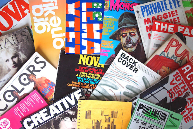
Chris Clarke, deputy creative director
To coincide with this week’s Society for News Design judging, we’re ending the week off by chatting with award-winning design director Chris Clarke about the magazines that he admires most. Currently global deputy creative director of The Guardian, Chris oversees the design direction across the newspaper’s multiple facets, and he keeps his beloved collection of magazines in boxes under his desk (often referring to them as the ‘Clarkive’).

Today, we asked Chris to select three mags from this Clarkive: an old issue, a new issue and any other design detail he thinks is great.

An old issue: Grafik, April 2007
Blogs were in their infancy when I was in design education. Our library, although stocked with everything I could possibly need for a solid foundation in design theory, didn’t intrigue the curiosity I had developed for other areas of visual communication. Grafik magazine was a fresh perspective of design theory and invaluable in contributing contemporary thinking to my design background. It was my everything.
It covered the full spectrum of visual culture from reviews of international design events and exhibitions, showcases of emerging talent juxtaposed with in depth features about a myriad of different subjects within design history.
Grafik lasted over almost a quarter of a century before closing it’s print edition in 2011. The 2003 ‘Made thought’ redesign was the magazine's period of greatest vigor for me.
The issue I have chosen has always resonated with me as innovation within magazine cover design. It celebrated Graik’s 150th issue with a process special report, showcasing how bold and innovative thinking marries with technical prowess.

Designed by Sea and screenprinted by hand at K2 print, it is — as it’s back cover states - ‘One of twelve thousand covers and is totally unique’.
And it truly was, not just as an issue — but as a magazine that contributed extensively to my design education. And I cherish it for that. I hold every issue from 2003 onwards dearly, and testament to it’s brilliant editing. The work inside is still a timeless, thoroughly considered archive of remarkable graphic design.

A new issue: Jacobin, #21 Spring 2016
Jacobin offers liberal perspectives on politics, economics, and culture and an engaged younger voice for the American politically left. It perfectly balances serious topics with engaging design and art direction. It’s topics are both rigorously researched, and polemic in tone.
This particular issue documents the Irish revolutionary period between 1919 - 2912 , and the fallout that followed. The magazine isn’t just retrospective, it also gives enough of the history to pose a thoughtful debate of the potential resurgence of a radical left in Ireland.
 It’s fascinating and thoroughly researched — creative director Remeike Forbes does a wonderful work bringing quite complex narratives to life. Packed full of detail, Jacobin doesn’t just present information it guides you through it clearly and intelligently.
All the while doing so using a reductive three colour palette.
Naom Chomsky best described the magazines as a ‘bright light in dark times’ and I agree — during our unsettling political climate it’s nice to have a companion.

And another thing...q Details, The Shelf Journal, Colors
One thing? I’m clearly a terrible hoarder so here’s three-ings. Above is a detail in Details October, 1988.

This shelf in The Shelf Journal issue 3, 2014.

This colour in Colors, No.4, 1993.