

December 2015
A little later than usual, our round up of magazines received last month includes fathers, anthropology, mental health, Star Wars and surfing.
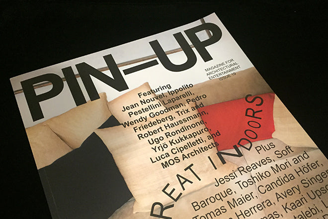
Pin-Up #19
A long-term favourite here at magCulture, the latest issue of Pin-Up features a redesign that pushes its collage look further. Building on the previous design, and sticking with the Arial font, new art director Erin Knutson has turned up the entertainment factor to work better reflect the content. The result emphasises the fun, entertainment and looseness of the magazine’s ‘pin-up’ approach to architecture. An important magazine.
pinupmagazine.org
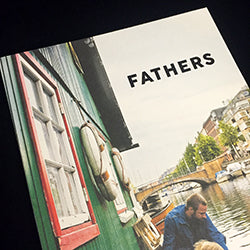
Fathers #3
A mini-trend for indie mags about fatherhood is an interesting coda to the recent demise of the more traditional lads mag genre. This bookish quarterly from Poland does a nice job of linking the generations; as well as plenty of dads n kids spending time together it finds space for memories of grandfathers and fathers with their fathers. As a father it’s intriguing to wallow in tales of fatherhood; at the same time the complete absence of mothers is slightly odd.
fathersquarterly.com

Peeps #1
This disappeared in the pile of recent arrivals here at magCulture, perhaps because its name and cover didn’t jump out. But look a little further and the mag’s a really interesting proposition. Offering an approach to anthropology gleened from founder Greg Salmela’s experience of the area in the context of branding and comms, it seems to want to fit somewhere between Offscreen and Makeshift. Stories include a look at how Medelin has rebuilt itself post-cartels; an interview with a Microsoft sociologist and a photo-essay on people reading books in public.
www.peepsforum.com.
Africannape #1
This hefty publication and photo project sets out to shatter any preconceptions that readers might have about Africa. Part-magazine, part-experiment, the idea is that you share what you think about the carefully curated selection of photography online, adding to what editor Anna Peisl describes as a continually evolving ‘interactive research project’.

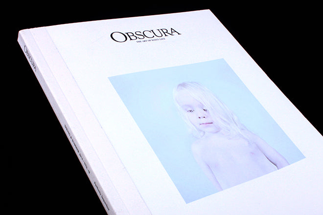
Collection of Documentaries #2
The second issue of the enigmatic photography magazine is just as strong as the first. Readers with a particularly sensitive sense of colour will notice that the white of the cover differs slightly to the last instalment: the idea is that every issue’s shade of white will differ slightly, which is exactly the kind of detail that collectors relish when they’re lining up magazines on a shelf.
What makes C.O.D particularly interesting is their complete rejection of an online presence and decision to promote entirely through word of mouth. Issue two still focuses on the idea of ‘True Britain’ and it brings together work that is particularly fragile or emotional charged. Photographers include Matt Lambert, Jago Rackham and Michael Salerno.

Wired US, December 2015
Included, simply, for that fold-out cover. Wired goes from strength to strength but this issue highlights what it does best – hooking a high-profile populist entertainment event into its specialist technology agenda. This cover boldly uses a single image across a three-page fold out without text or even a strong logo presence.
wired.com

Lifted Brow #27
Here is yet another strong issue of the Australian comic and literary mag The Lifted Brow. The explosive cover image is by Lale Westvind, and inside there’s also intriguing illustrative contributions from Mickey Zacchilli, Katie Parrish and Sergiy Maidukov.
theliftedbrow.com

Calmzine #
The newest issue of the suicide prevention charity’s magazine has an intensely zine-y feel to it, which is perhaps something to do with the fact that it was edited by the legendary Manzine editor Kevin Braddock and designed by It’s Nice That’s art director Jamie McIntyre. It’s Nice That took a closer look through the pages on their website (http://www.itsnicethat.com/articles/calm-zine-redesign), and noted the excellent illustrations from Paul Layzell, Tim Lahan and Rami Niemi.
thecalmzone.net/calmzine

Northern Correspondent #6
Northern Correspondent began in 2014, and the fact that they’re onto their sixth issues shows that the magazine has grown strongly and quickly over a short period of time. Their idea is to present in-depth stories about people in the north east of England, and like Delayed Gratification before it, Northern Correspondent sees the slower pacing of a printed publication as an opportunity to visit and reconsider old stories. Issue 6 is confidently themed ‘Home’.
northerncorrespondent.com

Weapon of Reason #2
There is so much promise to the concept of this magazine that it’s frustrating to see it struggle to convey it. Meeting our environmental challenges head-on, this second issue, dealing with the growth of the megacity, is editorially tighter and more focused than the first issue. It works harder to offer positive action to deal with the issues raised, but it remains too soft visually. Illustration is a fantastic tool, and there is plenty of strong art in the issue, but it tends toward the pretty, sugar-coating rather than emphasising the tough written stories.
weaponsofreason.com
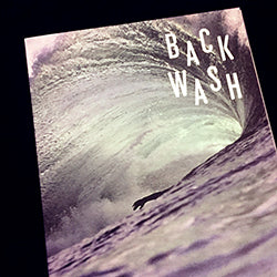
Back Wash #1
The first issue of Irish surfing publication Back Wash is filled to the brim with photos of icy waves, grey skies and pebbly beaches. It’s dedicated to surfing in Ireland, so this first issue isn’t filled with photographs of palm trees and sandy beaches like other surfing mags WAX, Acid and Desillusion. The design is also less psychedelic and experimental than the other surfing independents: Back Wash enthusiastically opts for Cereal-like cleanliness and simplicity. As Steve from Stack noted in his video review (http://www.stackmagazines.com/sport/video-review-backwash-magazine/), it’s a magazine that is setting out not to document trends is surfing or sell surf gear, but rather to tell stories through surfing. The approach and tone reminds me a bit of how Brygg uses coffee to tell its tales.
backwa.sh/#spit-shift

Smith Journal #17
The latest issue of this Australian men’s magazine delivers another fix of its smart, quiet, clean aesthetic. Inside you’ll find: safecrackers, a taxonomy of dust, a man building his own spacesuit and camping recipes from top chefs. Never predictable, it does a good job of gently surprising the reader.
smithjournal.com.au

Pallet #1
Pallet sets out to be two things: it’s a magazine for people that ‘like to drink’ (specifically who like to drink craft beer), but then it’s also a magazine for people who are ‘only interested in everything’. These two contrasting tag lines are a bit confusing at first, but once you get into it, Pallet is a magazine that tells its stories through the lens of beer and breweries. The cover is enticing, and if the magazine hones and tightens its vision a little bit, I can definitely see Pallet becoming a very popular independent.
allthingspallet.com

Frontier #1
This new Toronto-based publication tells stories centred around the theme of risk-taking, and it celebrates all kinds of dangerous decisions, whether creative, business-related or ones taken while adventuring in the wild. It’s yet another example of a magazine that uses a very specific theme to look at a broad array of topics. Interviewees range from Kickstarter co-founder Charles Adler to the design team behind WayHome Music & Arts Festival.
frontier.is