

Der Greif #8
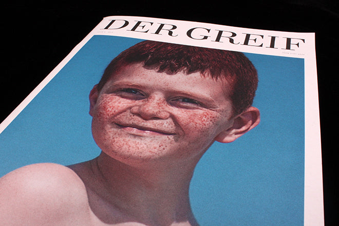
The front cover of photography and literary publication Der Greif stands out boldly when it’s lined up with other magazines on a shelf. The thick, offset white paper, the piercing blue photo, and the gorgeously simple masthead create something that is quietly arresting. Unlike most cover shots, the freckled star doesn’t look directly at you but slightly to the side – as if gazing at something you can’t see but that’s right beside you. The image is ambiguous but also assertive, it’s both still and consuming, traits much like the rest of the magazine’s beguiling content.
Der Greif is conceptually in tandem with photography publications like If You Leave or Romka, which have a similarly candid curatorial eye and which also see photography as riddled with memory and meaning. Pairing photos with poetry gives Der Greif its unique selling point, and its spreads collage the work of different photographers and writers in order to produce very particular atmospheres. The decision to combine photos and poems is effective: both art-forms are usually short and crisp, and they’re both used to create moods rather than to tell specific, well-rounded stories.
In issue eight of Der Greif photographs are clustered together in abstract themes - and sometimes a theme is anchored in the words of a poem. Christopher Mulrooney’s ‘Blizzard’ features the words ‘horizontal’ and ‘hand’, two words that are then evoked by photographs laid out around the poem (above). A pink jelly shape seems smudged into the paper stock of the spread (below): it looks as if it’s fallen out from one of the photographs.

The combination of words, pictures and this small graphic element create an atmosphere that none of the artworks have when they’re looked at on their own. Der Greif collages and combines images, and it’s less interested in simply showcasing artists and their work. The editors want the reader to compare and contrast pictures and words, and to find the similar themes and ideas that link a spread.


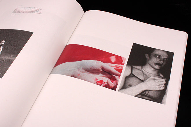
Another spread brings together three rock-textured photographs by three separate photographers (above). The nearby poem shuttles between long lines and short lines, creating a kind of rocky texture of its own. On the corner of the page, a spluttering of green and brown dirt seems to have spilled from the photographs onto the page (also above). Little imprints and smudges like this one and the jelly become visual markers designating the idea that unites the photographs and words in a spread. Stray wisps of hair and a splattering of black ink dots (below) are other examples of how the texture in a group of photographs strays on the page.

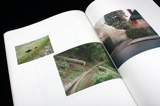

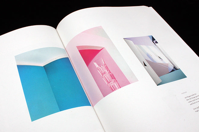
The themes grouping images together are dream-like: one spread is dedicated to gaps in vegetation (above), and another to dark domestic scenes that relate to girlhood (also above). Another spread seems linked by the idea of the unseen (below), and another by florescent interiors (also below).

The layout of a spread is sometimes dictated by the flow of a poem: two stanzas that make up a icy poem by Ben Lerner are accompanied by a couple of misty photographs, one placed on top of the other to mirror the two tier structure of the words (below).

Each photograph in Der Greif is interesting in its own right, but what makes the overall publication so fascinating is the way the pictures have been placed. The magazine’s ebb and flow takes you on a journey, and each page requires gentle and thoughtful unpicking. By having the textures of a picture spill out across the large pages, Der Greif subtly – and abstractly – guides us on our way. The magazine doesn’t use photographs to illustrate words, or words to dictate how we read a picture, though. It curates atmospheres, and uses layout to encourage us to form our own interpretations.