

Even #1
When a magazine comes along with the clear intention to shake up the status quo, to rethink criticism and tailor its writing and design to the contemporary world, it’s always an exciting moment. This is the kind of energy and fervour that Jason Farago brings to his new magazine, an art critic turned editor who has written for all the greats, including N+1, The Guardian, The New Yorker and Artforum. Jason tells us that he started Even ‘not out of a dissatisfaction with any particular art magazine, so much as a discomfort – an exhaustion, really – with the larger discourse around contemporary art as such’.
Contemporary art as a topic of examination has become very popular in recent years, and it’s widely covered and recorded online, yet Jason felt that the language we use to talk about art is still steeped in the stale vocabulary of the 1980s. Reviews centre around one exhibition at a time, thoughtfully covering facts, figures and analysis, but not necessarily looking at what’s going on in a wider context. The forms and words we use to talk about art are still focused on old structures, so as Jason explains, ‘Even was born out of a desire to start drawing up principles for new analysis, on a global scale.’

The new magazine features long-form writing that engages with multiple exhibitions in one article, connecting ideas across the globe and across art works. A review of Reena Spaulings crosses from New York to Berlin (above), and interviews focus on conveying a sense of place and atmosphere as well as artwork. ‘To really get our heads around the massive changes we’re living through, we have to expand the nature of our inquiry past individual artworks/exhibitions/artists, and start engaging with a much larger network of images, objects, and ideas,’ Jason says. Then he adds, in words many current independent magazine makers would enthusiastically echo: ‘This kind of analysis can only happen, I believe, in a slower and more deliberate format. It’s an enterprise to which print is ideally, perhaps uniquely suited.’
The magazine is designed by Yoonjai Choi and Ken Meier of New York design studio Common Name (there’s a fascinating interview with them about the project on the AIGA blog). Jason gave them the simple but daunting brief to design a contemporary magazine with a historical engagement, merging the radical with the traditional: ‘How do you make it clear that a publication with a seventeenth-century allegorical painting as its lead image is a contemporary art magazine?’

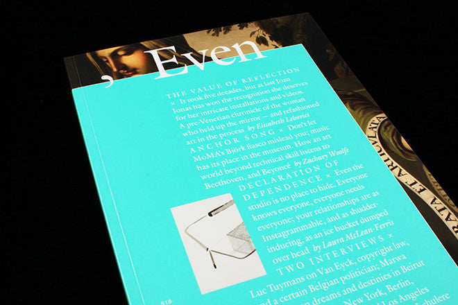
When you catch sight of Even, the first impression is striking: an austere block of text set on a glossy sea foam green background covers most of a classical painting and there’s a photograph of a modern, glass sculpture inset into the text. Time, thought and imagination are instantly mingled. The title ‘, Even,’ – with a deliberate and glorious comma – sits on the border between the background painting and the foreground text block. It’s as if the cover is asserting the ideology of its editor: announcing that it’s going to discuss art with the serious commitment and respect of traditional criticism, but also bring something new to the format. It elegantly bridges both worlds. The offset frame discreetly declares that the magazine is a kind of ‘re-framing’ – positioning the new within the context of the old.

The asymmetrical frame on the cover recurs as a line throughout the magazine, bringing together all the separate features and reviews into a cohesive whole (above). The use of a hefty serif typeface comes from the same impulse (also above). The same sea green of the cover becomes the colour designating Even in interviews (below), and quotes strikingly inset the text, another echo to the offset cover frame.

Pages are branded with a mutating E V E N in the gutter, forming a square, a diamond, a staircase, a vertical line (below) to indicate different types of content and, as Jason says, ‘inject contemporaneity into a format that looks to history but isn’t behold to it.’


The name itself also has multiple resonances. Jason sighted the idea of ‘even-handedness’, and ‘an even tone’, or ‘works being hung evenly on a wall’ as influencing the choice and meaning of the name. Its principal source, though, is the title of Marcel Duchamp’s The Bride Stripped Bare By Her Bachelors, Even. ‘Critics have spent decades debating the significance of the adverb, though Duchamp said in an interview that it has no strict meaning,’ Jason explains, ‘It’s the word that unhooks modern art from strict representation and lets it gloat in a realm of its own.’
Creating words from visuals, embedding meaning in design, these are the kinds of ideals at the heart of Even. Punctuation itself becomes a provocative, playful visual icon of the magazine: ‘In Duchamp’s title, critically, the word “even” comes after a comma. The comma, that little dramatic/ironic pause, means a lot to us here – it’s our unofficial logo.’ Jason says, and then he adds a pleasingly ‘geeky’ side note, which reveals a typographic mind inside the writer: ‘There was lots of debate about whether the title of the magazine would be in all caps or not. We went with Even, as it is in Duchamp’s English-language title, but the caps EVEN, with four letters with no curves, was tempting…’
The magazine is a serious, confident and very welcome undertaking. There are numerous art magazines at the moment to compete with, although few make any attempts to assert a new critical form or tackle a very traditional art world in ways that actually reflects unprecedented 21st Century changes and challenges. The magazine is due to come out three times a year, in order to meet art world time signatures. ‘We have to play it a little slower than average’ Jason acknowledges, ‘but the result, I hope, is worth waiting for.’ It definitely is.