

Fantastic Man #22
One of the secrets of strong editorial design is to be forever changing details without making it obvious to the reader. The general feel should remain the same, but otherwise the designer is free to gently adapt the design from issue to issue – it’s one of the joys of the role to be forever honing and improving.
Fantastic Man has always had a very strong and specific visual identity, matching its mannered verbal tone of voice. Structured and simple, the pages rely on strict typographic rules with minimal decoration other than carefully selected and lovingly used fonts. Its design is a defining part of today’s indie magazine culture – much copied, rarely bettered. Yet the typography and design changes more than you might think – just compare issues more than three or four apart and see how these small changes add up over time. The aesthetic is based on an ethos, not a strict, repetitive set of fonts and devices.
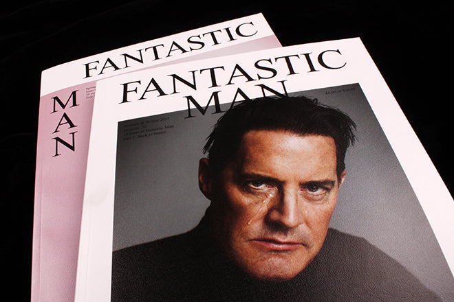
The latest issue of the mag launched last week, with ‘Twin Peaks’ star Kyle MacLachlan crying quietly to himself on the cover (above). This is the second isssue marking this year’s tenth anniversary of the magazine, and the sharp-eyed reader will immediately spot a change to the front cover design. The previous issue saw the first major logo shift in the magazine’s history, reatining the Times Roman but breaking from the stacked, centred version of the logo used for the first 20 covers. This change divided people; I liked the shift, I know others didn’t. In the wider context of publishing, Fantastic Man may generally be regarded as leftfield and challenging, yet in its heartland it has loyal readers who can be over-challenged.
For no22 the design has reverted to the centred logo. But before anyone assumes this is a simple reversal, creative director Jop van Bennekom wants to explain. Discussing how the two anniversary year issues have had very different roles, he says, ‘with the first we were looking forward into the future and this issue is retrospective where we revisit inspiration, people and ideas. It felt weird to play around too much with the logo for this issue where we are looking back, it just didn’t work in the set up.’
So for this issue the logo reverts to the previous version. Might it change again? ‘Maybe. I always want the magazine to change and evolve every issue, sometimes just a little bit and sometimes more drasticly.’ A large part of the editorial designer’s job is managing the gulf between a little and a lot in this respect. I look forward to seeing what happens to the logo on no23.

One less dramatic change worth noting in this issue: the introduction of a new headline sans serif, Kris Sowersby’s Founders Grotesk (above).