

Fare #1
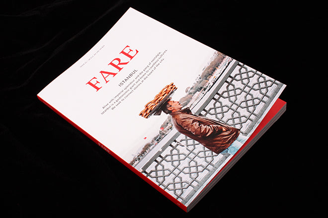
We know we are in for a modern interpretation of a food magazine when the cover shows a man walking over a bridge, smoking a fag with a tray of bread balanced on his head. Glasgow-based Fare plans to explore a different city through its food each issue, and that man is walking through Istanbul for this launch cover.

Writer Aimee Lee Abraham notes how the Turkish city mirrors and is mirrored by the diverse worlds that encircle it, sometimes beautiful, sometimes horrifying, and ‘Often both.’ Editor Ben Mervis first visited the city two years ago and was struck by how, at once, the city seemed so familiar and unfamiliar, ‘I was taken by the city’s many worlds, its incredible histories, and the amazingly diverse range of food on offer,’ he told us. ‘In the course of production we’ve encountered some troubles, and the political climate has gotten hot at times, but we were always determined to highlight this city regardless.’

The magazine shows us orchards, buildings, the food and its people, warts and all. It confidently brings together long, detailed articles and intimate interviews, and visits remote neighbourhoods, steeped in history and nostalgia. Locals talk about their lives, politics and history.

Thorough and well-researched, the team have documented Istanbul like a fly on a wall. You’ll find yourself fascinated by the stories of the fishermen and shopkeepers, as you learn about the rich cultural significance of the cuisine. It celebrates and appreciates the deep history engrained in Istanbul, leaving no stone unturned. Working mainly with local writers and photographers, the magazine observes thoroughly but sensitively.

Fare is text heavy and intended to be read rather than flicked. Mervis (a food historian and writer who has worked with Rene Redzepi at Noma and is currently part of the Chef’s Table team at Netflix) wants the text to be the focus, but the elegant illustrations, photography and tidy design and art direction are just as well considered. Liz Seabrook’s photography at Grand Bazaar, particularly the black and white shot of bowed stone steps leading into a back street kitchen (above), looks like a still from a Fellini movie.
Istanbul provides a strong subject for this launch issue. Its rough and ready nature really comes across. Whether the magazine continues in the same vein or adapts it visual sense for each city remains to be seen. I hope they’ll have fun with each city they go to, and transform the design and styles of photography appropriate to each new place’s character.