

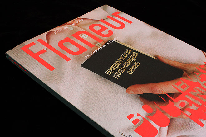
Flaneur #6, Moscow
We’ve showered praise on Flaneur countless times before. It never fails to impress; its concept a perfect balance of continuity and freshness so that you know what you‘ll get in a way that never gets boring.
The latest issue of Berlin’s globe-trotting magazine focuses on the Boulevard Ring in Moscow, a highway around the city that Flaneur's editorial designers Studio YUKIKO have chosen to visually translate into a colour palette of deep green and space-age red and silver.
It's a title about wandering, exploring and digging deep, so what better way to celebrate the new issue than to have a walk through the spreads with YUKIKO. Today, the designers Michelle Phillips and Johannes Conrad describe how they’ve transformed their experiences living in Moscow into the layout of Flaneur issue six.

‘Because the nature of Moscan city planning, the editors decided it wasn’t the kind of place where you could just pick a single street. So they took a whole ring - made of different streets. Thats how the roads work, big roads all pointing to the Kremlin and then concentric rings that bisect them.
‘Russian artist Protey Temen did some wonderful drawings to try and illustrate the structure of Moscow for our readers at the beginning of each chapter.’

‘The editors decided the street felt very cosmological and then we all got stuck on this cosmological vibe, because space and cosmology is a big theme in Moscow. You can really see that in Protey’s drawings. We were also all living right next to VFNKh, which is a park with a cosmonauts museum… So silver and red became an easy choice. We we’re really happy when Fedor Konyukhov, the ‘Russian Adventurer’ completed his world trip in a silver and red air balloon this year, it all made sense.
‘I’m quite small, but I think many people who travel there have a similar feeling, everything is just massive. It’s a completely different scale. The plane took only 3 hours, but I felt like I'd landed on a different planet. There is 10 lane traffic in the city centre and the buildings - those seven sisters, woah. Small things too - like a toilet door - felt totally over sized to me and super heavy. It took a lot of energy - opening doors. So thats where our industrial sized Russian chapter opening letters came from. We wanted to get that impact of scale in construction.

‘Many people asked us what Moscow looked like. Admittedly, we also had very few pre-existing images in our mind about how it looked. So when we returned to Berlin we commissioned the Russian photographer Alexey Naroditskiy to go to our different 'space stations' (thats what the team started calling the different parts of the ring we were covering) and take to pictures.
‘It’s really not a Flaneur-y thing for us to just go out and make really static objective photographs of the street. But, occasionally we get complaints that the reader doesn’t see enough of the street in our magazine (normally that’s ok for us - because it’s not really true, you just have to piece it together in a different way). This time we thought Moscow has a postcard-y quality, and because of the complex nature of exploring different ‘stations’ on a ring rather than one street, we decided we should probably do some scene setting.

‘As well as our red and silver color palette, we chose military green. I'm not sure how much explanation is needed here. The repetitive text was a small detail referring to a kind of social behaviour we witnessed. Editor Fabian Saul wrote a great piece in this issue called ‘Tactical Behaviour’ that delves much deeper into this topic.
‘Everywhere we went we saw people painting bollards and poles. Old buildings that looked slightly run down were immediately covered with a canvas printed with an illustration of the facade in its original state (its known as ‘The Veil of Death’). At restaurants, plates are cleared away practically before you’ve finished eating - it all seemed very industrious. There’s an old military joke: “If it moves, salute it; if it doesn’t move, pick it up; and if you can’t pick it up, paint it…” It’s really quite a fascinating and immaculate city…’