

Fukt #14
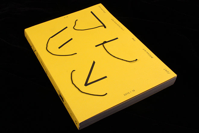
German contemporary drawing magazine Fukt always finds memorable ways to present the title on their cover; issue twelve’s title was written out with hair shavings, and I’ll always remember issue eleven’s giant foot/ pencil stood nonchalantly against a plain white background. Yet for issue fourteen, Fukt have taken their design to a whole new level; a chain link making up half of the F U K T letters swings on the lemon yellow background so that it’s constant motion (below). It’s like a perpetual doodle, never quite staying still or aligning up, and no matter how hard you try to arrange it, every time you put the magazine down it looks like the letters have been scrawled by a child.

 The swinging, spiralling lines of the chain are then evoked by the typography used for headers and titles inside the magazine (below) – making the whole thing feel half-solid, half-scribbled. It’s a very inventive design, and what makes it so perfect for Fukt is that the effect seamlessly evokes the spiraling lines of a pencil drawing.

Editor: Bjorn Hegardt
Design: Ariane Spanier Design