

The Guardian goes tabloid
Since 1988’s redesign by David Hillman, The Guardian newspaper has always put design at the heart of what it does, working for a long period with Simon Esterson before 2006’s award-winning shift to Berliner format and redesign by Mark Porter. Both redesigns were quantum leaps, prepared for months in advance and launched overnight. This morning the latest step in The Guardian’s development arrives.
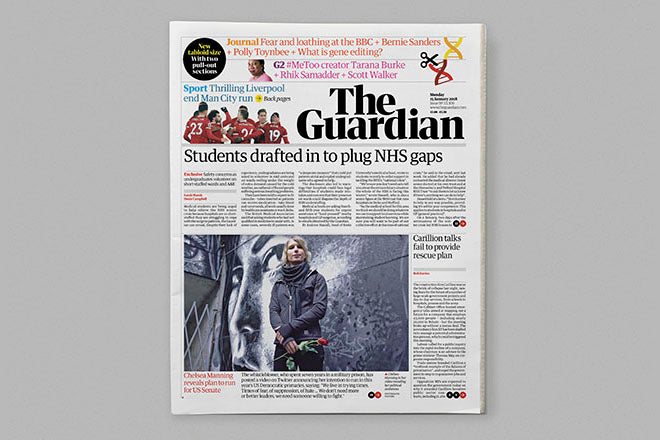
Developed by the newspaper’s inhouse design team led by executive creative director Alex Breuer and deputy creative director Chris Clarke, The Guardian is now a tabloid. That shift to a yet smaller page size has meant a complete revamp of the typography, grid and editorial structure.
There is now one single part, split to three sections that can be pulled apart: News, Journal and G2.
Flicking through the first edition, I find it a remarkably complete and finished item. Other serious British newspapers – ie the ex-broadsheets – have already shifted to tabloid (The Times, The Independent before it closed) to confound those that believed tabloid meant only lo-brow. The new Guardian emphasises this further.
No change can compete with the shock of the Mark Porter version when it first arrived; but this is a really smart redesign that carries just enough of the previous iteration that it feels familiar, while also feeling completely fresh. I saw PDFs last night, and was impressed, but the printed issue this morning is even more pleasing.
I’m a regular reader of the paper and felt immediately comfortable and excited by the new format and design. It’s been really well thought through editorially – we must assume this is now recently appointed editor Katherine Viner’s publication. Highlighting the opinions and columns in the off-white Journal section is a great idea as are the new design tools for a more forensic approach to investigative news. Both are essential parts of a modern newspaper, and a strength of this one in particular. But it’s a shame G2, although removable, is the same format as the rest of the paper.
Another doubt is the masthead; while it’s great to see it black on white, with the revived authority of a capital T and G, stacking the two words of the name feels awkward. It leaves some really difficult space on the front page around which floating teasers only make things worse. But as Alex points out below, a newspaper is a living thing and perhaps this will settle down as the norm.
The tradition of muted tint panels has been banished – these are too common now. Instead red and yellow dominate. Given its political leanings, it’s satisfying to have red replace the cyan-black house colour: little flashes of red appear everywhere in the News section. And within that section there is scope for an interview feature (in today’s case Michael Wolff) : the smaller pages turn out to be far more adaptable then the mid-size Berliner format. A story can easily fill a spread without interutping the news flow.
The team used vast blocks of yellow in last year’s Panama Papers special reports and although functional that was just too much; here, yellow is used more carefully and works very well (and better in print than on the screen images above).
In short, at first glance this redesign is a great success with just a few gripes. I’m intrigued to see how it settles down over the coming weeks, and how the Saturday issue and Sunday’s Observer will adapt the format.
Alex Breuer and Chris Clarke answered the following questions as the team completed the first edition last night.
What was the timeline for the redesign?
The core work for the project began in June last year, although some grid and text setting explorations had begun a couple of months earlier. We had a hard deadline of Jan 15th.
Did you start completely afresh or was it a case of adapting the current design to a new format?
We had to start from scratch. We knew that simply scaling down the current design would not work. The change of page size and loss of the fold created a whole new set of opportunities and challenges that demanded a fresh start. We news that the change size would nead a headline font with a different character than Guardian Egyptian,which at the sizes and styles we evolved would not have had the presence we needed. We Also had to reimagine the title piece to afford us a different space at the top of the page that would give us greater variety in a more compact space.
The new headline typeface, ‘Guardian Headline’ was designed by Tim Ripper and Paul Barnes of Commercial Type, and the new masthead hand drawn from a high contrast version of the bold weight of Guardian Headline, with some subtle changes to individual characters to give the right feel for a title piece.
Did you refer back to any other tabloid version of The Guardian: the Mark Porter versions from the last redesign, the original G2 etc?
We did take a brief look through the archive at all the previous designs of The Guardian. This was valuable to affirm the challenge to all the editors and designers involved. That the work we produced needed to stand tall alongside some definitive designs.
Which Euro-tabloids did you refer to/ admire?
We of course took a look beyond the UK at some of the European tabloids. It was interesting to appraise the their solutions to some of the challenges we faced. We are fond of the spirit of the culture coverage in Liberation.
Are there extensive editorial shifts alongside the design changes?
>There are substantial structural shifts in this re-design. Creating the centre section, Journal, for opinion and longer pieces was always key to us. We were aware that with the increase in the number of pages this key section may end up being lost in the back of the paper, or far too mobile given the dynamics of flat plans. We wanted this part of Guardian journalism to be at the heart of the paper. We have reimagined the structure and feel of Saturday too. This is the paper that people spend the most time with and we wanted to make each moment within it Distinctive and and have a print format and design that suited how people enjoy its content.
Does the feature G2 suppplement continue?
Yes, G2 remains, and will be the centre 16 pages of the paper. As it is tabloid size we felt we had to push the boldness and energy of the design to really lift it apart from News and Journal.
Was it difficult to overcome the British assumptions around the tabloid format?
Interestingly it was not. We produced a very quick dummy, in about a week. Of some simple newspages (no front, no section) using the previous Guardian Egyptian typography. We shared those with a select group of readers. It became clear very quickly that the format didn’t feel alien and that they recognised the distinction from other tabloids. Many in fact welcomed the size change because of the ease of read and navigability.
Did you enjoy the task? Happy with result?
It was hugely enjoyable. Editor-in-chief Kath Viner gave the design team a huge amount of lattitude to challenge everything. Format, structure style. Although the amount of time was short. That space meant we were able to stretch ideas, try some crazy things. Some of which didn’t survive but the extra reach has left us with and exciting new Guardian. A newspaper is a very living thing. No doubt over the coming weeks there will be refinements and evolutions as the wider team get to grips with all the possibilities the design affords.
The website has also been redesigned: theguardian.com