

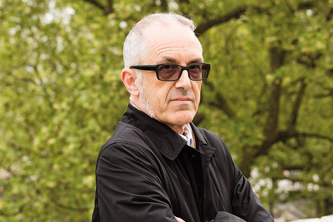
John L Walters, Eye
The ninth of our interviews republished from Jeremy Leslie’s book ‘Independence’ features the co-owner and editor of design journal Eye, John L Walters.

Jeremy: What the first magazines you remember seeing, the first magazines that attracted your attention when you were younger.
John: Because I was a musician as a young man, I was fascinated by music magazines, and also because I was interested in jazz and obscure experimental music, a lot of those magazines were really badly made
and badly designed, or you could tell there was a sort of spark of ingenuity to try and make something more or less readable.
In the 70s and 80s, you had a lot of what you might call samizdat publishing, very early, almost pre-desktop publishing where people were just doing things with Xeroxes and stapling them together.
One magazine which stands out from very early on, which became a very different kind of magazine, was i-D. Not a music magazine, but lots of people I knew on the music scene from that time turned up in i-D, either in those street shots that they did or they’d be in a band that was featured. I’ve got a small collection of early i-Ds, and they’re just A4 paper with a staple in the corner. Very crude. But there was a real design brain – Terry Jones – behind it. One of the early big interviews I did for Eye was with him, a thoroughly fascinating person. He’d studied with Richard Hollis at the University of Westminster, and been art director of Vogue. He really knew a lot about design but he went back to basics and made a very simple, crude magazine.
With a background in journalism, did you ever envisage you’d end up running or owning a magazine?
As a musician, I really wanted to be Quincy Jones, that obviously wasn’t going to quite work out. Once I moved from music to journalism I quickly realised, because I did a lot of freelancing when magazines were changing from old technology to the new technologies of the 90s, I realised that some places were really good fun to work in, and other places were really awful, and I wanted to gravitate towards a subject matter that interested me – things like architecture, design and culture in general. I worked quite a lot in supplements and papers and magazines and I found I always really enjoyed working with a designer.
And you were working on Unknown Public, with big name designers.
It was a pretty mad project to do, really. We won a few awards and we got a lot of very nice feedback from it, but it was crazy to make work financially. In the early 90s nobody knew where music formats would go. Vinyl was on the way out, CDs were sort of coming in but we were also talking about having music on credit cards or key or little things, or on digital cassettes, there were mini-disks and such. We thought, why don’t we make a music magazine where it doesn’t actually depend what the size of the format is. We can’t get vinyl in here, everything else would fit in the box.
You mentioned that is struggled financially. Do you think it might have been more successful in today’s environment where there is much more of a infrastructure for smaller, independent magazines?
I think it was both ahead of its time and really behind the times, because it also nodded back to those avant-garde magazines and zines and Dada magazines and things like that. Where it was perhaps ahead of its time, and I can see people like Wax Poetics and other magazines where they’re using design as a way to engage you with music. That was very definitely our agenda.
The idea was, we’re going to include some quite obscure, difficult music, but the idea is to reassure you that we think it’s good. The analogy I made at the time is if you are going to do an avant-garde music festival, it’s actually quite good to do it in a place where you’ve got good toilets and a bar and people can socialise. It’s not hair-shirt modernism, which this music was sometimes called, you don’t want people to suffer on top of listening to music that they hadn’t heard before. You don’t want them to have a really uncomfortable time. They’re plenty of things The Wire recommends where you are in a dark hole in the middle of nowhere like that, and you go there because it’s cool, but we felt it was a good idea to use design to introduce unfamiliar things.
One of the things I learned was how to make a magazine. I learned a lot of things about what not to do with a magazine – it took a long time before we even bound the pages together. I also learned a lot about design and designers, and we had fantastic guest designers at different stages. The original design was all by John Warwicker and Tomato, we were on a real roll, they got very, very successful, it was getting more and more difficult for them to squeeze it in for some paltry fee we were paying them. So I got guest designers such as Richard Hollis, Lucy Ward from The Wire, Stuart Bailey who went on to launch Dot Dot Dot. While I was doing this, I was also starting to work at Eye, having been at the Architectural Review.
Which was the first issue of Eye that you were involved in?
Well, I came in as managing editor when Rick Poyner had just left and Max Bruinsma was editor. I worked alongside Max for six or seven issues. I was editor from issue 33 in 1999, and Nick Bell was the art director.
At the time it was owned by a business publisher, it was part of a range of quite specialist magazines?
Quantum owned Eye, and we were stable mates with Meat Trades Journal and British Baker. At one time it suggested that we share an ad sales person with Seafood International because we were the only two international magazines in the building. It didn’t happen. Those big companies have transformed now, they’ve disposed a lot of their titles as you know. But, we were eventually sold by Quantum to Haymarket which is Michael Heseltine’s big publishing empire. So then we were stable mates with What Car? and Marketing Week, all sorts of things like that. I did go through a number of publishers, all of whom struggled to make a success of it. It always seemed to me that they weren’t quite sure what to make of Eye.
We did our best to make the magazine we thought our readers wanted to read. We felt there was a community around Eye, that there was an intense interest around Eye, around graphic design. There are
always a lot of fresh graphic design students leaving college who were using it as a way of finding what they’re interested in and looking at things. We’ve always had this dual thing of having quite a lot of history and quite a lot of undiscovered history. We’ve always had polemical articles by figures like Rick Poyner and Max Bruinsma, and things that perhaps challenge and critique what’s going on.
Which doesn’t sound like business-to-business publishing.
Indeed. Most business-to-business publishing is quite cookie-cutter, you can take almost any subject and it’s transferable, you can go from seafood to meatpacking far more easily than you can jump into the creative world, where there are a lot more things at play in terms of understanding the cultural position of what you’re doing.
There was one period where I had five publishers in six months. The job of publisher is usually to control the ad team and look at the budgets and manage the editor. And so I seemed to be having endless meetings where people would say, ‘Now John, tell me, what is Eye? What is the typical Eye reader?’ And I think we’ve always had a good idea of the typical Eye reader is, a lot of people who would come to Pick Me Up. But trying to understand that from a B2B magazine perspective is quite tricky. With a magazine like Eye you do get people who are on the periphery of graphic design, but I would say 95% of our readers are graphic designers.
There aren’t many magazines out there so expressively focused on graphic design. There’s Creative Review, there used to be Design Week, but they include other areas of design and also advertising. Eye specifically covers graphic design.
We call ourselves ‘The International Review of Graphic Design’. To be more precise, we are interested in what we think and what we’re told graphic designers are interested in. So we might deal with advertising, but we would like to look at it through the perspective of a graphic designer, rather than what the ad industry wants us to write. We might look at packaging, but then again, we’re trying to give it a graphic design angle. Same with photography, same with illustration. We’ve wanted to do, an illustration issue for a long time. To look at illustration through the eyes of designers and art directors, rather than just the story the illustrator has to tell.
What what we want to do is to surprise our readers, give them something that they would really like to read about. And maybe, because we’re a quarterly magazine we have this slow digestion of articles, maybe they’ll come back to it later when it’s more relevant to what they’re doing. I do get nice feedback, now that we use social media to such an extent, where people say ‘Oh I remember this article from when I was in secondary school.’ Then they might re-read it or make some interesting comments. That’s become a real gift form Twitter and Facebook, to actually revive interest in articles that are perhaps more relevant now in some cases than they were then. Or things that are totally dated, but they’ve maybe been around long enough that they’ve become cool again.
Magazines have always been community builders in their own right. Instagram and Twitter are the perfect tool to build on that.
Yes. To what extent it drives those all important things we need to survive, like advertising sales, subscriptions, copy sales is quite difficult to measure. Since we went independent, we’ve relied quite a lot on those things that don’t cost money. We leave subs cards at strategic places. We still have subscribers though for whom we don’t have an email address because they’ve been subscribing since 1990.
You bought the magazine ouright from Haymarket. Any regrets about going independent?
It is an enormously time-consuming thing to do. It’s a thing that we both love doing, so there is a labour of love element to it. But we do have to find ways of making it work as a business. Everyone who creates magazines has this challenge.
One of the reasons we’ve taken on Pulp as an extra thing is to give ourselves an extra source of income. It can’t be just about the magazine.
There are other aspects of what we do which are completely un-commercial but which I feel personally are quite important. For example Ralph who has been interning this week has been adding lots of archive articles to the website. There is no real way that we can monetise that at the moment, unless at some stage in the future we go behind a paywall, which I hope we don’t have to. I feel it’s quite important for all those early issues that are going out of print. Whether an article’s about Tomato or Bruno Monguzzi it’s great that they are there online to be read by a new generation of people. So, it feels almost like we have the role of a library or a University, but there is no real financial model which makes sense of it.
By going independent you took on the financial risk of running a business but you also took control. You went ahead and improved the quality of the product.
There was a stroke of luck or good timing, which we couldn’t have possibly known about. I should also remind you, we went independent right before the great financial crash of 2008 so it wasn’t a great time to be starting anew. But looking at it now, our independence pretty much coincides with a great wave of new young independent magazines, which you chronicle so well on magCulture, and which also forms the subject of things like Printout and so Simon and I feel like the grand old men of indie mags. We are all facing the same challenges.
We’ve taken part in the Stack subscription a few times. People who are completely outside of our normal readership, outside graphic design and art direction, stumble into Eye through this new obsession with indie magazines. Almost as a genre in itself. I think we have to a certain extent benefited from that wave, which includes Cereal and Hole & Corner and Delayed Gratification. I think we have benefited from this great new wave of printed magazines. So the decision to improve the print quality, improve the paper, probably looked like quite a smart one. Smarter than we perhaps knew it was at the time. I think we just felt the readers deserved better.
Perhaps it was an assertion of independence as well.
It was. It was a statement. Also, the thing that is an incredibly brave and difficult thing for Simon and Jay
One of the defining characteristics of independent magazines is the attention to the production values and the detailing of the design. In your case, that becomes even more important, doesn’t it? Your readership are going to spot any ugly kerning.
As I discovered when we were in the B2B sector, people would look at a page with a lupe and notice bad registration. A few issues were shockingly printed. But it’s a very discriminating audience. I think the other thing which I hope we do make some sort of argument for in the independent sector, and I’m sure Delayed Gratification would make a similar argument, it’s very important to have very well-written stories, to have good journalism, to have good writers and editors. There are some magazines that are very much driven by the visual content, and that’s absolutely fine, that’s how they work financially and for their audience. Our readers want to read Rick Poynor, and your interview with Chris Dixon, they want to read Eric Kindel’s absolutely fantastic piece about stencil typefaces. These are things that really stand out well and you can go back to. We try and make them as good as they possibly can be.
That again aligns very much with a lot of the other independent magazines. It’s very much a quarterly timeline, they’re aiming higher than a weekly or a monthly.
That’s absolutely true. I think one thing that is quite difficult compared to when I came into the industry 20-25 years ago, is that there aren’t all those boring B2B magazines where you can learn your trade without it quite mattering so much, you know? I did my 10,000 hours doing really soul- destroying shifts on magazines that no one has ever heard of that have long gone, in all sorts of places, because I had small children and we needed to make money. It’s very difficult for someone who is now in their 20s or 30s who wants to get into the magazine business to really do that kind of coal-face type work and learn their trade. I think it puts a bit of extra focus on the design colleges to try and teach that stuff in a bit more detail. You can’t learn that stuff just by being an intern for a few weeks, you have to get stuck in and really do the work when it counts, and get shouted at by editors and production editors.
One of the things we’ve been talking about this week is how there has been such growth in small independent magazines. One of the reasons that’s been offered is the lack of opportunity to go and learn your trade anywhere. You have to do it yourself.
It might be. I think there are also certain cultural shifts that have happened. When I was young, everyone wanted to form a band, whereas now they either want to make a magazine or have a coffee bar or a restaurant. I think there are changes that happen. I wonder if there is going to be the end of the bell curve of independent magazines, and we’ll see another shift. The spectre of digital magazines though doesn’t quite seem to have changed people’s interest in design or physical magazines.
When I interviewed Johanna of Disegno magazine, the first question I asked her was why start a new print magazine in 2011, the year after the iPad launch. And she actually replied that she felt there was something about what you read and how you remembered content that you read on the pages of a printed magazine was different to how you experience things on your phone or tablet. I think that’s quite an interesting topic.
Having said that, I am very grateful that with all those early issues of Eye that are now out of print, people can now read a lot of them online. I think they still stand up quite well. Maybe there is a credibility that
comes from having been printed in the first place.
You’ve mentioned Simon Esterson several times during the conversations. You’re both very experienced magazine-makers, you must both have quite strong opinions on each others part of what you’re doing.
Simon is an editorial designer above all. He makes books and magazines and editorial products, even things that are for more commercial clients still have an editorial element to them. So that’s what Simon lives and breathes, and has done as long as I’ve known him and as long as he’s been a professional designer. So he has very strong opinions on what makes a magazine. I think he really wants to make the best possible magazine he can make, without the kind of restrictions you would have with a normal publisher or commercial client.
In a way, Eye is a dream project. There are certain things where I will have a story that doesn’t have an obvious visual way of representing it. Or maybe it does have an obvious visual way of representing it but Simon doesn’t like it or doesn’t want to do it because it’s a cliché.
There is a piece we commissioned a piece from blogger/illustrator John Coulthart about steam-punk. And that was actually very difficult to illustrate, because it’s a piece to read, that just needs a few illustrations.
It wasn’t a big, big overview feature. Simon really wrestled with that, for quite a long time. We bumped it from issue to issue until Simon found a solution.
Simon is a fantastic art director, because he lays things out the way they’re written. He will also say if he doesn’t think if there is enough about a particular bit, or that it ends oddly. Sometimes of course, because Eye gives us the opportunity to have quite long captions that aren’t just repeating what’s in the main text, we can then, Simon might choose a particular issue or gate folder, that then demands you write another 200 words explaining what that was all about. That wouldn’t have gone in the article, because it wouldn’t make sense without showing the picture. At that point, the choice of the art director is driving what gets written. Rather than it just being, here is a bunch of stories, make them look good. Which is the most uninteresting side of magazines.
Yet I’m sure that a lot of people not involved in magazines still think that’s how it works. The editor tidies up the written article, it goes to the designer and he goes into a corner and designs it.
Sadly, the greatest threat to the medium of magazines is not so much all the magazines we know and love, it’s the magazines that have basically given up the ghost but still commercially have reason to go on. You really see these magazines, and it looks like either it’s been done in a great hurry, or people have just given up, they’re not interested. Or, they don’t have those skills, which actually you do need to lay out stories.
If you’re buying a magazine that is not very well edited or art directed, doesn’t have pictures that have been put properly through repro, or they haven’t been properly printed, or they haven’t checked pages on press, those magazines are the best argument that any internet evangelist could have against magazines.
In a way, that’s the hope. That the bad magazines will disappear.
What I would hope is that some of the energy and talent of the indie sector will actually go and revitalise the commercial sector. I don’t think all this energy and talent should be left to people doing it as labours of love.
Is there really a clear, defining line between the independents and the mainstream magazines? Are we not really just talking about well-made magazines done with love and passion that appeal to an audience and therefore can succeed? Or not done so and fail?
There’s a musical analogy here. The word indie in music actually meant something aesthetically as a genre, but it often now doesn’t mean anything at all. Good stuff comes from the indie sector and good stuff comes from the most big bastard commercial companies. That will always happen. They will hire good people and bright people.
We see this at the moment: someone like Matt Willey who launched Port is now art director at The New York Times. His is a kind of skill and inspiration that has been inspired by working in the indie sector, and he’s now in one of the biggest newspapers and magazines in the Western hemisphere. It could be quite good if in a few years time we have this conversation and actually we’re just talking about magazines rather than distinguishing them because they’re loosing money.
We’re also looking at a situation where some of the more successful indie magazines are selling not that much less than some of the less successful mainstream magazines. If the big magazines are selling less, and the independent magazines are selling more, they’re going to meet in the middle, at which point, which is which?
Let’s hope that might happen. There is lots of talent out there. I’d like to see those people not just working on obscure magazines, I’d like to see the newsstands full of much better-designed magazines.
What one piece of advice would you offer that person?
I think actually getting a relationship with your readership or potential readership through the cheapest means possible, which at the momentis social media. And I think having events which we all do, you and I do, we do these Type Tuesdays, where you actually get to meet readers. I think that’s a good way to start. It’s a bit like when you’re in a band. You play in a pub every week and you get to know, you build up an audience. I think you can do the same thing with a magazine.
The interview is from the book ‘Independence’ by Jeremy Leslie, first published in October 2015 and now sold out. The twelve interviews took place in front of a live audience at the Pick Me Up festival at London’s Somerset House, in Spring 2015.
Portrait of John by Ian Pierce.