

July 2016
Our monthly look back at some of the magazines we received but couldn’t quite squeeze into the daily schedule. Includes publications about water, graphics, dogs and gear.
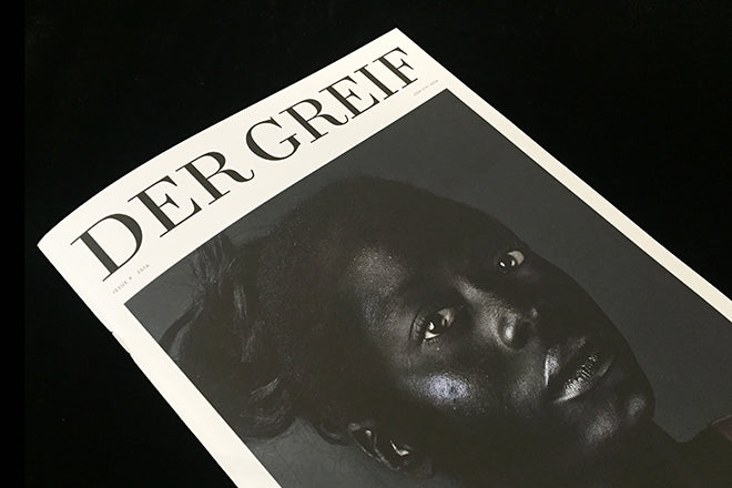
Der Greif #9
This German photography and literature title is consistently strong: I would go so far as saying it’s one of the most engaging and consuming photo titles around right now. In a time of so many photography magazines that simply lay out a selection of series against glossy pages and let them doing the talking, Der Greif is using the curatorial space of a publication to do something genuinely different and evocative. It’s layout and photographic juxtapositions take you on a journey. Der Grief doesn’t just showcase, it uses the white page to make connections between photos and words in unexpected ways, and it forces the reader to form intriguing insights and to engage, not just consume. Issue nine’s striking cover image is by Monika Krzynowek.
dergreif-online.de

Mincho #9
Barcelona-based illustration magazine Mincho has always been on-point in terms of the work it highlights. Its collection of articles centre on the best kind of drawing talent, similar work to what you’d find on a good day on It’s Nice That or inside Wrap, but the title also has a tantalising historical bent that contextualizes what’s currently on trend. The magazine’s let-down is its design: the highly grid-based and formulaic set up can feel quite restrictive and pare down what’s being showcased. Wrap sprawls and explodes – the illustration is given space to live as it cascades into a full-blown poster. Mincho could take some of the spirit of its content and apply the energy to its layout too. minchomag.com

Victory Journal #11
Always worth waiting for, the new Victory is tucked in here because there was little to add to what we’ve said before about it – we love it. The large format image-led sports mag is even more pictorial this time round, with highlights including a report from West Ham as the football team leave their old stadium, a lovely story from a US dog show and an attempt to explain the Thai game Takraw. There’s also space for ballet, volleyball (on the cover) and boxing. It’s all about scale — the pictures look fantastic on Victory’s large pages.
victoryjournal.com

Perdiz #7
The magazine dedicated to happiness looks at the theme of balance for its latest issue. Perdiz is consistently warming without being twee or sentimental: issue seven includes an interview with a hairdresser who trims locks with a Samurai sword and fire, there’s a discussion about death with the director of the Morbid Anatomy Museum, and an exploration of why roller-derby players ignore the negative connotations of injury and pain.
perdizmagazine.com

Formerly Known As Graphic Design #1
This small, crafted publication was the catalogue for this summer’s Central St Martins graphics degree show. It opens with an essay by new course leader Peter Hall that challanges preconceived ideas of what graphic design is today, then opens out into a well-presented mix of student work and thesis excerpts. Designed by graduates under the watchful eye of typography tutor Phil Baines, it reinforces my impression that the degree show was one of the summer’s strongest.

Water #1
Two new titles all about water have emerged in the last few months: there’s Italy’s Sirene Journal and now also Water Journal from London. The sentiment and idea behind them is strong – water is an evocative theme, it’s fluid and open to such a variety of interpretations. Yet this new London-based magazine has opted to simply look at the serene and still. Therefore the visual language is Cereal-esque, with lulling white space and hazy pictures that, quite frankly, don’t reflect the multitude of ways that water can inspire. There are beautiful shots and thoughtful articles inside the magazine, but Water still only skims the surface. I hope its next issue plunges into the depths of what can be done with the subject.
waterjournal.co

Revue #1
This chunky magazine has been sitting on the must-read pile here at magCulture for too long. Sharing a sense of scale and production values with fellow French title Shelf Journal, Revue is a fashion title that is a little too generic to my eye. The design is great, with smart typography (the lovely Vendome Condensed) and a good use of space and structure. It’s a confident first issue but I’d love to see a few more surprises in the imagery.

Four & Sons #5
Some magazines seem so niche you wonder whether they can survive beyond the first few issues, and despite the obvious global love of dogs and all things canine I wasn’t sure Four & Sons would make it this far. But here’s issue five and it’s going from strength to strength, more than justifying its place in the indie canon. Dogs seem to warm even the coolest person, and the magazine does the same thing. Well photographed, well designed and well produced, there’s always a few surprises. Eddy de Azevedo’s images of rubbish collected from beaches by while walking are an example how the link to dogs can be broader than you expect.
fourandsons.com

She is Fierce #1
It’s a brilliant thing that so many young women are sharing their opinions and thoughts in the form of zines like the 90s riot grrrl movement, but there is a danger – as there is with every movement turning to trend – that editors of these titles are simply jumping on the bandwagon and not contributing anything new or original to the genre. I like the girl gang that She is Fierce is forming and promoting – its decision is to showcase teenage girl writers, musicians and artists – yet I’m unsure that another illustrated guide to embroidering jeans or a semi-ironic powder pink colour palette is going beyond what Rookie has done so well for so long. That’s not to say that everything everyone does in the form of making a magazine has to be original to be worth reading – I would be very pleased if my teenage cousin was carrying around a copy of She is Fierce.
sheisfiercemag.co.uk

Gear Patrol #2
This chunky tome is a spin-off from the US website of the same name. It’s a curious mix, ranging from staple indie stories of travel and adventure to gadgets and technology of the type to be found in more mainstream men’s mags. It’s well put together, visually closer to the indie world with its matt stock and sleek design, and already selling well enough for the publisher to launch it in the UK with local printing.
gearpatrol.com