

June 2016
June was another busy month for new launches and new issues of existing mags. Here’s our quick overview of 16 that stood out for us. Includes: Cycling! Beer! Furniture! Irish photography!
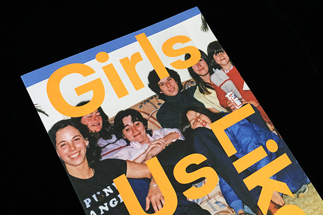
Girls Like Us #8
Amsterdam and Stockholm based Girls Like Us should be known as standing alongside Riposte in terms of being one of the very first of the new wave of women’s titles that are currently being celebrated. Each issue turns the spotlight on women from all genders within arts, culture, and activism, mixing politics with pleasure to map uncharted routes when it comes to feminist and post-gender thinking. Issue 8 is themed ‘Family’ and looks at different kinds of support structures—whether an Amsterdam-based queer collective or a family of artists/sheep-farmers. It should also be noted that Girls Like Us was amongst the selection of design winners at this year’s Brno Design Biennial too.
glumagazine.com/

The Eat Journal #1
Here’s another new ‘culinary culture’ magazine, this time from the makers of bi-monthly EAT Magazine. They’ve opted for a new size (to fit on your bookshelf), high quality paper stock and a design language that’s more in-line with pared-back, well-known indies. It’s another example of a long-standing title that’s drawing from the carefully crafted world of independents for its next publishing move. Issue 1 looks at food and dining in Victoria and the Vancouver Islands, aiming to provide readers with a look at what makes the area unique when it comes to gastronomy.
theeatjournal.com

Naked Punch #18
A heavyweight cultural journal that arrives in a pleasingly pamphlet-like newsprint format, Naked Punch is created by a global co-operative of editors and writers. Dealing with the intersection of philosophy, politics and culture it has a visual urgency that suits its punchiness.
nakedpunch.com
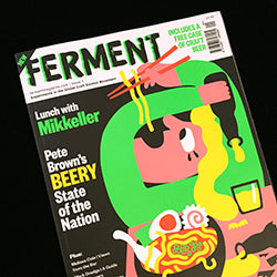
Ferment #1
What started as a newsletter for customers of weekly craft beer delivery service Beer52 has now become a printed magazine. While I’m not keen on the illustration on this cover at all, issue two shows a definite improvement. As Drift is for coffee fanatics, Ferment is a must-have for craft beer obsessives– a neat combination of in-depth brewery stories and the kind of illustration you often find on the labels of independently made beer bottles.
beer52.com

Junior #1
A recent Kickstarter launch from Ireland, Junior offers a series of six photo essays along the theme of Youth. Introductory notes to each story do a good job of contextualising the stories, and the layout is pleasingly unfussy and simple. I Particularly liked Nicholas Harur’s black and white shots of ‘our shared everyday trials and tribulations.’
facebook.com/juniorphotomag/

Girls Club #3
Gotta Girl Crush, Film Fatales, BBY and OOMK are current favourite, contemporary zines that centre around young women’s themes and topics, and now Girls Club is another London-based title to throw into the mix. The mag is all about the ‘quarter-life crisis’ and it delves into what it’s like being a 20-something woman today through illustration, creative writing, photographs and poetry. It’s got that hand-drawn, powder pink, 90s infused aesthetic that features in quite a few of these titles and is championed most famously by online Rookie magazine.
girlsclubzine.com

The Keep #0
This pilot issue of The Keep from Hay is dedicated to the Welsh marshes, so presents new work by contributors who live in these borderlands. The group of writers, artists, photographers, and illustrators making up Hay & Wye CIC are using the platform to encourage work by established and aspiring creatives in the local area. Aesthetically, the influence of Kinfolk and Hole & Corner is definitely present, with folkloric wood-engravings and marshy photographs giving the publication a distinct Hay-edge.
thekeepmagazine.com

Conquista #10
The venn diagram linking magazines and cycling already features a weighty overlap, and here’s another quarterly publication. Not the best-looking of the set, but clearly popular, Conquista covers club and group outings with detailed written and photo reports.
conquista-cycling-club.myshopify.com

Acquired Taste #4
This small-format Canadian food magazine defines its own approach to this common subject as ‘Exploring the human element behind food culture,’ which it does by interviewing chefs, restaurant owners, farmers etc. Having started in Toronto, the reach is now international and gives some insight into the food industry. It’s a useful and well-designed resource, but sometimes the interview format gets repetitive.
acqtaste.com

Pioneers Post Quarterly #3
This smartly designed magazine backs up an online project dedicated to socially responsible business, and is itself such a business. Packed with case studies from charities and other projects from across the world, it’s a really purposeful magazine.
pioneerspost.com

Backstage Talks #1
A few months ago we noted on the Journal that galleries and exhibitions were beginning to create magazines over traditional catalogues. Looks like conferences are catching on too: Bratislava’s By Design Conference have just released the first issue of Backstage Talks, a publication that showcases the conference’s speakers through interviews and brief overviews of work. This first issue features the usual design conference suspects: there’s interviews with Christoph Niemann, Erik Spiekermann, Brosmind, Jessica Walsh and more. I wonder whether this will be the first of many similar publications, especially in the realm of design festivals. It’s an interesting way of extending the topics covered during these talks beyond the realm of the conference bubble.
backstagetalks.com

Cactus #2
Cactus is a new title from Milan, Italy focusing on fashion, photography and visual arts that identifies as ‘geeky-bold’. It’s hefty, thick and matte, with lots of use of bright, unflattering flash and ironic looking models. The logo is strong but the execution doesn’t quite hit the mark for me; the title has its eyes set on a particular visual language and I’m looking forward to seeing it hone and refine it.
cactusdigitale.com

Mid Century #10
Designed by Simon Esterson and Holly Catford, the tenth edition of the quarterly about C20th modernist design is as smartly put together as ever. The design suits its subject perfectly, and with the seemingly ever-growing interest in the era it covers it’s maybe a surprise to learn this is its final issue. It leaves a hole to be filled.
midcenturymagazine.com

Eyesore #1
This university project about buidlings and spaces deals with the consequences of man-made environments rather than the usual narrative of design and style. It includes an intriguing icon and navigation system, and promises much for the next issue which is due later this year. Great name too.
eyesore.co.uk

C41 #2
Here’s yet another title from Milan, a photography magazine that takes a different theme for every issue. Issue two uses photography projects to explore the idea of the double (or the number two), and it also includes a wide range of photographic mediums including stills from video and gif.
c41magazine.it

Loupe #1
This frightening cover, from a set of images of clowns inside the issue, sets the tone for new London-based photography quarterly Loupe. It aims to be approachable and to have an ‘unpretentious’ style; this broad sensibility makes it a new platform open to a range of photography projects and submissions.
loupemag.com