

Kris Sowersby, type designer
As founder of the New Zealand-based Klim Foundry, Kris Sowersby has created a range of typefaces that are widely used in newspapers and magazines across the world. Founders Grotesk, Tiempos and Domaine are recent examples of his work that will be familiar to anyone working in publishing.

We invited Kris to select magazines from his collection in Wellington. As ever, we asked for a new issue, an old issue and another thing.

A new issue: Stemme
The Stemme website says: ‘Each issue hosts eminent and unexpected commentary from a range of design disciplines. We strive to probe beyond established design disciplines, challenging current design discourse and showcases projects, processes, and points of view.’
Stemme is only two issues young. I like its ambition. I like its severe design aesthetic, seriousness, and local remit. The production values are high across the board, which communicates focus and commitment. Furthermore, the accompanying website (designed by the renowned Sons & Co.) mirrors and complements the printed magazine perfectly. This is quite important to me, because it shows the cross-discipline understanding — too many contemporary magazines fumble the www aspect of their output.

An old issue: The National Grid
Over its eight-issue run, The National Grid billed itself as:
1: “A peripheral publication for graphic design”
2: “A provincial publication for graphic design”
3: “A PARANOID PUBLICATION FOR GRAPHIC DESIGN”
4: “A Frail Barricade for Graphic Design”
5: “A Colonial Outpost for Graphic Design”
6: “A maintenance manual for graphic design”
7: “A Civil Defence for Graphic Design”
8: “A catalogue for Design and Designers”
Clearly indicating the wide-ranging eclectic seriousness of Mr Valentine and Mr Wood as editors. It was fiercely local, but they maintained an outsider perspective. When the national design “discussion” maintained a business-centric client-focussed outlook, Valentine & Wood probed the outskirts of design culture. I was 25 when I got the first issue, not long out of design school. I didn’t quite understand it, I was baffled and intrigued by what it was, what it said and what it stood for. Now — 10 years later — I appreciate their stance and how it made me think.
Another thing: Helvetica and Times used in issue one of The National Grid.
National was one of my first typefaces, I didn’t know much and was very green. I was keenly interested in learning about typography and typeface design, filled with the unflappable zeal endemic to recent graduates.
During this time I got a copy of the first issue of The National Grid.
It was typeset in Times & Helvetica, incidentally pre-dating the “default” typography and contemporary resurgence of both typefaces. However, I was mildly appalled: how could such a New Zealand publication dare to use “foreign” typefaces? I used to imagine “accents” for typefaces: Caslon was British, Bodoni was Italian, Garamond was French and so on. I thought it would be nice to have typefaces with a New Zealand accent, something made by locals for locals. (This was actually part of the impetus for starting Klim in a wider sense.)
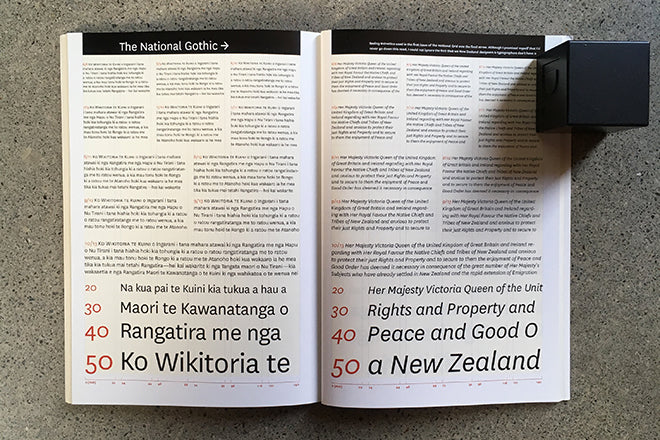
And, so, with these fevered thoughts I drew National. More specifically, National was drawn to be the exact opposite to Helvetica: looser spacing; old-style figures as default; unambiguous forms; shorter capitals; a “true” italic; smallcaps; angled Grotesk terminals. The general functional aim was to make something suitable for text at small sizes, something more classically “typographic”. The first specimen of “The National Gothic” appeared in issue two of The National Grid. You can see the clear influence of Jost Hochuli’s typeface specimen design — I had just managed to save up enough money to buy a new copy of his wonderful “Printed matter, mainly books” — which was the most expensive book I had purchased up until then.