

Libération redesign
Newspaper design has always been as polarised as the newspaper market itself in Britain, ranging from the carefully composed serious ex-broadsheets to the more free-form, populist tabloids. with little between. Nobody’s successfully mixed the two, even the shift from broadsheet to tabloid/Berliner format saw the serious press invoke rigid design formats and modular structures.
Many of these are fantastic designs – regular readers of magCulture will be aware how The Guardian continues to develop its visual identity across print and digital channels, with The Times and Independent not far behind. In Portugal there’s Publico, and I’m sure everyone can name an example in their own country. Meanwhile in the UK, the true tabloids continue their versions of Photoshop hell.
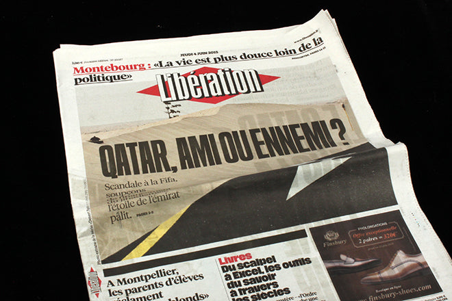
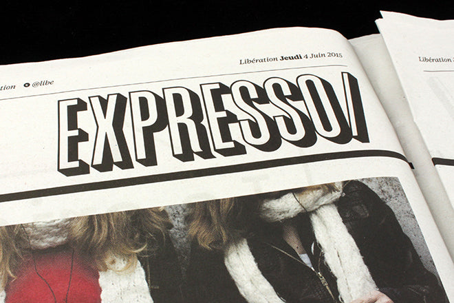
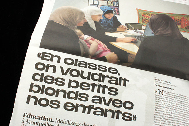
But take a look at the recent redesign of French newspaper Liberation. Here’s a tabloid-sized newspaper providing serious coverage but turning away from the rigidity of the newspapers we’ve grown to admire. Here is free-form design using spectacular (commissioned) typography and bespoke page layouts. There’s an excitement about the pages that shifts the look towards a more magazine-like look but retains a serious edges for news.
Check the images below – I think this is a real game-changer for newspapers, pointing the way to a more flamboyant gestural design that relies less on style sheets and more on story-based decision-making. I’m off to brush up on my French language skills.


Congratulations to design consultant Javier Errea (Yorgo Tloupas designed Next, an associated magazine). Read more here.