

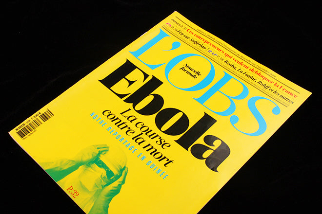
L’Obs

Newsweekly Le Nouvel Observateur is part of the magazine furniture of France; it first appeared (as france Observateur) in 1950 and has been through various identities since, before redesigning (under art director Serge Ricco) and emerging as L’Obs late last year.
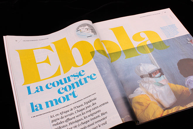
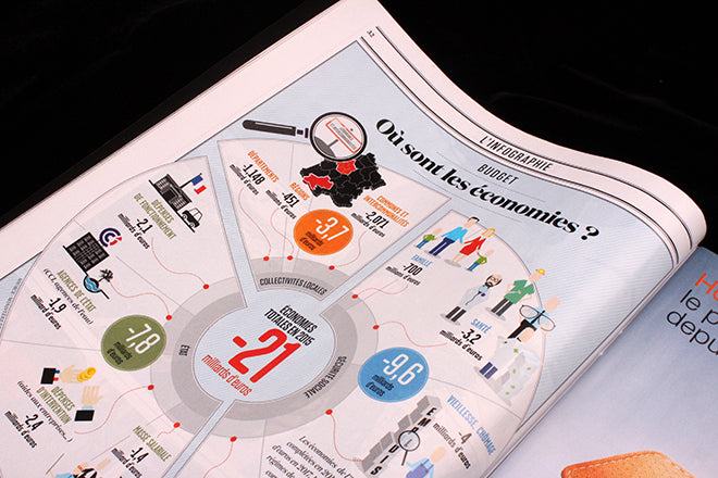
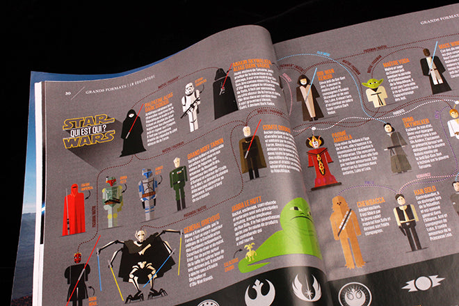 Serge has picked up on the future-retro look of other weeklies – New York magazine comes to mind – and cites US titles Esquire, Interview and Vanity Fair as other influences. All are visible in his smartly designed magazine. Popular contemporary fonts Domaine, Tungsten and Mercury are used heavily, adding to the transatlantic feel, although the smaller European-sized design team means less detailing.
 There are many creatively-led weeklies around at the moment; from the freemium giveways like Stylist and Shortlist in the UK, to the US giants like the New York Times Magazine. Add in IL from Italy and ZeitMagazin from Germany and there’s quite a range of magazines trying to present strong writing and imagery in well-designed packages. It’s good to see a publication from France jostling for room in the same space.
 Does it work? Serge has a mixed message abut French publishing, ‘We are in an industry that loses every day readers which requires us to be better for the future. Paper is not dead, it will be the ‘haute-couture’ of the magazine industry and internet the ‘ready-to-wear’.’