


Magazine of the Week: Avaunt #1
A new genre of independent magazine has quietly absailed into your local stockist: the adventure magazine. Bristol’s Sidetracked has led the stampede with its pure adventure experience, but this week Avaunt arrives with an altogether more reflective approach to adventure and adventurers. Launched by Port founders Dan Crowe and Matt Willey along with explorer Ben Saunders, it looks very much like Port, but feels more complete than that magazine.

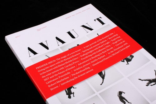
The similarities start with the stencil logo, and continue with a gentle entry into the issue via a reproduction of a funding letter to Sire Ernest Shackleton (above). Yet already you sense Avaunt has a more complete idea of how it future issues will pan out. I’ve admired Port’s refusal to do the obvious thing with its covers but at times this has led to some real stinkers of a front cover – for every Fergus Henderson turning his back there’s been a flat Esa Pekka Salanen. Avaunt promises its cover will be related to the theme of adventure rather than reflecting a particular story inside; thus freed, a single photographer/designer/artist will create a cover about their idea of adventure. The launch cover has Giles Revell’s photographs of a naked trampolinist flying through the air, expressing the simple thrill of unconstrained freedom. With the coverlines confined to a bright belly band the cover itself is freed to be plain and simple, yet the combination is compelling in colour and tactile approachability.

The same bespoke stencil font runs through the issue as the primary headline font for the major part of the mag (above). It’s also used as a page-height section divider (below) in another echo of Port. The headlines and numbers are at extremes – nothing is middling.

Overall, the magazine is refreshingly simple. The three numbered sections – Front, Style and Features – speak for themselves editorially and the design reflects this lack of complexity. A clear grid structure underpins the pages, with strong, consistent navigation and a clear hierarchy of elements down the pages. Just what you’d expect from Matt Willey and regular collaborator Alex Hunting.

Black text and red details (above) set the tone; everything tidily in its right place and order, full-bleed picture opposite, with neat sidebars offering brief stories accompanied by miniature diagrams from La Tigre (below).


This written content is occasionally punctuated with double-page images of adventure (above) or product such as high-end watches. Most of the issue uses matt paper stock; then the features launch into gloss and the pace changes drastically, shifting into a more free-form editorial experience, and again we find design similarities with Port – the new condensed headline face (below) a more finessed relative of Port’s early headlines.

If there’s a criticism to be made, it’s that for a magazine about adventure Avaunt is visually rather unadventurous; but in terms of considered editorial design we’ll be lucky to have another such finely tuned example turn up this year. This is classy editorial design, the content, design, typography and photography right up there with magazines of far longer standing.

Dan and Matt have clearly learned much from the first years of Port (and earlier on Zembla) and this is the result. Its arrival makes sense of the decision to move Port to a biannual schedule, (presumably alternating with Avaunt), and already there seems to be a clearer strategy and plan to the newcomer. This isn’t a quiet launch, it arrives full of confidence, bags packed and ready for a long hike – the issue features this ad (above) for the first ‘Avaunt Live’ event and they promise more online for their paid ‘members’. And that cover concept has already spawned a limited edition print version for sale online.