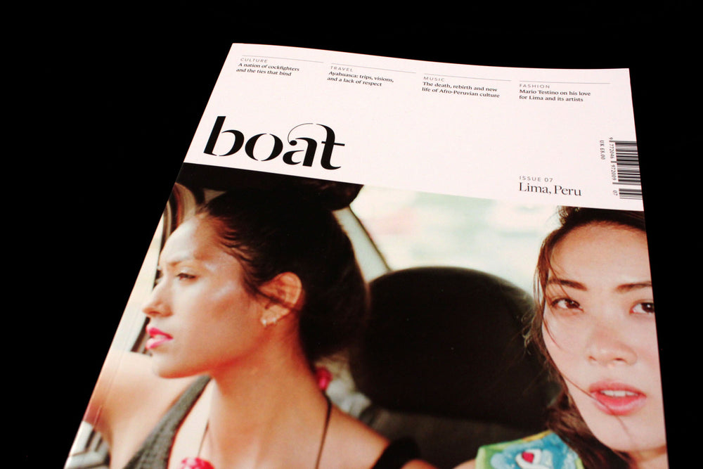
Magazine of the Week: Boat #7

Boat has long been a favourite project here at magCulture, for its ambition in setting out a brave new nomadic idea of magazine publishing. But this new issue, created in Lima, Peru, takes a huge step forward with a redesign that shifts the magazine into mainstream territory.

The growth in the global independent magazine scene has led to a certain aesthetic becoming the norm; there are more and more magazines being launched and inevitably certain themes and visual trends emerge. What was once different becomes copied, in a manner quite contrary to the reason for being independent. Centred lower serifed case logo – tick; uncoated paper – tick; title including the word ‘Journal’, ‘Quarterly’ or ‘Review’ – tick. You know the new clichés.
This is not to knock the many good titles out there that do feature these elements, and I’m not suggesting the previous iteration of Boat was an example. But I propose that from now on as many new indie mags as possible should avoid these common traits.

The new Boat slices through all this with a crisp new design (from She Was Only), varied papers and a clearer editorial intent – the cover explains so much more. The result is a more confident version of the old magazine which will stand out better and, I believe, appeal to more people. I love the colourful hand-painted headlines opposite clean white spaces and elegant typography. Great contrast, and a perfect context for the magazine’s photography and journalism about its host city.

The previous issues of Boat felt like a series of one-offs; the city was the lead. This new design puts the magazine itself to the fore.


