Magazine of the Week: Krass Journal #1

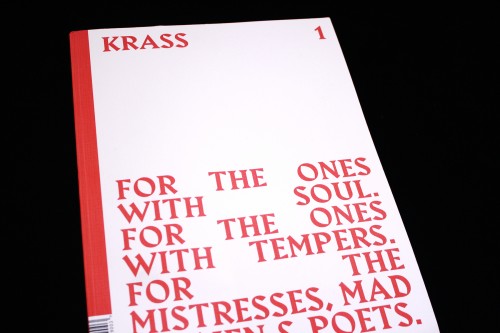
Any magazine that begins with a lengthy quote from Kurt Vonnegut has already got our attention here at magCulture. And this is how Krass Journal begins, a new art magazine from Australia that has quotes from the likes of Oscar Wilde, John Cage and Angela Carter at the start of articles instead of conventional, informative intros.
The magazine is dedicated to curiosity, to the idea of raising questions instead of pushing a particular point of view on a reader. The editors letter is confident and clear about this, stating: ‘At a time when knowledge is widely available – when you can Google answers to the most curious of questions – we have stopped asking them... Apathy dulls curiosity.’ In order to combat passive apathy, editors Sanja Grozdanic and Tess Martin have decided to fill the magazine with interviews only, asking questions in order to spark ideas and leave the reader guessing.

In an interview with model/ artist/ actress India Salvor Menuez from New York (above), India says something that particularly intrigues me and gets questions circulating in my mind. She writes: ‘I’m really interested in how culture is moving more and more to being more and more visual’ – these words seem especially resonant in the context of Krass. The publication has its own distinctive attire; celebrating visual culture not just with words but also typography and design. The layout is like an elaborate frame that champions the magazine’s text and images across its large pages.

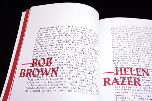
The red of the cover and striking serif are the ‘frame’, the main aesthetic that threads through Krass. The two elements take different guises, but are always present. Sometimes the font and the colour are used to enliven text-heavy sections (above). At other times, the two motifs are subtler: the red makes an appearance in a fashion spread (below), or it is used as the background colour of a feature (also below). The combinations are strong, confident and arresting, with words bleeding into images so that the text and photographs combine and are given equal weight.


For a small piece written by artist Yanyan Huang, her green artwork is juxtaposed strikingly with a shift to green headlines (above), so Krass doesn’t just engage in word-based dialogues but visual ones as well.

On the back cover the magazine brands itself as ‘Independent, ambitious, gracefully impolite’, and the artists showcased can be described by a combination of these words. Voices range from Catalan activist Enric Duran to Ana Kras, whose woven lamps have stolen the hearts of many design magazines recently (below).


One noticeable aspect of the magazine is its particular emphasis on showcasing female artists and voices, both historical and contemporary ones. An essay dedicated to Ella Fitzgerald is accompanied by a beautiful set of drawings by artist Iman Person, which explore the idea of gender and genius (above). Iman’s images respond to Ella Fitzgerald’s story, but they also deter from the narrative, and are infused with Iman’s own way of thinking. This creates a dialogue not only between image and text, but between a contemporary artist and one from the past.
Krass has a point of view, it is a magazine of many conversations, and it has a direct and emphatic voice that is expressed both visually and textually. It also raises questions that are not easily answerable with a Google search. And as this is their first issue, what I really want to know is: what’s next?
Design: Simon Pearce
Review by Madeleine Morley


