

Magazine of the week: Urban Pamphleteer

In 17th Century London, pamphleteering was rife, a way for Londoners to circulate subversive ideas through cheap printing technology. Pamphleteering took place on the street, it was radical and politically charged, a reaction to the aggressive Elizabethan exploitation of new media. Four centuries later, Urban Pamphleteer magazine is doing just the same, working in this tradition to confront contemporary urban debates and politics. Although it takes heed from a traditional format, there is nothing out-dated about the publication’s content or aesthetic.

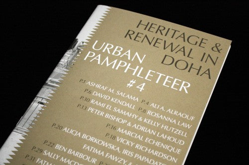
Guglielmo Rossi’s design is arresting: the text-based cover draws on old pamphlet design but have a distinctly contemporary finish through the use of colour and typography. Each issue is primarily black and white with an eye-catching third colour (covers, above).


The same colour acts as a highlighter for images (top), infographics (above) and text (below). The shiny gold for issue four is subtle but particularly effective, shimmering in the light and drawing your eye to key nuggets of information.


The way that the pages are formatted conveys the message at the heart of the magazine. Footnotes, titles, images and pull-quotes are in square boxes that intersect the text of the essays (above). For a publication that encourages urban interaction between the streets, the buildings and the people of a neighbourhood, this design makes a lot of sense: the layout is like a complex but perfect puzzle where each square section comes together harmoniously.
An essay on railings in issue two is particularly thought-provoking and its message spills into the design. Matthew Ingleby contemplates the way that railings are seemingly transparent spaces that historically were used as barricades between those who could enjoy private gardens and those who couldn’t. If rails and walls are ways to separate spaces and people in a city, Urban Pamphleteer’s design is similarly opposed to lines that separate or divide on a page. The puzzle-like layout ensures that all sections of text are integrated, in the same way that the editors argue for the city to become more connected.

Occasional variations and inverse colour motifs for spreads are also effective for conveying a feature’s content. A piece in issue four on how streets drastically change after refurbishment is faded and it is difficult to see the images clearly (above). The design evokes the dust of construction work and the old street fading away from memory and existence. A piece in issue three on a community reclaiming a football ground claims the page as its own through graphically recreating the lines of a pitch (below).

In the 17th Century, pamphlet writers would use language that was easily accessible so that all sorts of readers could understand the radical ideas printed on the page. 21st Century Urban Pamphleteer uses design as a universal language to convey and emphasise the information in the text. Their visual eloquence is why Urban Pamphleteer is our Mag of the Week this week: it’s the kind of publication that you wouldn’t say no to if it were being handed to you on the street.
Review by Madeleine Morley
ucl.ac.uk/urbanlab/research/urban-pamphleteer