

Mark Neil, Time Out
Just over three years ago, the London edition of Time Out joined the ranks of free magazines distributed at the city’s train stations. As it has adapted to this new model it has gone through various changes, the latest and most dramatic of which launched last week. This redesign sees significant editorial and design changes; it is crisper, more colourful and spacious. We last met art director Mark Neil when he was designing NME. We catch up with him again as his new design settles into its second week.
Where are you today?
I'm on the platform of Streatham Common station debating if I should stop for the tube or go to Victoria and do my walk through Green Park. Think it's a walk day. I'll walk past Buckingham palace and photobomb another 3-5 tourist's photos. I've been all over the world - in everyone's holiday snaps.

What can you see from the window?
When I’m there, I'll see Charing Cross road and Soho. Later, I'll probably be blinded by some sun and it's the ritual "blinds down" and all I have is Tom's (Havell, senior designer) chilli plant to look at.

Are you a morning or evening person?
Evening.

Which magazine do you first remember?
In terms of complete magazine, it would be Raw. I have faint memories of football magazines Match and Shoot. Garfield magazine. Before that, it was comics: Dandy, Beano, Transformers, Action Force (I never call it GI Joe)

Photo illustration Justin Metz
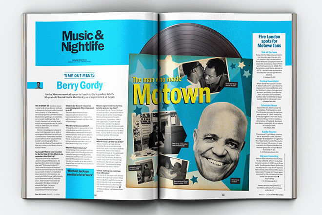
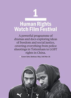
Tell us about last week’s redesign of Time Out.
It centres on better use of layout with colour, space and typographic detail. Caroline McGinn (editor-in-chief) and I wanted to make it quicker and simpler. If this is a magazine, then lets make it more like a digestible magazine and less like a difficult, hectic guide. Hierarchy of content is key. We had to bring better definition to quick bite-sized pieces of content and add more depth to the longer reads.
Design Tim Clark

Design Tim Clark
 Design Tom Havell, illustration by Matthew Brazier
Time Out is not just a listings magazine anymore. We needed coherency to the look, feel and content across all platforms. It was decided the London and New York titles would launch simultaneously. Carla Sosenko (Editor-in-chief) and Tom Hislop (creative director) of Time Out New York, did a brilliant job taking our philosophy and template and adapting it to their magazine that has a different page format, different content decisions, different editorial teams etc.
It's incredibly difficult to manage. It's constantly developing for both of us but its better to let the editions fly and see what's working and what's not. I'm glad we're past the dummy stage. It's best when you're working on real, live issues. It'll take time for us both to find our feet with it.

Things are going wrong all the time. My colour profiles don't work for different platforms. The first advertising cover wrap arrived in our brand colours making me change the design of the front cover last minute. Last week, section openers changed last minute on press day... we'll get there. I've got a great team supporting me:
Anthony Huggins (brand creative director, hides under desk a lot, you've not seen him, right?)
Anamaria Stanley (studio manager, designer, oracle, rock, everything)
Tom Havell (senior designer, likes to talk (a lot), presently moved from mouse to "place mat")
Tim Clark (designer, the best goalkeeper ever, in the world, allegedly, ever, forever-ever)
Ben Rowe (pictures, cool dad, magic hair)
Rob Greig (photographer, Time Out legend, leaving soon, I'll miss him)
We all collaborate. Everyones involved in cover ideas, illustration commissions and so on. It works like a studio and it works best that way.
A big part of the new look is this poster-like aesthetic to the content. I've always loved this painting by John Parry, ‘A London Street Scene’ (circa 1835-40, below) It inspired my thought process for the project.

"How can I make the content look like posters without it looking like a complete mess?" I thought. Hopefully you can see how the design stems from that idea. Or maybe you can't. Maybe I'm just bonkers...
You even managed to change the logo!
Funny you should mention that. The new logo is part of the wider brand relaunch that Anthony overlooked with agency Adam&EveDDB. Merchandiser feedback tells us that the masthead wasn't legible enough on the street and could have affected pick-up. This doesn't mean we can’t use black. There are generally no restrictions to our cover logo options - black background or transparent . In this case I guess we could've made sure the background image was darker - but this one was all about the sun coming out... and the sky had to look bright... and we wanted it to look new... anyway, I just hope it brightened up a dreich Tuesday morning for folk.

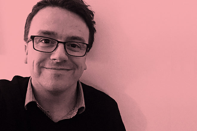
Portait Rob Greig
You’re just completing the second redesign issue; any subtle shifts after the first one?
It went to press Friday and guess what? There’s a black background on the logo! We had those last minute changes to deal with. Once I'm in we'll be looking at what we need to improve on this week. Hang on... I've just realised we changed the section title of Eating to ‘Food’. Ha... I can't keep up!

Design Tim Clark
You've developed a bit of a speciality for the weekly mag, first with The Big Issue, then NME, now Time Out. Can you imagine working to a more leisurely schedule one day?
It does keep you on your toes but yes, I can. Very much so. Gardening? Dog walking..? Give me a call.
What are you most looking forward to this week?
The EDO talk with David Hillman and Harri Peccinotti; the delivery of a lovely chair me and Mrs Mark Neil have just ordered. And the next ‘subtle shift’ in the design.
What are you least looking forward to?
The next ‘subtle shift’ in the design.