

mono.kultur #40
Editor and publisher Kai von Rabenau brought a copy of the freshly printed mono.kultur number 40 to my studio recently, a beautifully minimal issue featuring the great ceramicist, artist and author Edmund de Waal. As always, although the new issue is that staple mono.kultur A5 format, the frothy white aesthetic is in sharp contrast to the last issue’s design, which was back-to-front and an evocative black and hot pink to reflect its interviewee. The design continues to draw poetically from the work of the person being featured, so issue 40 is soft, white, understated, and deliciously precise.

This design, by Copenhagen-based studio Designbolaget, makes a subtle yet striking use of paper stock. Photographs are printed on a glossy stock while text sits elegantly against matte. This suits de Waal’s work and its material quality, specifically the way that the interior of a ceramic might have a different texture to the exterior, which will often have a soft, glossy glaze.


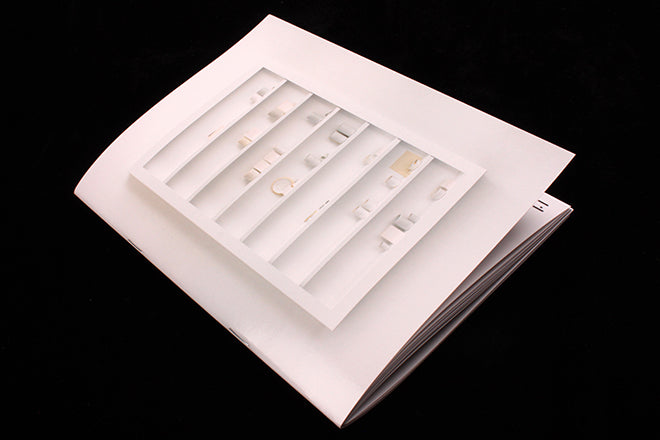
The entire issue is structured as an A-Z, an idea born from the two interlinking strands of de Waal’s practise—writing and making. These themes have an enticingly abstract quality to them, I is for idleness, for example, Q is for quotation, and Z is for zone. As the issue’s writer, Mareike Dittmer, explains in the introduction: ‘Questions around keywords, concepts and affinities almost naturally suggested an alphabet as an alternative approach to the world and work of de Waal, an indexed stream of consciousness that could embrace both his words and his vessels.’

There will be more on the magCulture Journal very soon about the new mono.kultur, but how and why is still a secret. What I can say is that Kai discussed the issue in depth with us, and revealed how it was the very first issue in the 10+ year history of mono.kultur that ever had to be re-printed (the initial choice of paper stock was simply too delicate). Now that it’s finally finished, it’s another flawless issue from a publishing venture that’s had a flawless concept and vision from the start.