

Monocle, redesigned
Monocle is such an ever-present item in magazine-land that it’s easy to take it for granted and look past it at shinier, newer publications. Yet despite much cynicism at launch — one commentator comparing it unfavourably to Condé Nast’s hugely hyped but short-lived Portfolio business title — this week it publishes a special 300-page 10th anniversary issue.
Over those ten years it has focused tightly on print, founder and editor-in-chief Tyler Brûlé not only resisting the temptation of digital distraction but actively arguing against iPad apps and social media. Instead, the company launched its Monocle24 digital radio station, cleverly investing in a state-of-the-art sound studio rather than throwing money into an ill-fated app. This distinct positioning has been backed up by Brûlé’s support for smaller indie magazines. For all these reasons we are marking the birthday by highlighting Monocle as this week’s Magazine of the Week, just as the magazine itself celebrates with its first significant redesign since launch.

Redesigns are often contentious; if you tear everything up you upset one set of readers, if you don’t change enough others may be unhappy. It’s fair to say this one is destined to fall in the latter camp, at least at first glance. ‘The aim was to offer a significant editorial update without stripping out the original design values,’ Brûlé explained to me earlier this week, ‘we started out small but as we went through every section we realised it was a much bigger task.’ The result is a cunning balance of familiarity and change. There are new sections and paper stocks, yet the general graphic identity feels very much the same, with the same fonts (but fewer) and the familiar, retro children’s book illustration style. A single piece of reader feedback came into play — the text font size has increased slightly, ‘Beyond that we weren’t swayed by much else,’ says Brûlé.

Creative director Richard Spencer Powell oversaw the project alongside Brûlé and editor Andrew Tuck. According to Powell, after 10 years, ‘Certain processes and work schedules were forcing the magazine to feel a certain way.’ This is a common problem, todays systemised workflows allowing little room for a more organic reorganisation. He started thinking about the redesign last summer. ‘The photo team were assigned with finding a new roster of talent and a new aesthetic. The same for illustration, and once I was ready with the grid and general direction, the design team were set to work on live layouts from the start of the year.’
Had he wanted to make a more dramatic statement of change? ‘There was a trim size change I suggested, which would have been nice to get through — but maybe we’ll use that for another project.’ Instead, it’s that point size change and the new grid that will be seen as the primary focus, and Powell highlights his hopes the grid will inspire a change of approach, relying less on templates to ‘make sure that we are really crafting a new issue with new content each month. We are being braver about showing less.’

This is the main feature of the redesign. Monocle has always been remarkably consistent in its fullness. Every inch of every page felt packed with different type styles and devices, such that despite their commitment to print the pages sometimes suffered from a need to feel almost web-like. The devices overwhelmed the content. The new issue is notably emptier. ‘There are far more objects that sit off of the grid, so that may have opened areas of white,’ says Powell, as he mentions he’s just briefed his team to create more such space in the next issue.

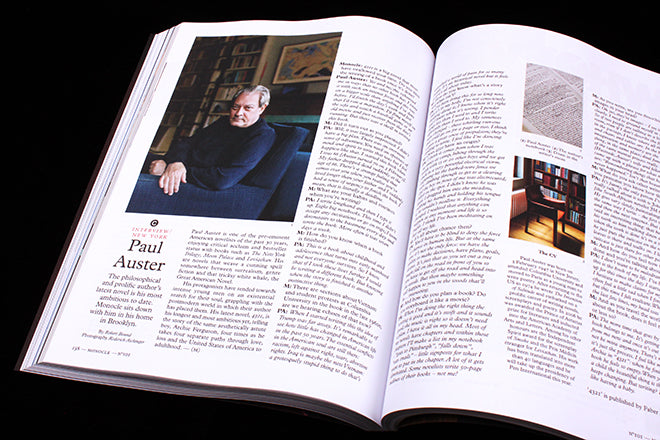
At launch Monocle used many book techniques — standfirsts were labelled ‘Preface’ and the five main sections heavily tagged A / B / C / D / E. With the addition of F (for Fashion), this structure has been extended but also dropped down in importance in the hierarchy. It’s still there, but the full names (Affairs, Business, Culture, Design and Entertaining, previously Edits) lead over the alphabet tags. This improves the flow of the magazine. And features are longer, which helps too, ‘We wanted to to tell stories with less images and more words,’ says Powell, ‘it’s always tempting when you have good original photography and additional information to try to fit it all on, but it was time to change that pacing slightly.’ There are still some very packed pages but even these are less cluttered than before (below).


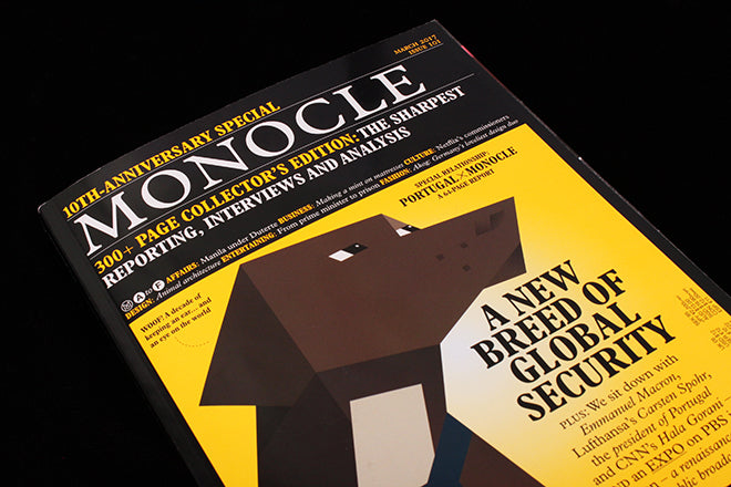
This less-is-more approach is reflected on the front cover, where a significantly larger logo and bolder lead headlines serve to make a bolder statement. As Powell explains, ‘I’m a firm believer in celebrating the cover lines. The typography should be something to be proud of not removed for a subscriber-only edition.’ For me, the cover is still Monocle, to the extent some readers won’t notice the change, but it’s been turbo-charged, as is clear in the comparison above.
I asked Brûlé how happy he was with the new issue, and is reply was a simple, ‘Very.’ And Powell? ‘I’m pleased with the result and I really like the spirit of the cover. But the work isn’t finished, its a project not just a single issue or moment. I’m looking forward to getting going on the next issue.’
This is a successful and subtle redesign that builds on the magazine’s strong identity while dismantling some of its more easily copied elements. My initial reaction was that the layouts felt a little rudderless, but I soon got used to the relative lack of decoration and enjoyed reading the longer texts. The design feels satisfyingly more open, and I’m keen to see how the team take advantage of the looser grids in future issues.