

Notes from The Modern Magazine conference

A week ago today, magCulture’s The Modern Magazine conference took place at Central Saint Martin’s, London. Here’s a summary of the day along with my intro, links to other reports and a set of pictures I hope give an overview of the day.
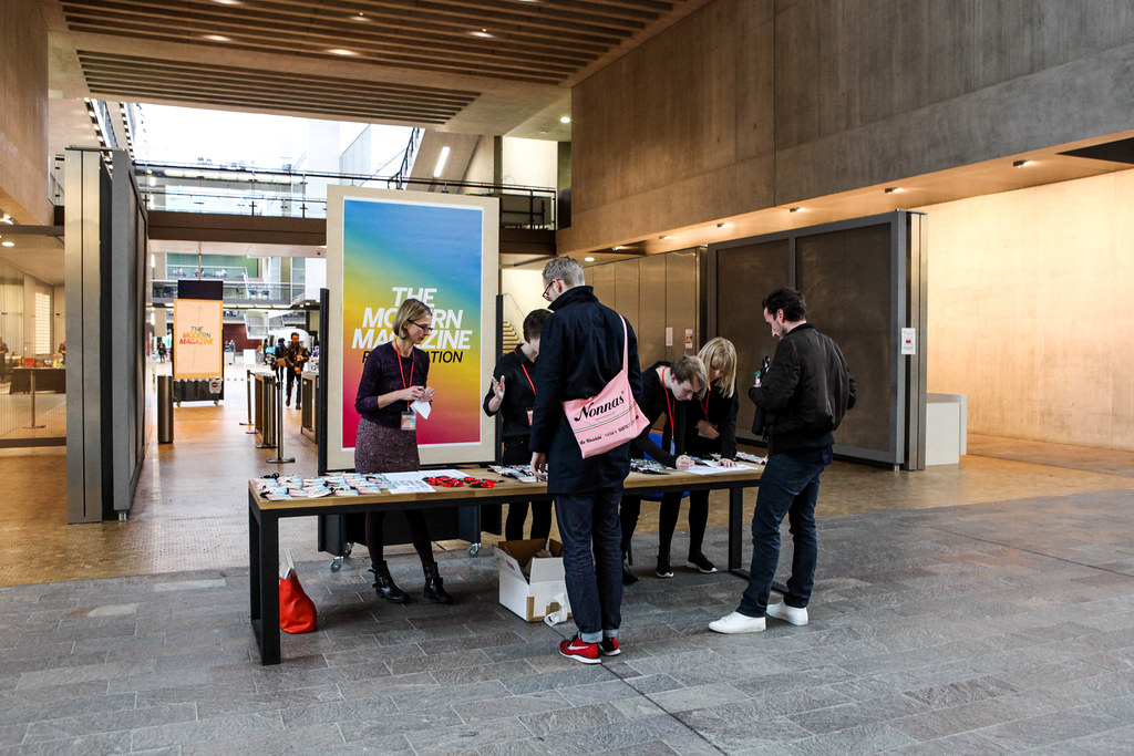
Registration

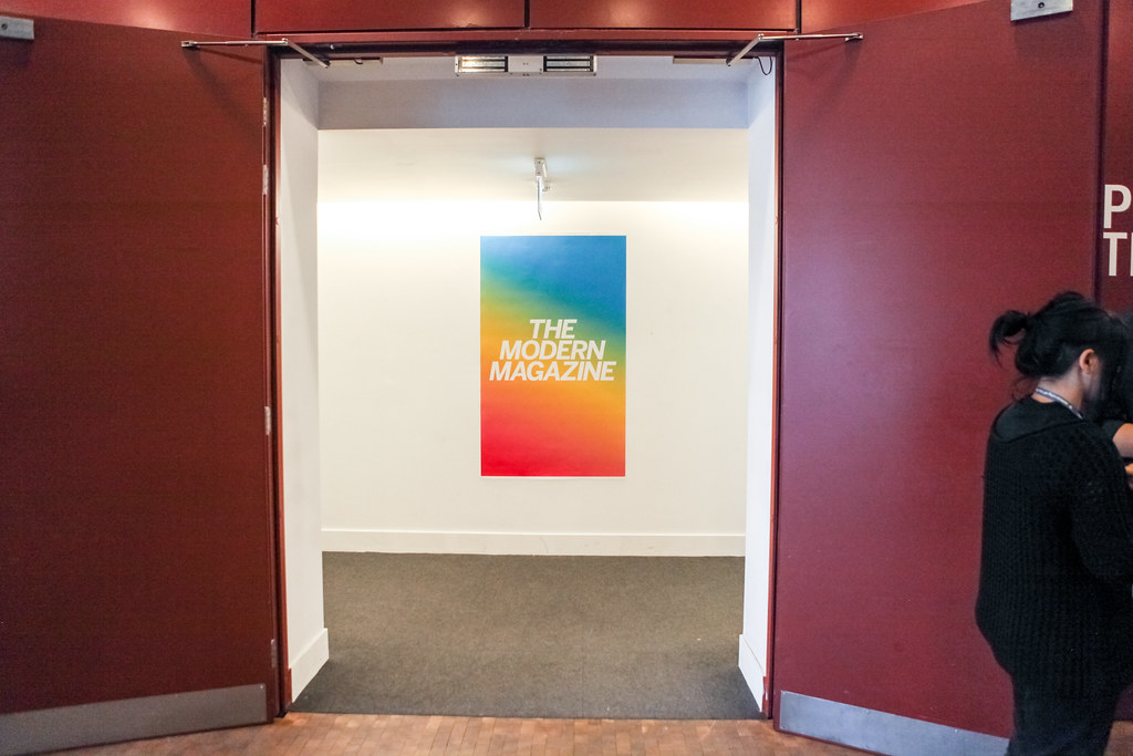
The approach to the Platform Theatre

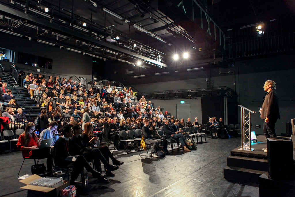
The foyer – the 200-strong audience was a 50-50 student/professional split
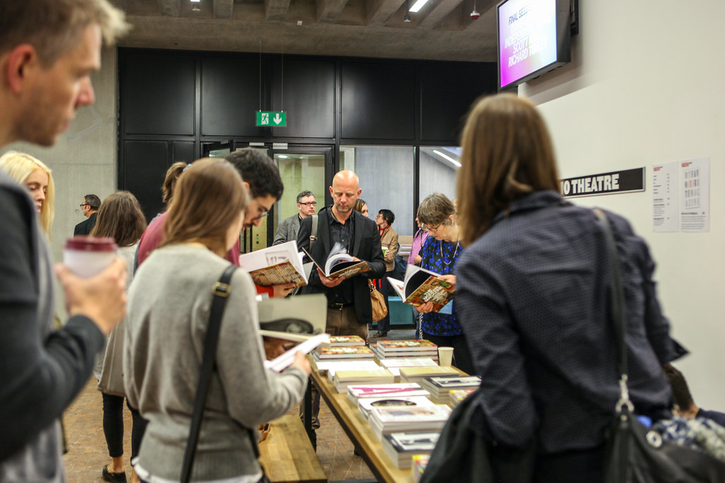
The magCulture shop, selling the independent magazines represented on the day
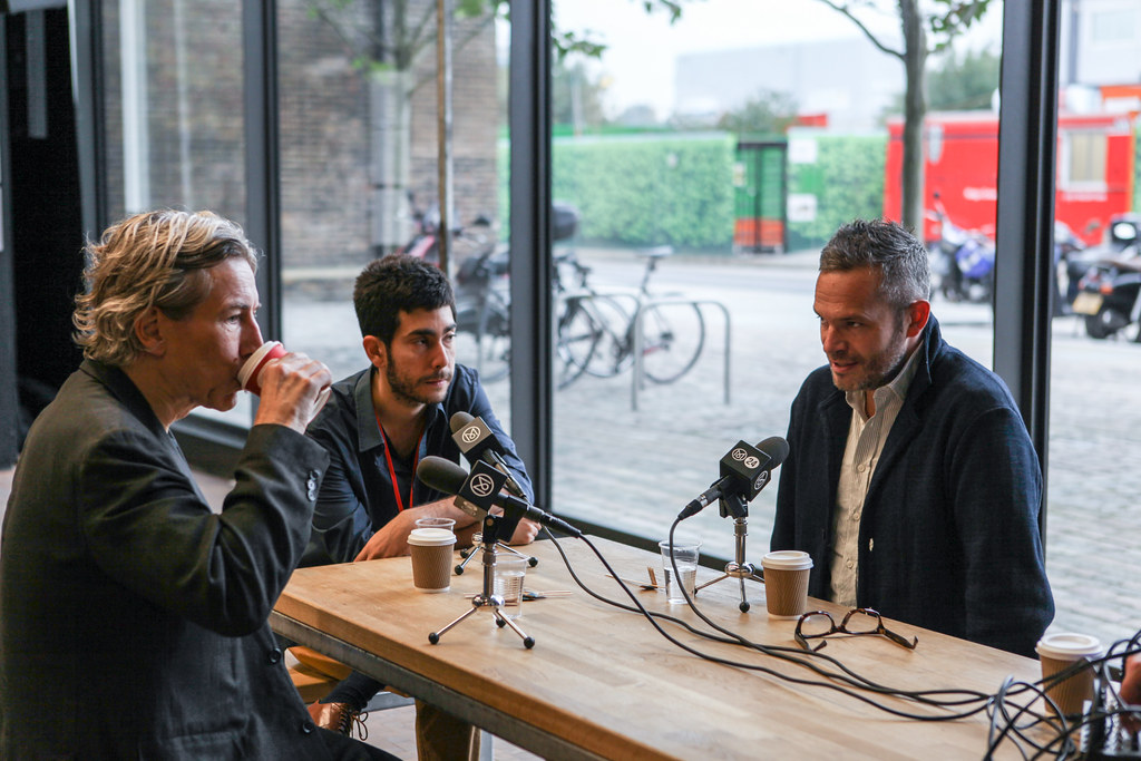
The pre-conference roundtable discussion between myself, Omar Sosa of Apartamento and Tyler Brûlé. Hear it on The Stack
Entrance to the auditorium
A summary of my introduction to the day:
‘I’ve tried to programme this day like a magazine, with pace and a mix of longer and shorter sessions. It’s designed as a celebration; too often we as magazine makers are on the defensive. So why not sit back and see and hear from some great achievers in our industry? Let’s celebrate them and their work.
The day also marks the publication of my book ‘The Modern Magazine’. The last book I wrote came out almost exactly ten years ago. I revisited that book, ‘magCulture’, before I started this one. I was surprised to find myself even then dismissing the end of print, and noting the rise of the independent magazine.
So here we are ten years later, and the same things might be said, except that judging by my daily post-bag there are more independent magazines than ever joining the shelves. So I wanted to make a bigger splash with the launch of this book.
The title ‘The Modern Magazine’ was a key part of the project for me, and is why today’s conference and the book share it. I wanted to draw a line; to move on from earlier discussion of the end of print and start dealing with the plain fact that print was here to stay, and that digital was a partner not a competitor.
For me, ‘The Modern Magazine’ is an affirmative statement about magazine making. It makes the case that the magazine is a contemporary medium with a valid role in today’s world.
It’s usual at publishing events like this to dedicate a session to intense discussion about tablets and digital channels. I’ve deliberately avoided allocating a special part of the schedule for that. With the exception of one speaker who specialises in iPad apps, everyone here today works primarily in print. This is not avoiding the issue; rather, I’ve briefed the speakers to mention digital along the way, as we all should be doing day to day.’

Apartamento’s Omar Sosa spoke first, speaking charmingly about the magazine he co-founded seven years and 11 issues ago. He talked easily through the origins of the magazine, sharing the original dummy he and Nacho Alegra created and discussing their desire to reflect real living. Theirs is a simple, strong story that introduced a key theme of the day – not being worried to take on the perceived wisdoms of the industry. He contrasted over-styled room set-ups from traditional interiors titles with shots of the real, lived in rooms which inspired Apartamento, highlighting how an unmade bad can be more engaging and beautiful than a neatly prepared one.

Rosa Park being interviewed for The Stack
Next up was the first of five briefer talks by smaller, independent publishers. I first met Cereal founder Rosa Park at a Printout evening earlier this year and was struck then by the drive and ambition she exudes. Her talk here reflected the magazine: a highly focused vision was balanced by absolute passion for what she and creative partner Rich Stapleton are doing. She thanked the influence of her travel agent/foodie father for her decision to make a magazine about food and travel, and reminded us that the quality of writing mattered as much as the presentation. Given the self-evident importance of art direction, design and production to their magazine this is worth highlighting – the content matters. As well as discussing further plans for the Cereal website, she also revealed the upcoming launch of a new paid-for travel website, while confirming print remained central to the their thinking, ‘for it’s gravitas’.
After less than a year and with issue four only just published it’s remarkable that Cereal already feels like a mainstay of the independent scene. Rosa is typical of the more entrepaneur–like approach being taken by young publishers as they produce magazines that make an economic strength of their creatively led approach. Which leads us nicely to the next speaker.

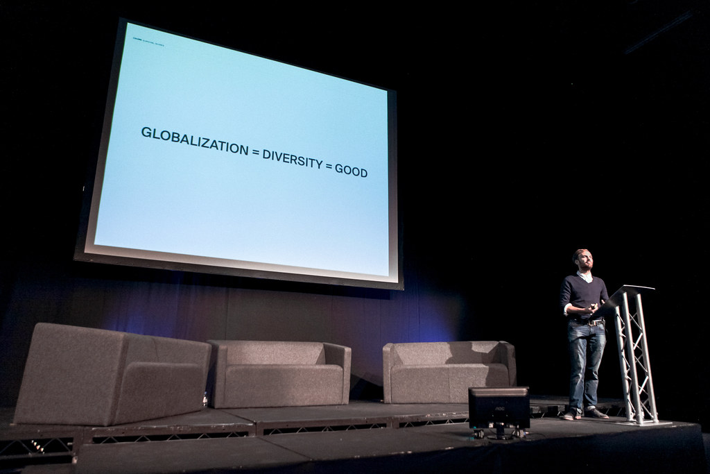
Tyler Brûlé presented a refreshingly open overview of his Monocle empire, using the story of the magazine and its many associated strands as a base for explaining his belief that the mainstream publishers lost interest in print a decade ago. His description of the gradual strangling of creative businesses by successive consultants and VCs had a familiar ring, and I loved his notion of ‘the consultancy of common sense’ as an alternative. He spoke against the focus group, while reminding us to listen to our readers – a subtle but essential difference.
Despite speaking from a more strategic point of view than the earlier, creatively orientated presentations – just as I was beginning to think we weren’t going to see a single spread from his magazine we did see a few – Tyler had exactly the same message: define your vision and stick to it.
Perhaps the best example of this is Monocle24, the digital radio station launched two years ago. Following a successful earlier audio project (he dislikes the word ‘podcast'), the radio station was devised as a cost-effective digital alternative to making an iPad app (the cost of their radio studio matching that of launching an app). He also pointed out that sales of their branded goods – collaborations with favourite brands on baggage, clothing and even radios – are far more than just a sideline, accounting for a remarkable 25% of Monocle’s turnover at Christmas.
Tyler ended with the news that Monocle24 planned to move into radio drama, emphasising an earlier point that his first love was broadcasting.

After the break the audience returned to hear Simon Esterson give an overview of his graphic design magazine Eye. Esterson was art director on the original launch of the title, since when he had moved on and the magazine had been passed from publisher to publisher.
He and editor John L Walters now own the quarterly magazine, and Simon spoke strongly about being able to make key creative decisions without interference from others. His story of production meetings at which dummy editions of Eye printed on thinner (cheaper) paper were presented to nodded approval by publishers provided keen insight into the cost-cutting that has forced magazines to become commodity products. He and John can now decide to mix paper stocks, add foil block, and drop in a gate-fold without reference to others – ‘completely irresponsible behaviour,’ as Simon put it. Although covering a relatively specialist subject, Eye remains a benchmark for production and print quality.

Justine Picardie has had a successful career writing for, editing and launching a whole range of magazines – her first was made with her sister when they were children. Her latest project is the reinvention of Harper’s Bazaar, a job she took on a year ago with Marissa Bourke (ex-Elle) as her creative director. The two had been working on a possible launch at Hearst (rumoured to be a UK edition of Town & Country) which came to nothing. Instead they were offered the roles on Harper’s. Justine spoke without notes for 30 minutes, describing the importance of her working relationship with Bourke and their shared interest in reviewing the magazine’s vast archive. Although less well-known (and less exploited) than Vogue’s history, the magazine has a similar history of illustrated front covers, brave photography and commissioned writing from name authors.
Justine expressed the same passion for her magazine as the other speakers, but shared the problems of getting things done her way within the corporate environment of Hearst Magazines. She noted how her famous predecessors on the US edition (editor Carmel Snow, fashion editor Diana Vreeland and art director Alexey Brodovitch) managed in the same environment.

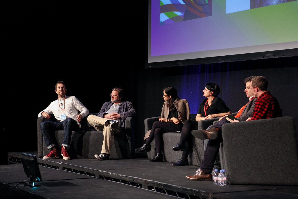
Justine’s talk opened the way for a more general discussion of women’s magazines. This huge part of the magazine industry rarely surfaces at events like this – not so much maligned as just plain ignored – and several recent events encouraged me to schedule a group discussion: Port’s naive all-male ‘Golden Age’ front cover from a few months ago, the planned relaunch of Spare Rib (which has subsequently arrived as Feminist Times) and Elle’s recent ‘Rebrand Feminism’ campaign.
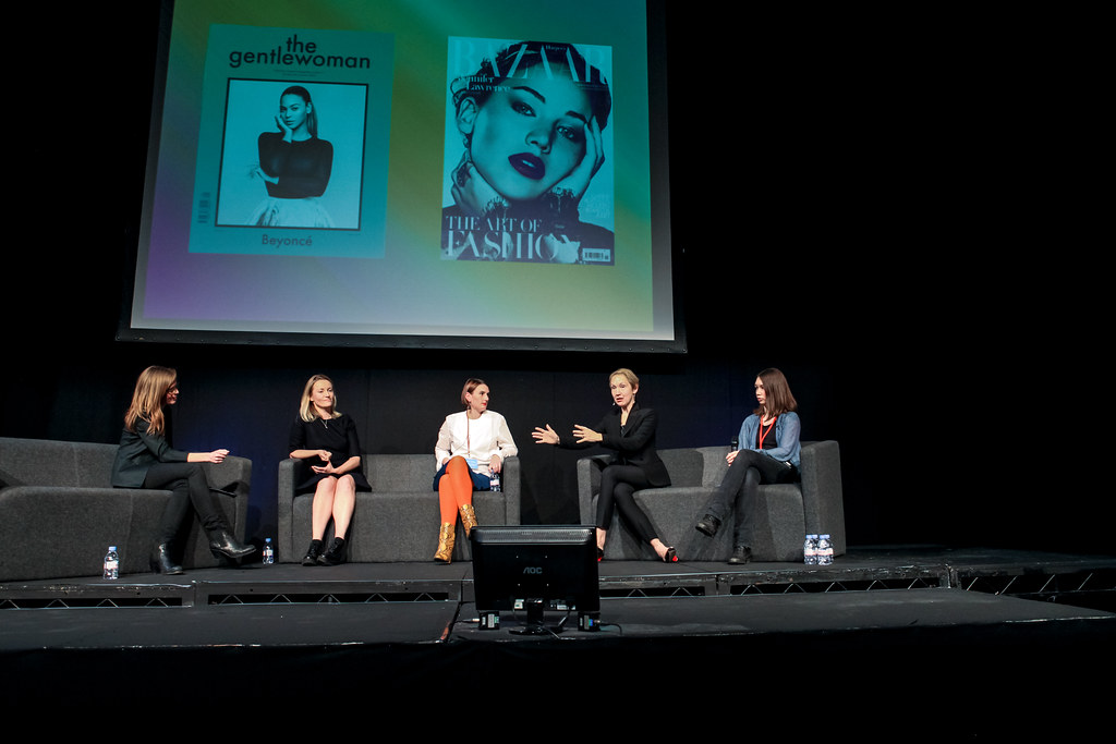
Joining Justine were (from left) Kati Krause (chair), Penny Martin (The Gentlewoman), Debbi Evans (Libertine) and far right Liz Ann Bennett (Oh Comely).
Sometimes panel discussions can be a little safe and over-friendly but what followed was a healthily contested opener for a longer future event. Penny and Justine dominated, as befitted the reach of their magazines, and although polite there was an undercurrent of mutual frustration with the other. Penny stressed her lack of magazine experience and the freedom that gave her, while Justine continued her theme of working within what’s possible in the corporate environment. And between those two extremes Debbi and Liz pitched in with comments on fashion, self-image and the relevance of feminism.
The main discussion centred on what is a women’s magazine? We didn’t get a solid answer but even among this group from relatively similar magazines – they’re all alternative to some degree – there were differences, something Penny highlighted as a positive, in the process quashing one of the most common put-downs, that women’s magazines are all the same. One thing everyone agreed with was Penny’s description of her magazine as an oasis for reading, ‘It’s amazing how many magazines are not made to be read,’ she said, before stating ‘It’s an obscenity to make a bad magazine.’ I could hear the amens around the room.
A further detail that sticks in my mind is Penny’s point that although her magazine is in effect the woman’s version of Fantastic Man, it can’t actually be so because that magazine takes a lot of inspiration from fifties women’s magazines. I hadn’t made that connection before. I appreciated Fantastic Man refers ironically to another era in its tone but it is women’s magazines and not men’s titles it uses.
A women’s magazine based on a men’s parody of an earlier women’s magazines would soon trip up on itself.
Our third indie speaker was Davey Spens, creative director of Boat, who outlined the thinking behind the magazine, explaining it came about in response to a quiet period in the Boat Studio design agency he runs with his partner Erin. They headed off to Sarajevo to make a magazine. ‘An antidote to lazy journalism’ was an early subtitle they used, describing their hope to discover the reality behind their (often troubled) host cities.
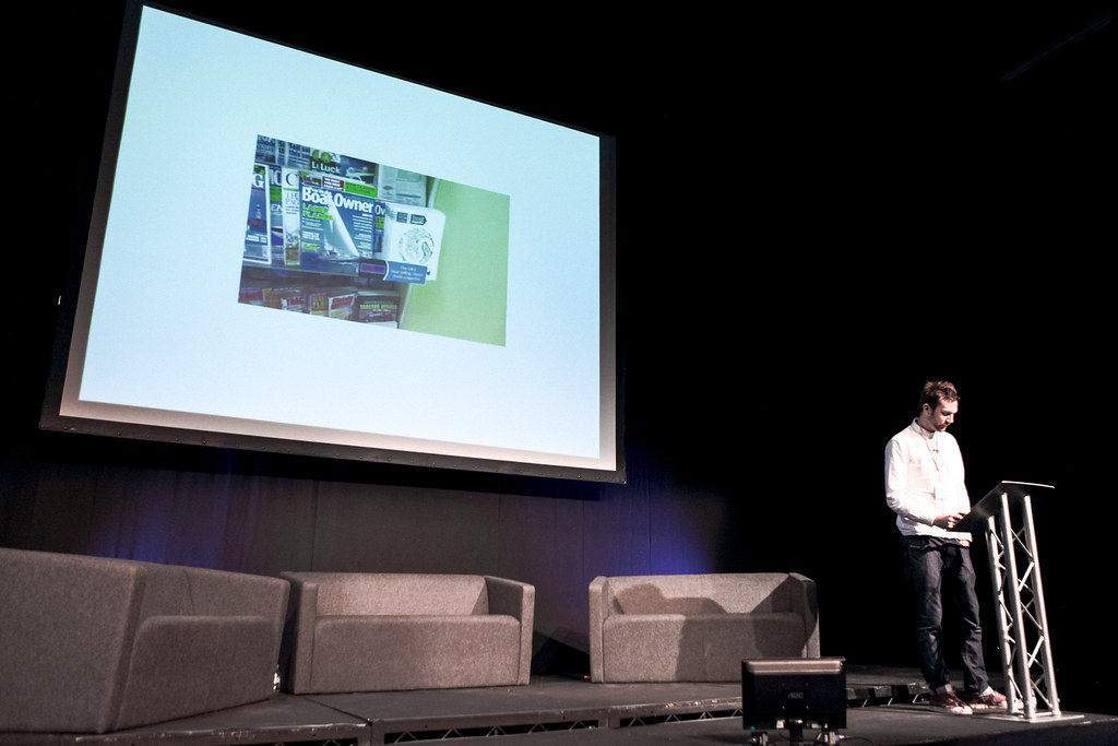
One result of their initial naivety of the publishing process was that the name Boat meant their magazine was displayed in shops alongside other boating magazines (above). But the magazines themselves are anything but naive. The five issues to date (Sarajevo, Detroit, Athens, London and Kyoto) have established a strong voice combining local and imported writers and photographers.
Davey and Erin are just back from Reykjavik and will have that issue out next month. A transcript of Davey’s talk can be read on the Boat site.
I first became aware of Patrick Waterhouse’s reinvention of Colors when I saw him speak in the Netherlands a couple of years ago. It was a lovely surprise to discover a renewed vision for what was once an essential magazine, and to hear that vision presented with such clarity and wit. So it was a pleasure to see him update that presentation to include the excellent Making News edition and the just-published Looking At Art issue. Patrick’s a natural storyteller, and that shines through his magazine, where he’s moved from creative director to become editor-in-chief.
We’ve just received stock of the Art issue for the magCulture shop.
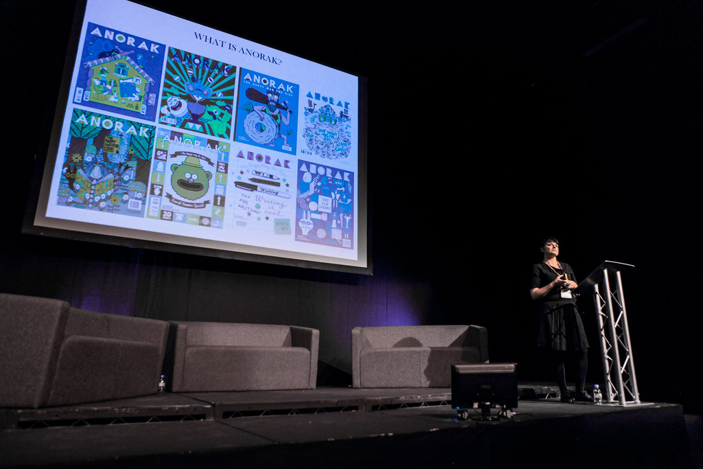
The fourth indie mag was Anorak, a fixture on the independent publishing scene since 2006. The ‘Happy Mag for Kids’ aged 6–12 continues to go from strength to strength as an alternative to the usual branded children’s glossies.
Founder and creative director Cathy Olmedillas had worked for The Face and Sleazenation before the arrival of her son led her to launch her magazine. She shared some of her influences, the illustrated magazines and books of her youth, and the links were obvious. What started as an experiment, almost a hobby, has developed into a proper business, with US and French editions.
Cathy also announced plans for a new title, Teepee, for teenagers. For anyone doubting her ability to break into that most tricky of audiences, she pointed out that Anorak launched to derision from more experienced publishers. She proved them wrong once, so why not again?
Next it was time to focus on one of the detailed elements of magazine making – typography. Paul Barnes has worked for a number of magazines, from US titles Spin and Newsweek to Esquire in the UK. He now specialises in typographic consultancy – as one half of Commercial Type he’s one of a small band of type experts regularly called on to help in-house teams develop their designs. He spoke about his and partner Christian Schwartz’s work with Chris Dixon at Vanity Fair before being rushed though his recent work with Wallpaper* (sorry Paul!).
While others had spoken well about editorial vision and the relationship between content and design, Paul provided a reminder of the need for attention to detail across all elements of a publication. Designers in the audience lapped up his historical references and definitions of differences between the European and US traditions of typography, while the editors I spoke to found his passion for a subject they were less sure of won them over.

According to our final indie speaker, David Jacobs, CEO of 29th Street Publishing, the company was originally called The Modern Magazine Company, so their place at the conference was a natural fit. David was our only digital speaker, but his company is proud of their love of print and promote themselves on that basis – the word ‘reader’ looms larger than ‘user’. With Tim Moore, the man behind my favourite iPad magazine Letter to Jane, as creative lead, 29th Street are publishing (their word) some great, easy to use magazine apps that are well worth a look.
David shared examples of their work, and compared Letter to Jane and The Gentlewoman in terms of content strategies, making the point that design matters in apps as well as print. He also offered the memorable figure that 1000 regular readers make a sustainable magazine but with 5000 you can earn a living.

The second panel discussion was intended as a development from Steve Watson and my Printout evenings. It brought together the five speakers from independent magazines to discuss their projects and the future of indie publishing. Coming straight out of David’s presentation about apps, the discussion took a digital turn at first, but many of the points made were germain to print too. Simon Esterson in particular spoke well here, referring to the money that could be wasted on iPad apps and talking passionately about how ‘it’s the bad magazines that will disappear.’
Davey Spens queried the phrase ‘Golden Age’, pointing out that in many ways these were also the dark ages for publishing, ‘There’s plenty of opportunity but nobody quite knows what they’re doing.’
Perhaps the most important thing was the need to remain open to new developments; Cathy Olmedillas has published an Anorak iPhone app, and considered but decided against an iPad app. In the end she found Twitter to be the key digital channel. Her approach was simple, 'Social network, social network and social network,’ while David Jacobs suggested print might learn from digital in terms of measurement. A magazine read at home guarantees engagement at a level unlikely if read at work.
Rather like the first panel discussion, this one opened up many avenues for thought and perhaps inevitably raised more questions than it answered. There was more to agree on than the earlier panel, and the sense was that while the creative side of independent publishing is in rude health there remains plenty of angst around the business side.

Scott King was a late addition to the line-up. Known now as an artist/provocateur, he has previously art directed i-D and Sleazenation and has retained an interest in publishing. He opened with a look at his Sleazenation covers – work he insisted was created with the hope of getting the magazine banned from the shop shelves. One cover featured a policeman in a balaclava, a perfectly pitched confusion of law and terror. He was delighted when his publisher told him they couldn’t publish the cover as it was, then disappointed when the reason was the green background to the shot. A quick bit of Photoshop and the thing was deemed fit to print. He also showed his ‘I’m With Stupid’ cover, reminding us it appeared a few weeks post 9-11. And then there was his fashion shoot using reportage images of England football hooligans.
The main thrust of his talk was the Sink American Vogue project, for which Scott imagined he had been appointed Anna Wintour’s successor. With power going straight to his head, the new editor soon finds himself dependent on drink and drugs and Vogue’s front covers descend into madness issue by issue. Playing his role in perfect understated mode, Scott had the audience laughing out loud, I was in tears, and my only regret was not scheduling Scott adjacent to the women’s magazine panel. Serious points, hilariously made, and a brilliant change of mood in preparation for the final speaker of the day.

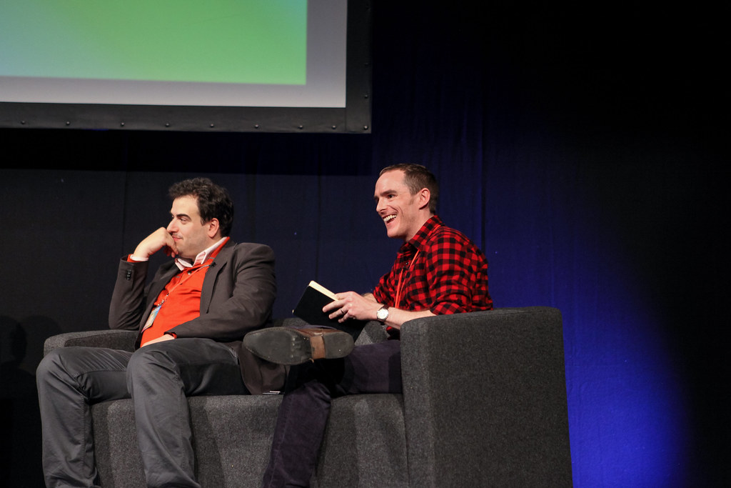
Richard Turley arrived on stage announcing such talks were his form of therapy. And in a sense they are – his speaking persona is a complex mix of proud exhibitor and embarrassed thief. ‘I’m just not cool,’ he stated, coolly. The love for what he does seeps out despite the insistence he just happens to be the man in the job, reliant on his (admittedly huge by London standards) team and his ability to ‘steal ideas.’
His reinvention of Bloomberg Businessweek has resulted in an extraordinary body of editorial work. Normally I’d push the front covers to the fore, and Richard started his presentation with a series of them, but it was the later display of spreads that really impressed me, perhaps because I know the covers so well. The covers do a fantastic job of expressing excitement about often quite mundane business stories, but also communicate a spontaneity that is perfect for the weekly magazine.

But the spreads were the star here, and made sense of his tribute to David Carson’s RayGun. Recent work has involved breaking the tight grid he has relied on, as he struggles with a love/hate relationship with modernism – he showed some aging tabloid newspaper designs that had inspired an issue, all cascading columns and stepped indents.
A paean to a particularly ugly Prada boot showed how he thinks beyond the realm of editorial design to define and collate his thoughts. And his description of working with editor Josh Tyrangiel emphasised one of the key themes of the day, that of collaboration and conversation.
Later this week I’ll post some conclusions I drew from the day.
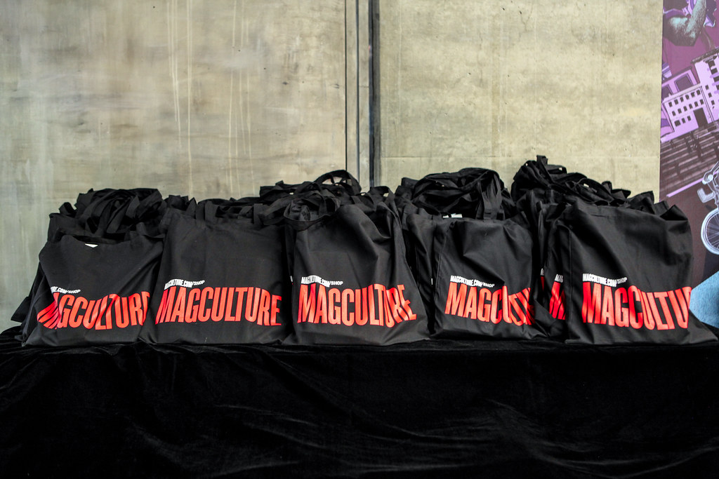
The magCulture tote bags…
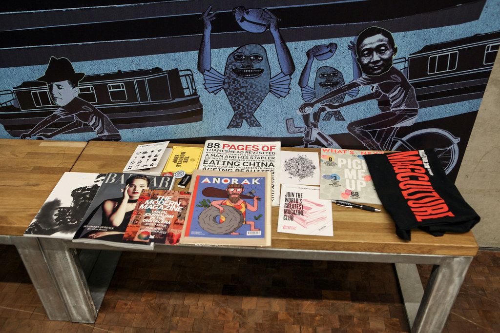
…and their contents. Thanks to Sappi and Adobe for their support for these, and to everyone else who supplied magazines, postcards, even chocolates.

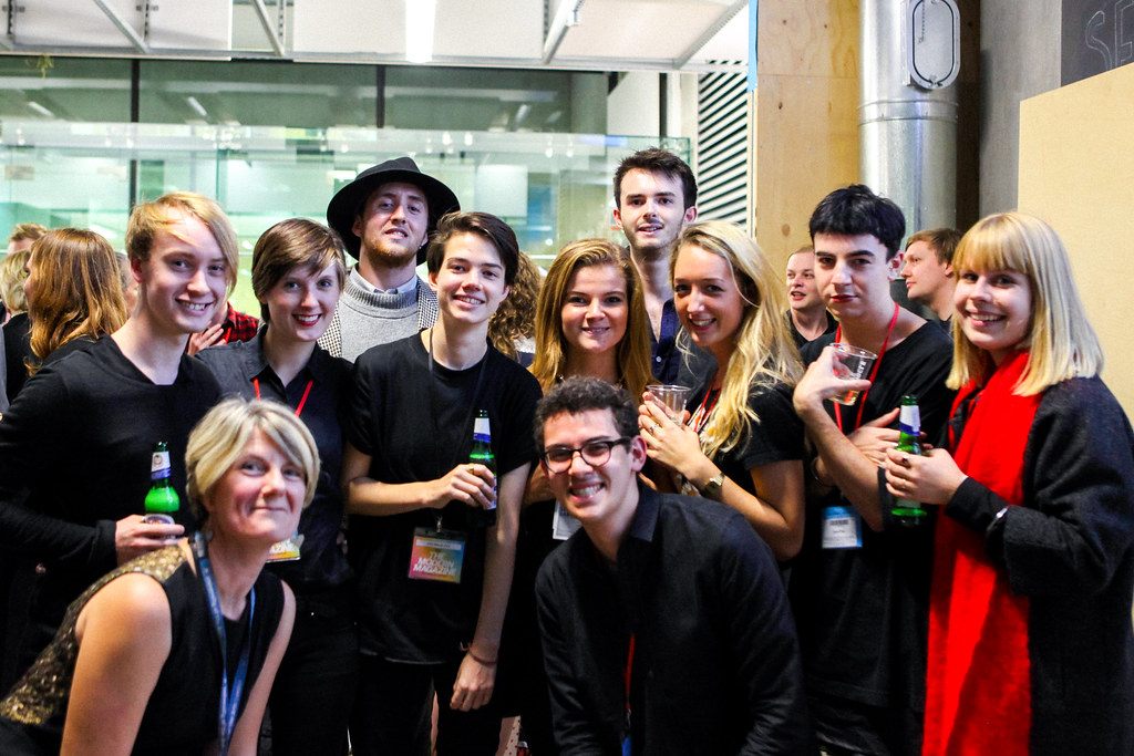
The end-of-day drinks and raffle, held in the CSM graphics studio alongside projected images from the day. Thanks to Monocle for the beer and wine.
Thanks also to the team of student helpers, with CSM tutor Cath Caldwell (left).
Photographs by Rhys Atkinson
Further reviews:
It’s Nice That live blog
Ben Serbutt part one / part two / part three
Fraser Allen, White Light Media
Steve Watson, Stack Magazines
Tim Milne, Artomatic
Quintatinta (Spanish)
Sarah Snaith’s live blog for magCulture part one / part two / part three
Central Saint Martin’s blog
Monocle24’s The Stack edition 60 (audio, interviews with me, Richard Turley, Justine Picardie, Penny Martin, Rosa Park and Cathy Olmedillas)
It’s Nice That Studio Audience podcast (audio, from 18:40)
magCulture production team:
Lesley Allan
Steph Hartmann
Ross Aitken
Alison Still