

Ordinary #5
Last time we took a look at Amsterdam-based concept mag Ordinary we wondered how long they could keep the fun going. That was issue three, and the new issue five shows the magazine successfully developing its beautifully simple idea. It’s familiar now – an everyday object is sent to a selection of artists who produce a photograph featuring the item – but the results are stronger than ever.
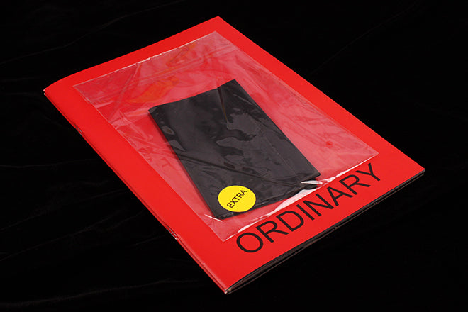
For previous issues they sent out plastic cutlery, cotton buds, a washing up sponge and socks to their contributors. Now it’s the turn of the black rubbish bag, and the response from the artists has been such that this is a double issue, bound together with a rubber band. As ever, the object, the plastic bag, is attached to the front cover; and if this object itself is less visually interesting than previous ones the images inside are among the best, as the examples above demonstrate.
At the heart of it is the pure simplicty of the idea and its execution. The title ‘Ordinary’ sits on the cover in a very ordinary font – Verdana? – amended with the word ‘Extra’ stickered onto the bagged item. This is the only type you see until the back cover, the image spreads are presented without comment or credit (the back cover is reserved for the credits, presented as a list in page order). This blank, unfussy approach is key to the magazine’s success. It is utterly matter-of-fact and, yes, ordinary, yet the images are anything but ordinary.