

Out now – eleven recent arrivals

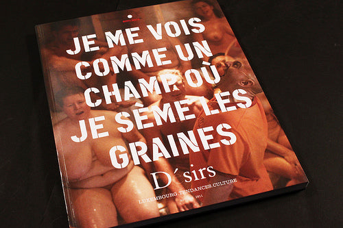
Sooo many magazines pouring through the letterbox… yes, it’s time for a quick catch up with eleven recent arrivals. Starting with the smart new design for the front cover of Luxembourg trends mag Désirs. Each issue will feature a different quotation as the lead element of the cover.

A new mono.kultur is always exciting, and no28 is no exception. The issues subjects are fashion-product design duo Bless and it features lots of their collaborations as well as a recent look book. Lovely double-ended format, too.

Flamingo is a curious thing. A4, 70pp, it packs a punch with some great stories about hitchiking in Germany and a look round London with Metronomy. The cover of issue two, the Outside Issue (above) has a charm and completeness that isn’t always matched inside, where the design doesn’t always quite hang together. But I’m interested to see the next issue – it has character.

Toronto-based culture magazine Bad Day makes the most of its small format, using mixed paper stocks (this, its eleventh issue, mainly uses pastel pink paper) and a very simple layout that exudes confidence in its content. Cover star Mike Mills places its interests pretty well – also featured are David Shrigley and Martino Gamper, while previous issues have included Panda Bear and Daniel Eatock.

London Design Festival took place a few weeks ago. With typically little involvement from the city’s graphic designers, it was good to see the It’s Nice That guys trying to link things up with a one-off special. A typically well-crafted object.
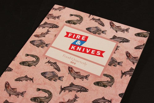
The latest Fire & Knives is here. This is where I usually write something glib like ’yum’ but will resist that temptation and guide you towards what I believe is the first photo-feature in the magazine. But don’t worry, they haven’t succumbed to an overstyled food shoot. Alex Renton’s photo report from rural Armenia is a must-see, showing attempts to retain dignity in the kitchen even as food supplies disappear. Very moving.

Blanket first appeared on the Internet in December 2006, and now almost five year later has published its first printed issue. Dedicated to presenting new creative talent, the launch edition reflects the online presence but takes full advantage of print. Metallic inks, embossed logos. Magazine-y! They’ve very nearly run out of copies so get in fast.

Issue three of FAQNP calls itself a guide to travel for the queer nerd. Black and white, well-designed and featuring its usual combo of design nerdery (Indian shop typography) and gay lifestyle info (a pictorial history of gay travel guides) that defines it audeince as such a small niche it actually becomes interesting to everyone. Unique and characterful.

Part of my contribution to the Walker’s ‘Graphic Design– Now in Production’ show is the notion that new magazines are reinventing traditional genres. The Plant Journal is another example. Like others covering food, cycling, cars, this new gardening magazine mixes personal stories with advice and detail, including a matt stock section on a single plant (the Staghorn Fern) and DIY guide to building a city garden. The issue also includes the afore-mentioned Bless duo. I enjoy gardening so I’m fascinated to see a new sub-genre of indie magazines looking at the subject developing. Another title, Wilder Quarterly, has just launched too.

Here’s the second Canadian magazine of this round up. Snap is a free magazine from Montreal. Now in its fourth year its been redesigned to a larger format and is a surprisngly high-quality publication for a freebie: thick matt stock, lots of advertising, and a broad remit of culture and lifestyle that lets the team wander randomly. I think it’s still finding its true self but it’s definitely worth tracking down if you’re in Canada.

Finally, Ampersand Magazine is the size of old-style Penguin paper presented in landscape format and comes from Australia. Its 200+ small pages are packed with illustration and photography and command repeated flicking. Launched to remind Australians magazines can take risks, it resolutely follows its own nose rather than trying to be ultra-cool. Issue three (above) takes its theme ‘The Fade’ from a photography competition the editors ran last year, and many of the entries are published here.